You're probably here because your form is doing too much and helping too little.
A prospect clicks a lead form and sees every possible question. A shopper starts a product quiz and gets asked about categories they don't care about. A support request form makes everyone scroll through billing, shipping, and technical questions whether they apply or not. That's when a form stops feeling like a conversation and starts feeling like admin work.
Google Forms skip logic can fix a lot of that, but only if you treat it as a form design problem, not just a menu setting. Most tutorials stop at the click path. They tell you where to find “Go to section based on answer,” but they don't help you decide how to structure the form so it supports lead qualification, segmentation, or product recommendations without turning into a mess.
Table of Contents
- Why Your Forms Need to Be Smarter Not Longer
- Real-World Scenarios for Marketers and Shopify Owners
- How to Set Up Skip Logic in Google Forms
- Testing and Troubleshooting Your Logic Paths
- Common Limitations and Smart Workarounds
- When to Graduate from Google Forms
Why Your Forms Need to Be Smarter Not Longer
The usual bad form isn't too long because it has a lot of questions. It's too long because it asks the wrong people the wrong questions.
A wholesale inquiry form asks retailers and end customers to complete the same fields. A skin care quiz asks someone with dry skin to answer questions intended for acne shoppers. A B2B lead form asks students, consultants, and enterprise buyers to follow the same path. You don't just get annoyed respondents. You get muddy data, weaker segmentation, and less confidence in what a response means.
That's why Google Forms skip logic matters. Used well, it helps you route people based on what they tell you early in the form so they only see relevant sections. Used poorly, it becomes a branching maze that nobody on your team wants to maintain.
Practical rule: The hard part isn't learning where the setting lives. The hard part is designing a branching architecture that doesn't create dead ends once the form gets bigger.
That distinction matters because Google Forms doesn't offer true question-level branching. The workflow is section-based, which creates a real planning problem for teams building lead-qualification or product-recommendation flows, as highlighted in this discussion of branching architecture challenges.
If you care about form performance, that planning sits inside a bigger conversion question. A useful primer on that is Otter A/B on conversion optimization, especially if you're thinking beyond form setup and into what gets more people to complete the journey.
For teams collecting feedback, support requests, or customer profile data, it also helps to look at examples of purpose-built customer interaction forms so you can spot what belongs in a branch and what should stay universal.
Real-World Scenarios for Marketers and Shopify Owners

Google Forms skip logic is most useful when the first answer changes what “relevant” means for the rest of the form. That's common in ecommerce, lead gen, and support.
Product finder quizzes for Shopify stores
A Shopify merchant selling perfume, clothing, or dog food often needs a lightweight recommendation quiz, not a full survey. The first question might split shoppers by use case, such as “shopping for yourself or as a gift,” or by need state, such as “sensitive stomach,” “puppy,” or “senior dog.”
From there, each branch can ask a narrower set of questions:
- Perfume store: Scent family, occasion, gift intent
- Apparel store: Fit preference, category, style
- Pet brand: Age, dietary concern, product format
That keeps the experience focused. It also makes the final recommendation easier to interpret because each answer came from a path built for that shopper segment, not from a generic form trying to serve everyone.
If you work on app or ecommerce validation, the framing behind shopify app research screeners is useful because screener logic and product-quiz logic share the same discipline. Ask a small number of decisive questions early, then route.
Lead qualification without sending everyone to sales
A B2B marketer can use branching to separate inquiry types before a rep ever reviews the response. One path can send high-intent prospects into a demo-oriented section. Another can route students, partners, or low-fit leads into a lighter follow-up path.
A simple structure might look like this:
| First answer | Next section | End goal |
|---|---|---|
| Request a demo | Company and use case questions | Sales handoff |
| Need pricing info | Budget and timeline questions | Qualification |
| Just researching | Newsletter or resource opt-in | Nurture |
That's where section routing helps. But Google's own documentation tends to focus on mechanics, not the respondent-experience tradeoff. Branching can improve relevance, yet complex paths can also confuse users, and the available documentation doesn't give strong comparative performance data on that tradeoff in conversion-focused use cases, as noted in Google's help documentation context.
Support intake that sends people to the right lane
A support form is another strong fit. Start with issue type, then branch to the right follow-up questions. Billing can ask for invoice context. Shipping can ask for order status. Product defect can ask for batch or item detail.
For ecommerce teams building more guided buying or support flows, it's worth reviewing dedicated ecommerce form examples because the structure matters as much as the fields. In practice, simpler decision trees work better than trying to mirror every edge case in one Google Form.
How to Set Up Skip Logic in Google Forms
The setup itself is straightforward. The mistake people make is opening Google Forms first.
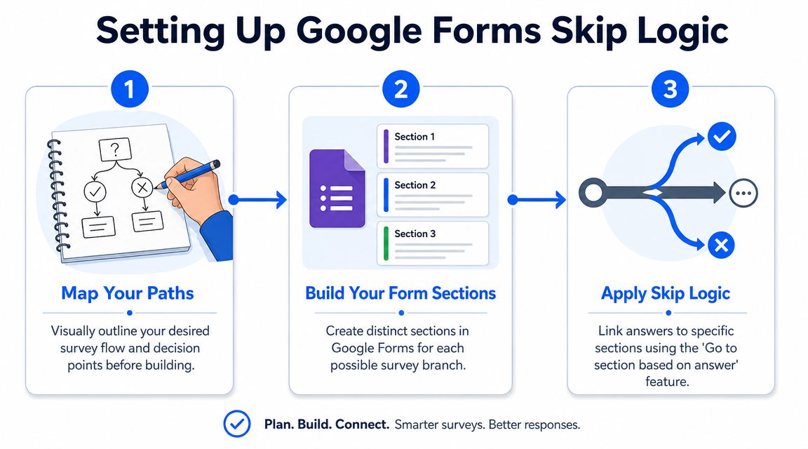
Map the path before you build
Start on paper, in a doc, or on a whiteboard. Write the first question that determines which kind of respondent you're dealing with. Then list the sections each answer should reveal.
For a lead form, a strong opening trigger might be:
- What are you looking for today
- Book a demo
- Compare options
- Get support
- Just browsing
For a product quiz, it might be:
- Who is this product for
- Me
- A gift
- My child
- My pet
Keep the map shallow. Google Forms branching works best when you can think of it as a small decision tree, not a fully dynamic questionnaire. Independent guidance on the feature describes the standard workflow as splitting the form into sections, assigning destinations to answer options, and optionally ending a branch with Submit form in forms meant to route users through only relevant questions using section-based branching.
If your flowchart already looks crowded before you build it, the form probably needs fewer branches or a different tool.
A quick visual walkthrough helps before you click around in the editor:
Build sections that match business decisions
In Google Forms, skip logic is implemented through section branching. You don't hide individual questions inline. You split the form into sections, then route people between them.
That means every major branch needs its own section. For example:
- Intro and trigger question
- Demo request section
- Pricing interest section
- Support section
- General thank-you or submission end
Many forms get clumsy when teams create sections based on topics instead of decisions. Don't group by internal department names if your respondent doesn't think that way. Group by what the user is trying to do.
A practical setup pattern:
- Universal first section: Name, email, or a single opening question if needed
- Branch trigger section: The multiple choice or dropdown question that sends users down different paths
- Path-specific sections: Only the questions needed for that audience
- End section: Confirmation or submit path
Apply the branching rules carefully
Once the sections exist, add the branching rule to the trigger question.
Google Forms supports this workflow by using a multiple choice or dropdown question, opening the question menu, selecting Go to section based on answer, and then assigning a destination for each answer. At the section footer, you can choose whether the next move is to continue, jump elsewhere, or submit. This approach works best for decision-tree structures because only those two question types can trigger the branch, as explained in this section branching walkthrough.
Use this sequence:
Select the trigger question
Make sure it's multiple choice or dropdown. If it's checkboxes or short answer, it won't trigger branching.Open the three-dot menu
Choose Go to section based on answer.Assign a destination for every answer
Each answer should point to a specific section or to Submit form.Check each section footer
Decide what happens after the respondent completes that section. Continue, jump, or submit.Keep branch labels obvious
Use section titles your team can understand later, like “High-intent lead path” or “Gift buyer follow-up,” not “Section 4.”
A common example for a service business:
- Question: What do you need help with?
- Billing issue → Billing section
- Technical issue → Technical section
- Partnership inquiry → Partnership section
- Wrong fit → Submit form
That's Google Forms skip logic at its cleanest. One trigger, clear sections, deliberate exits.
Testing and Troubleshooting Your Logic Paths
A form can look correct in the editor and still fail for real respondents.
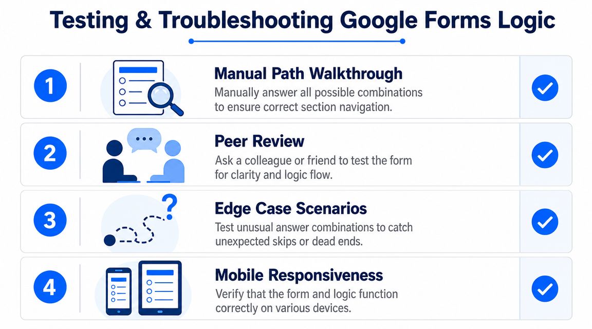
Run a full path audit
Testing isn't optional with section branching. Because routing only happens through the Go to section based on answer option on multiple choice or dropdown questions, using the respondent preview step is necessary to verify every path before publishing, as shown in this Google Forms preview-focused explanation.
Open Preview and go through the form like a real user. Don't just test the happy path. Test every branch.
A simple test matrix works well:
| Test case | Trigger answer | Expected destination | Actual result |
|---|---|---|---|
| Lead path A | Demo | Demo questions | |
| Lead path B | Pricing | Pricing questions | |
| Lead path C | Support | Support questions | |
| Exit path | Not interested | Submit form |
Use one row for every answer path that changes the user journey. If a branch has a second branch inside it, test that too.
Pre-flight check: Every path should have a clear end. If you can't explain where a respondent goes next in one sentence, the logic needs cleanup.
Check the mistakes that break live forms
Most logic issues fall into a few repeat offenders:
- Dead-end sections: A respondent reaches a section that doesn't continue anywhere useful.
- Wrong destination: An answer points to the wrong section because the builder was rearranged later.
- Broken trigger type: Someone changed the branching question from dropdown to another field type.
- Accidental loop: A section footer sends the user back into a previous branch.
- Missing submit path: A path never reaches a real endpoint.
One practical habit saves time. Rename sections as if you're going to hand the form to someone else next week. “Support > shipping issue” is much easier to troubleshoot than “Section 6.”
Another good check is device testing. Open the preview on your phone. Section-based forms can feel longer on mobile because each click to the next section adds friction. If the path feels jumpy or repetitive, simplify it before launch.
Common Limitations and Smart Workarounds
Google Forms handles straightforward branching well enough. The trouble starts when you try to use it for actual business decisions, such as qualifying leads by budget and timeline, or steering shoppers toward different product recommendations based on a few signals. At that point, the form builder stops being a questionnaire tool and starts acting like a very simple router.
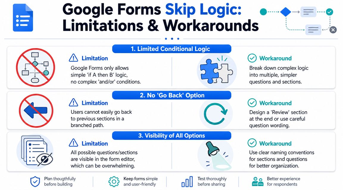
What Google Forms does not do well
The biggest constraint is the logic model itself. Google Forms relies on sections, assigning a destination to each answer option, and optionally ending a branch with Submit form. That works for simple yes-or-no routing. It gets awkward fast when your form needs to reflect more than one condition, reuse the same question across several paths, or branch from inputs that are not multiple choice or dropdowns.
Three limits come up again and again in real projects:
- Branching only works from certain question types: You cannot route users directly from short answer, checkbox, linear scale, or rating-style inputs.
- Simple logic creates section bloat: A small follow-up question often requires a whole new section just to keep the path clean.
- Shared paths are hard to maintain: Once branches split, merge, and split again, small edits can send people to the wrong place.
That is usually where teams feel the strain first. Not in the respondent experience, but in the maintenance.
How to work around those limits
The best workaround is structural. Build the form around the business decision you need first, then fit Google Forms into that logic instead of trying to mirror every nuance.
For lead qualification, start with the sorting question that matters most. Intent, company size, use case, or timeline usually deserves the first branch. If someone wants support, send them down a support path. If they want pricing, send them there. Do not waste your cleanest routing opportunity on a low-value preference question.
If you need logic based on free text, use a controlled choice before the text field. Ask “What best describes your need?” as multiple choice, then collect details inside the branch. You lose some flexibility, but you gain a form you can effectively manage.
A few patterns help keep Google Forms usable:
- Group universal questions together: Put name, email, order number, or store URL in one shared section instead of repeating them across branches.
- Use branch labels that reflect intent: “Wholesale lead > high volume” is easier to edit than “Section 8.”
- End dead-end paths early: If a respondent is a poor fit, route them to Submit form or a short closing section.
- Limit nested branching: One main split and one follow-up split is usually manageable. Beyond that, maintenance costs rise quickly.
For product recommendation flows, a two-question filter often does enough. Category first. Then one clarifying question inside that category. A skincare brand might ask “What are you shopping for?” and then “What is your main concern?” inside the skincare path. That gives you usable segmentation without turning the form into a maze.
There is also a point where the workaround costs more than the tool saves. If your team needs multi-condition logic, answer recall, or a more guided one-question flow, a dedicated builder is usually a better fit than another round of section patching. A tool like VeeForm's AI form generator is built for that kind of interactive logic.
And if the operational problem starts after submission, not inside the form itself, your handoff matters too. This guide for ecommerce HTML form emails covers one of the common follow-through issues store owners run into once responses need to reach the right inbox in a usable format.
When to Graduate from Google Forms
Google Forms is fine when your form behaves like a basic decision tree. It starts to feel strained when your team wants the form to behave more like a guided conversation.
The signs your form has outgrown section branching
You've probably reached that point if you need any of these:
Logic based on more than one answer
You want combinations, not just one-answer routing.Branching from text, ratings, or richer inputs
Your key decisions don't fit neatly into multiple choice or dropdown fields.Answer recall and personalization
You want the form to reference what the user already told you.A more polished one-question-at-a-time experience
Especially for lead gen and mobile-first ecommerce flows.Better analytics and operational follow-through
You need clearer reporting, exports, or CRM syncs tied to path performance.
That's usually when a dedicated no-code builder makes more sense. For example, VeeForm's AI form generator is built for interactive forms with conditional logic, answer recall, and guided flows that suit quizzes, lead qualification, and segmented customer journeys. That's a different category from a basic section router.
If your bottleneck is no longer form creation but what happens after submission, adjacent workflow pieces matter too. For store owners thinking about downstream handoff and notification patterns, this guide for ecommerce HTML form emails is a useful companion read.
Google Forms is still worth using when the job is simple. But once you're spending more time maintaining branches than learning from responses, the tool has done its job and it's time to move on.
If your team needs forms that qualify leads, recommend products, and adapt cleanly without section sprawl, VeeForm is a practical next step. It's a no-code builder for interactive surveys, quizzes, sign-ups, and support forms, with conditional logic, answer recall, analytics, and flexible ways to publish on-site or by link.