A shopper adds two items to cart, checks shipping, hesitates, then moves toward the browser bar. That moment is where most Shopify stores lose the sale. Not because the product was wrong, but because the store had no last response when doubt showed up.
A good exit intent popup isn't just a discount box. It's a final, well-timed intervention. Sometimes it's an offer. Sometimes it's reassurance. Sometimes it's a simple question that tells you why buyers keep slipping away.
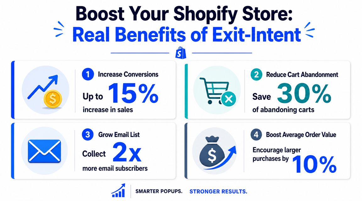
Used badly, it feels like noise. Used well, it can recover visitors who were already gone. Well-implemented campaigns can save 10% to 15% of visitors who would otherwise leave, according to Flint's summary of Conversion Sciences and popup benchmark data. That's why this tactic has stayed in the CRO toolkit for so long.
The bigger question for Shopify teams isn't whether exit intent can work. It's where it belongs, where it doesn't, and what should replace it when the popup itself becomes friction.
Table of Contents
- Introduction The Moment Before Goodbye
- What Is an Exit-Intent Popup and How Does It Work
- The Real-World Benefits for Your Shopify Store
- Best Practices for Design and Copy That Converts
- Smart Targeting and Segmentation Strategies
- How to Create an Exit-Intent Popup with VeeForm
- Exit-Intent Popup FAQs for 2026
Introduction The Moment Before Goodbye
You know this session. A visitor lands on a product page from Instagram, browses a few variants, adds one to cart, opens shipping info, then stalls. They aren't bouncing in the classic sense. They're interested, but something is unresolved.
Then comes the cursor drift. Upward. Away from the page. Decision made.
For Shopify stores, that moment matters more than many realize. Acquisition already happened. The click cost money. The merchandising worked well enough to get product interest. The buyer got deep into the session. Then the store went silent right when the last objection appeared.
An exit intent popup gives you one more shot, but only if you treat it like part of the buying journey rather than a generic overlay. If a buyer is worried about shipping, a broad newsletter ask is the wrong move. If a reader is leaving a blog post, a sitewide discount can feel random. If a shopper is close to checkout, an aggressive popup can lower trust.
Practical rule: The closer the visitor is to purchase, the more specific your popup has to be.
That's why the useful conversation isn't "Should I add an exit popup?" It's "What problem is this popup solving on this page, for this visitor, at this exact moment?"
On some Shopify pages, the right answer is a cart-save prompt. On others, it's a first-order incentive, a product recommendation, a fit guide, or no popup at all. The stores that get this right don't just collect more emails. They recover intent without damaging the experience that created that intent in the first place.
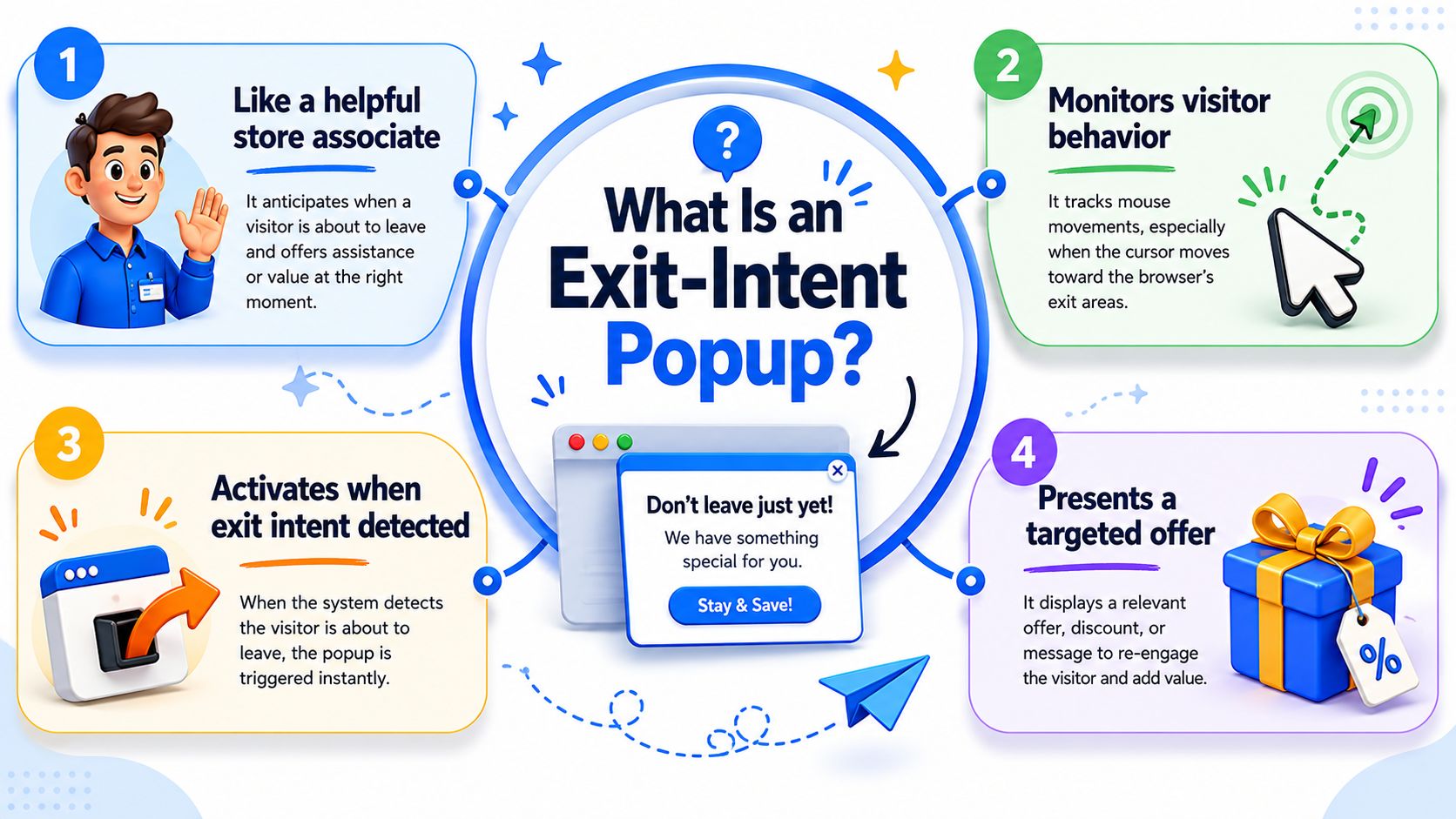
What Is an Exit-Intent Popup and How Does It Work
The simple version
An exit intent popup is the digital version of a good store associate noticing you're about to walk out and asking one useful question before you leave. Not ten questions. Not a speech. Just a timely intervention.
On desktop, the system usually watches mouse movement and fires when the cursor heads toward the top edge of the browser. That's why the trigger is best understood as a proxy for abandonment, not mind reading. SaaSFrame's guide to the mechanics explains that implementations commonly rely on JavaScript listeners for mouse position and direction, and that precision depends on threshold tuning so the popup doesn't fire too early.
That distinction matters. If your thresholds are loose, the popup catches curiosity instead of departure. If they're too strict, you miss the window.
Desktop and mobile don't behave the same way
Exit intent became standard because it targeted a specific behavioral moment. Dazze Studio's overview of exit-intent timing and design notes that desktop triggers often map to cursor movement toward the browser's back button or address bar, while mobile relies on broader movement and scrolling signals. The same source cites a dataset where popups shown after a 6 to 10 second delay converted at 2.4% versus 1.9% for immediate popups, and another where countdown timers converted at 8.07% versus 3.79% without them.
So the trigger isn't the whole story. Timing and presentation shape the outcome.
For Shopify teams, the practical lesson is simple:
- Desktop triggers are sharper: Cursor movement gives you a clearer abandonment signal.
- Mobile triggers are noisier: Scrolls, pauses, and back-button behavior can mean several things.
- Design has to match the moment: A popup shown too early feels like interruption. A popup shown too late never gets seen.
If you're thinking about turning abandoning visitors into customers, start by respecting the difference between a true exit signal and a guessed one. That's what separates a useful conversion tool from a popup that annoys buyers who were still browsing.
The Real-World Benefits for Your Shopify Store
A good exit-intent popup earns its keep in one of two ways. It either saves the sale that was about to disappear, or it captures enough intent to bring the shopper back later through email or SMS.
That sounds obvious, but the revenue impact depends on where you deploy it. A cart or checkout-adjacent popup can recover high-intent visitors. A popup on a low-intent blog post often collects discounted, low-quality leads that never buy. Shopify teams get better results when they judge the popup by page economics, not by opt-in rate alone.
Where exit intent produces real value
The strongest use cases are usually tied to a clear conversion obstacle.
- Cart recovery: The shopper has already done the hard part. A timely offer, shipping reassurance, or return-policy reminder can remove the last point of hesitation.
- Lead capture for delayed purchase cycles: Some products need comparison, budget approval, or a second visit. Capturing email or SMS gives you another shot without paying again to reacquire the same visitor.
- Product-selection help: On larger catalogs, exits often come from uncertainty. A quiz, fit finder, or guided recommendation can outperform a coupon because it solves the actual problem.
- On-page feedback: A one-question popup can surface friction like delivery concerns, sizing confusion, or weak product detail that analytics alone will not explain.
That last use case gets overlooked.
Stores often treat exit intent as a discount box. In practice, it works best as a decision tool. If a shopper is leaving because pricing is uncompetitive, a popup may recover the session. If they are leaving because the page is slow, the product offer is unclear, or trust signals are missing, the popup just masks a deeper conversion problem.
When an exit-intent popup is the wrong tool
This is the part many articles skip. Some Shopify pages should use a different capture method.
If the page has low purchase intent, a static inline form or embedded quiz usually fits better than an interruptive modal. If mobile traffic dominates and exit signals are noisy, a sticky signup bar or timed slide-in may be easier to control. If the audience is highly brand-aware and already engaged, adding a popup can reduce completion rate instead of improving it.
Use a simple filter before you launch one:
- High intent, clear objection: Use exit intent.
- Low intent, education-first page: Use embedded capture.
- Complex product selection: Use a guided form or quiz.
- Weak page fundamentals: Fix the page first.
That broader view matters more than squeezing a few extra opt-ins from a popup. Tagada's conversion guide is useful here because it frames popups as one part of a larger conversion system. The same logic applies if you're building ecommerce form experiences that qualify shoppers instead of just collecting emails.
A popup should recover existing intent. It should not carry a weak product page, compensate for hidden shipping costs, or rescue unclear merchandising. When stores use it in the right places, it adds revenue. When they force it onto every page, it often adds noise.
Best Practices for Design and Copy That Converts
The fastest way to tank an exit intent popup is to ask it to do too much. Too many fields, too much copy, too many offers, too many buttons.
Mailchimp's guidance on exit-intent popups gets the core principle right. These popups appear at the highest-friction point in the session, so performance is tightly tied to relevance, brevity, and CTA clarity. The same guide notes that benchmark ranges are commonly around 2% to 5% depending on audience and offer quality.
Design for a fast decision
A leaving visitor won't study your popup. They scan it.
That means the layout has one job. Make the next action obvious within a second or two.
Use these design rules:
- Keep one goal per popup: Don't ask for an email, promote three categories, and explain your loyalty program in the same modal.
- Match the site visually: When the popup looks off-brand, buyers read it like an ad unit.
- Prioritize mobile readability: Large text, clear spacing, and an easy close button matter more than decorative effects.
- Lead with the offer: The value should appear before the form field, not after it.
If you're evaluating A/B testing and personalization tools, look for products that let you test offer, layout, timing, and segmentation independently. Those are the levers that change performance.
Write copy that answers one question
Every popup copy block should answer this unspoken buyer question: "Why should I stop leaving?"
Good copy is specific. Weak copy is dramatic.
Compare the difference:
- "Wait before you go" is broad.
- "Get free shipping on this order" is concrete.
- "Join our newsletter" is generic.
- "Get product drops and first-access offers" is clearer.
- "Submit" is dead language.
- "Send my code" tells the shopper what happens next.
A clean structure works well:
- Headline: State the value.
- Short support line: Add one piece of context or reassurance.
- CTA: Use action language tied to the offer.
For stores collecting leads instead of pushing a purchase, a focused discount form template can help keep the interaction short and on-brand.
Field note: If the close option is hidden, tiny, or guilt-loaded, conversions may look better for a moment, but buyer trust gets worse.
Exit-Intent Popup Design Do's and Don'ts
| Do | Don't |
|---|---|
| Use one clear offer tied to the page context | Mix multiple offers in one popup |
| Write a direct CTA such as "Send my code" or "Save my cart" | Use generic CTA text like "Submit" |
| Keep copy short and scannable | Add long brand paragraphs nobody reads mid-exit |
| Design for mobile first with readable spacing and obvious controls | Assume desktop behavior translates cleanly to mobile |
| Test relevance before styling tweaks | Obsess over colors while the offer is still weak |
| Exclude recent converters and subscribers | Show the same popup to everyone |
What usually works isn't flashy. It's relevant, brief, and easy to act on.
Smart Targeting and Segmentation Strategies
The jump from average to strong performance usually doesn't come from prettier design. It comes from targeting.
A sitewide exit intent popup is easy to launch and easy to outgrow. Shopify stores with broad catalogs, repeat buyers, and mixed traffic sources need different messages for different situations. Otherwise the popup interrupts more people than it helps.
Page context changes the offer
The page tells you what the visitor is trying to do. Your popup should follow that signal.
On a product page, a shopper is evaluating. On cart, they're hesitating. On a blog post, they're learning. Those aren't the same moments, so they shouldn't get the same overlay.
A practical framework looks like this:
- If the visitor is leaving a product page, offer help that reduces uncertainty. That could be sizing guidance, a first-order incentive, or a recommendation flow for similar items.
- If the visitor is leaving cart, focus on completion. A cart-save prompt, shipping reassurance, or a limited purchase incentive fits better than a content signup.
- If the visitor is leaving a blog article, use content-aligned capture. A generic discount can feel disconnected if the person wasn't shopping yet.
Many Shopify stores overuse discounts. They put the same offer on every page, then wonder why the popup converts leads but not revenue quality.
Visitor history should change the message
A first-time visitor and a repeat buyer shouldn't see the same pitch.
First-timers often need an introduction or low-friction incentive. Returning visitors may respond better to a reminder, a new-arrivals message, or a path back to products they already viewed. Existing subscribers should usually be excluded from list-growth popups altogether.
A few segments are worth building early:
- New vs returning visitors
- Carted vs non-carted sessions
- Product viewers vs content readers
- High-consideration categories vs impulse-purchase categories
- Traffic from paid campaigns vs branded or direct traffic
One useful discipline is to write the popup logic in plain language before building it. "If a new visitor exits from a product page after viewing at least one variant, show the first-order offer." If that sentence sounds messy, the targeting probably is too.
The best exit popup often feels like a continuation of the page, not a separate campaign.
Suppression rules protect your UX
Good targeting includes rules for who should not see the popup.
Suppression matters because repeated interruption teaches buyers to ignore you. It also creates avoidable friction for visitors who already converted, dismissed the popup, or are moving through a high-intent flow where trust matters more than one extra email capture.
Set rules like these:
- Suppress after conversion: If someone already subscribed or purchased, stop showing acquisition popups.
- Suppress after dismissal: If they closed it, give them breathing room.
- Suppress on sensitive steps: Payment and final checkout stages often need less interruption, not more.
- Suppress by device when needed: If your mobile trigger quality is weak, don't force it.
This is also where the contrarian question matters. If a page already has strong embedded capture, clear product guidance, and healthy buyer flow, an exit intent popup may be the wrong tool. On those pages, adding another layer can lower clarity rather than improve conversion.
How to Create an Exit-Intent Popup with VeeForm
The build process is simple when the strategy is already clear. Most mistakes happen when teams choose the trigger first and figure out the offer later.
Build the flow before you touch the trigger
Start with the goal. Decide whether the popup is meant to recover a cart, capture a lead, collect feedback, or route shoppers toward the right product. That choice determines the copy, field count, and ending state.
Then choose a format that keeps friction low. For lead capture, a focused lead capture form template is a practical starting point because it keeps the ask narrow and easy to complete.
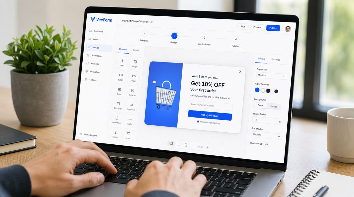
Inside VeeForm, the sequence is usually straightforward:
- Pick a template that matches the page goal.
- Edit the questions and ending so the value exchange is clear.
- Customize colors, images, and styling so the popup looks native to the store.
- Keep the flow short unless the popup is explicitly for feedback or guided recommendations.
A one-question-at-a-time flow works well here because a leaving visitor is more likely to respond to a lightweight interaction than a dense form block.
Set targeting before publishing
Once the form is ready, set the display trigger to exit intent. After that, the important work is targeting and suppression.
Configure the popup around context:
- Choose the pages: Product, cart, blog, or selected collections.
- Choose the audience: New visitors, returning shoppers, or campaign-specific segments.
- Set exclusions: Existing subscribers, recent purchasers, and people who already dismissed the popup.
- Preview on mobile and desktop: Make sure the message still feels readable and controlled on both.
Before publishing, run one last check. Ask whether the popup solves a real objection on that page. If the answer is vague, don't launch yet. Tight targeting beats fast deployment every time.
Exit-Intent Popup FAQs for 2026
Do exit-intent popups work on mobile
Sometimes, but mobile exit detection is less reliable than desktop. Wisepops' discussion of exit behavior gaps on mobile notes that desktop intent is usually tied to cursor movement, while mobile relies on looser signals like back-button taps, tab switching, or upward scrolling.
For Shopify stores with mobile-heavy traffic, that changes the decision. A mobile exit popup should earn its place through testing. If trigger accuracy is weak, an inline signup, sticky offer, or timed message often does a better job with less interruption.
When should a Shopify store not use an exit-intent popup
Skip it when the popup adds friction instead of removing it.
That usually means one of five situations:
- The page is already cognitively heavy, and another decision hurts product comprehension
- The shopper is in a trust-sensitive step, especially near checkout or payment
- The visitor needs guidance, comparison help, or reassurance more than a discount
- The page intent is low-pressure, such as blog content, where inline capture fits better
- The traffic is mostly mobile, and trigger quality is too inconsistent to control cleanly
This is the filter strong Shopify teams use. Start with page intent, then ask what objection is blocking progress. If the answer is price, an offer may help. If the answer is confusion, a popup with a coupon is the wrong tool. If the answer is trust, adding an overlay can make performance worse.
Can exit popups hurt UX
Yes, and the cause is usually poor use rather than the format itself.
Dynamic Yield's lesson on exit-intent tactics reflects the shift many CRO teams have made. Broad triggers, repeated displays, and generic discounts create annoyance fast. Controlled targeting, clear value, and strict suppression rules are what keep the experience usable.
I treat exit intent as a page-level intervention, not a sitewide default. On some pages it lifts email capture or saves carts. On others, a quieter option performs better and protects conversion quality. Strong Shopify operators ask not only how to optimize an exit popup, but whether a popup is the right intervention for that page at all.
If you want to build on-site forms, quizzes, signups, and exit-triggered experiences without custom code, VeeForm gives Shopify teams a fast way to launch polished flows, test different capture strategies, and keep every interaction aligned with the page where it appears.