A shopper lands on your Shopify store because they want help choosing. Instead, your form asks everyone the same long list of questions. A dog food buyer gets asked about cat allergies. A perfume shopper gets asked about budget before scent family. A wholesale lead gets the same contact form as a retail customer. People feel the mismatch immediately, and many leave before they finish.
That's where a conditional logic form changes the experience. Instead of forcing every visitor through one rigid path, the form adapts to what they say. It behaves less like a spreadsheet and more like a store associate who asks the next sensible question.
For busy Shopify owners, that matters for two reasons. First, shoppers get faster answers. Second, your team gets cleaner data, better-qualified leads, and more useful recommendation flows without manually sorting every submission.
Table of Contents
- The Problem with One-Size-Fits-All Forms
- What Is a Conditional Logic Form
- Four Essential Conditional Logic Patterns
- How Smart Forms Increase Shopify Sales
- How to Build Your First Conditional Form with VeeForm
- Common Pitfalls and Testing Your Smart Form
The Problem with One-Size-Fits-All Forms
A static form treats every visitor like they're identical. That sounds harmless until you watch someone use it. A customer selecting “I need help choosing a gift” still has to answer technical product questions. Someone trying to contact sales has to scroll past support fields that don't apply. Every irrelevant question adds hesitation.
For Shopify stores, that friction shows up everywhere. It affects newsletter signups, custom order requests, wholesale inquiries, shade matching quizzes, sizing help, and product finders. The form doesn't just collect information. It shapes whether the customer feels understood.
Form-building guidance describes conditional logic as a direct application of the long-standing “if this, then that” pattern, used to show, hide, or route questions based on earlier answers, creating a more dynamic and personalized experience in multi-step forms (FormAssembly's explanation of multi-step form conditional logic).
What the customer experiences
Here's the difference in plain terms:
- Static form: “Answer everything, even the parts that don't apply.”
- Smart form: “Tell me one thing, and I'll ask the next relevant question.”
That second experience feels lighter. It also feels more respectful.
Practical rule: If a question only matters for some shoppers, it probably shouldn't appear for everyone.
This is especially relevant if you're working on list growth and lead capture. If you're revisiting how signup flows support retention and segmentation, this guide on What Is Email List Building is useful background because it frames why the quality of subscriber data matters as much as the raw signup itself.
A simple lead capture flow can already benefit from this approach. For example, a store using a lead capture form template can ask whether someone is a retail buyer, wholesale buyer, or partner, then show the right follow-up fields for each group instead of piling everything into one page.
Why one-size-fits-all forms hurt sales
Customers rarely complain about a bad form out loud. They just stop.
That's what makes static forms tricky. The problem isn't only that they're long. It's that they ask for effort before they've earned it. When a shopper has to work to explain their situation inside a rigid form, your store feels harder to buy from.
A conditional logic form solves that by narrowing the path. The shopper sees fewer irrelevant questions, your team gets more context, and the conversation starts closer to the customer's real intent.
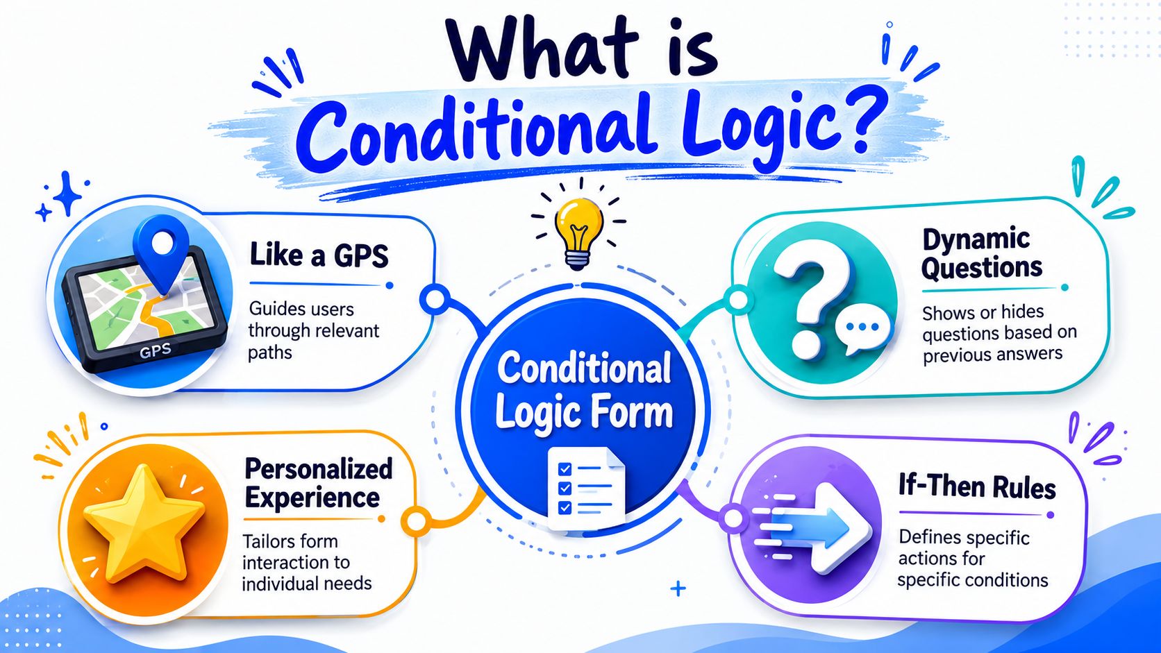
What Is a Conditional Logic Form
A conditional logic form changes its path based on what a shopper selects. One answer can reveal a follow-up question, hide an irrelevant field, send the person to a different result, or route them to a different outcome.
In plain English, the form pays attention and adapts.
A useful way to picture it is a store associate asking better follow-up questions. If a customer says, “I need help choosing a moisturizer,” the associate does not start listing products for acne, beard care, and sunscreen. They ask what matters next, such as skin type or sensitivity. A smart form follows that same rhythm online.
For a Shopify store, that can be surprisingly practical. A coffee quiz can ask for brew method first. Someone who picks espresso may see grind size and roast intensity. Someone who picks French press gets a different set of follow-ups. The shopper avoids clutter, and you collect details that can power a better product recommendation, a more qualified lead, or a more relevant email flow in VeeForm.
The three parts of every rule
Under the hood, a logic rule usually has three pieces:
| Part | What it means | Simple example |
|---|---|---|
| Trigger | The answer or field the form watches | Brew method |
| Condition | The test applied to that answer | Is equal to |
| Action | What the form does next | Show grind preference |
Written out, the rule looks like this: If brew method is equal to espresso, then show grind preference.
That simple if-then structure is the part that matters. Once you see forms this way, the feature stops feeling technical. You are just deciding which question should appear for which customer.
A good conditional form asks for context at the right moment. It does not dump every possible question onto the page at once.
Modern form tools can do more than basic branching. HighLevel's documentation describes conditions for fields like dates, numbers, scores, and currency, plus logic connectors such as AND and OR, with actions including redirecting, showing or hiding fields, disqualifying submissions, and jumping between slides (HighLevel conditional logic documentation). That matters because Shopify merchants often start with one small rule, then expand into richer flows like product finders, wholesale qualification forms, or post-purchase surveys.
One point trips up first-time builders. Conditional logic does not need to be fancy to produce a real business result. Even a small rule, like showing “company name” only when someone selects “business purchase,” can shorten the form for retail shoppers while giving your team better lead data from wholesale buyers.
Four Essential Conditional Logic Patterns
A good smart form behaves like a helpful store associate. It asks the next useful question, remembers what the shopper said, and ends with a response that fits the situation.
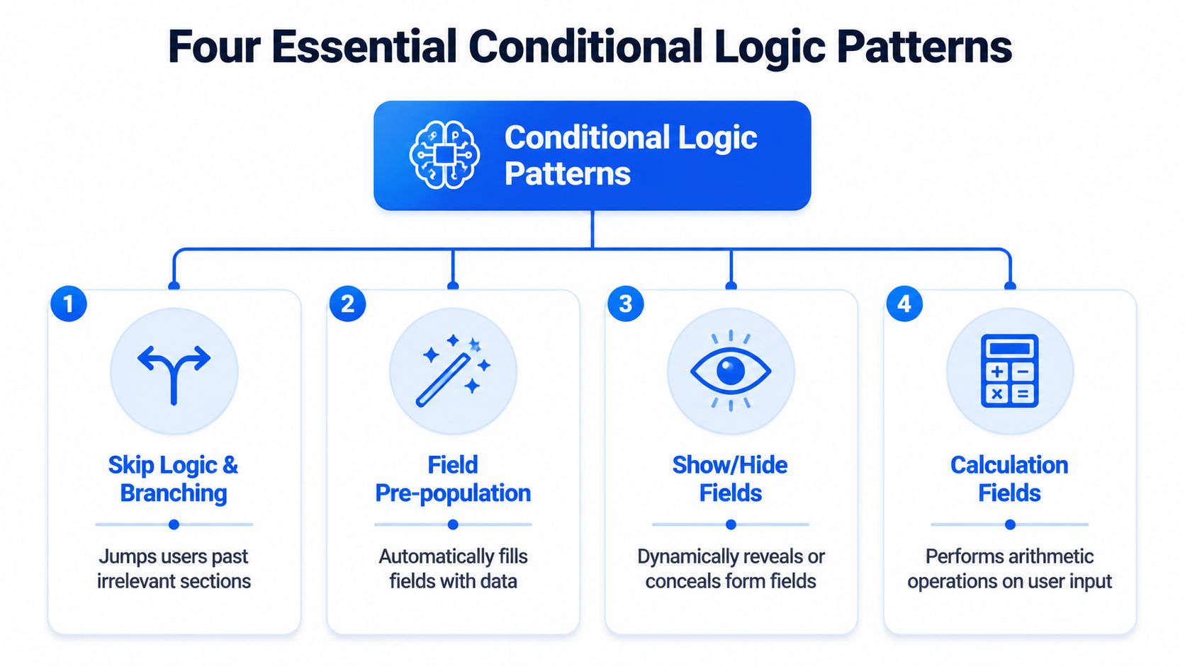
For Shopify stores, four patterns do most of the work. If you understand these, you can build product recommendation quizzes, lead forms, and post-purchase flows that feel shorter for shoppers and produce cleaner data for your team.
Skip logic and branching
Branching changes the route based on an answer. One shopper sees one path. Another shopper skips it.
A skincare store is a simple example. If a shopper chooses “dryness” as their main concern, the form can skip acne questions and move straight to hydration habits, sensitivity, and preferred texture. That keeps the quiz focused. It also reduces the small moments of friction that make people abandon forms.
This pattern is often the first one merchants build in VeeForm because the payoff is easy to see. Fewer irrelevant questions means the quiz feels faster, even if the total form has many possible paths. On an ecommerce quiz and smart form flow for Shopify, that can mean more completed quizzes and more shoppers reaching a product match instead of bouncing.
Answer piping
Answer piping reuses an earlier response later in the form. It is a small detail, but it can make the experience feel more personal and easier to follow.
Say your coffee quiz asks for a first name and brew method. Later, the next screen can say, “Alex, what roast level do you usually enjoy with espresso?” That line does two jobs at once. It sounds human, and it reassures the shopper that the form is tracking their preferences correctly.
Piping also helps with lead capture. If someone says they are buying for a team, a later question can refer back to that context instead of forcing them to restate it. The rule is simple: only pipe answers that improve clarity. If a field is optional, the sentence still needs to read naturally when the answer is blank.
Logic-based scoring
Beyond branching, forms can also evaluate answers.
Scoring assigns points behind the scenes. Each answer nudges the shopper or lead toward a result. In a supplement quiz, answers like “better sleep,” “sensitive stomach,” and “capsules preferred” can build toward one recommendation, while another combination points to a different product bundle. The shopper sees a helpful result. Your team gets a structured signal about intent and fit.
This matters for revenue because scoring can handle cases where one answer is not enough. Many purchase decisions are patterns, not single choices. A wholesale inquiry works the same way. Company size, purchase timeline, and order volume can combine into a more accurate lead picture than one yes-or-no question. If your team is also focused on optimizing B2B opt-in forms, scoring is a practical way to separate casual interest from sales-ready requests without making the form feel harsh or intrusive.
Dynamic endings
The end of the form should match the path the person took.
A shopper who finishes a product finder should see a recommendation, a shortlist, or a product page. A wholesale prospect should see next steps for account review. A customer support form might show care instructions, shipping guidance, or a message that sets expectations for reply time.
Dynamic endings are where the logic turns into a business outcome. Instead of sending every submission to the same generic thank-you page, you guide people to the next useful action. That might be a product collection, a booking link, a coupon, or a personalized follow-up email.
Here is the quick mental model:
- Branching changes the path.
- Piping reuses what the shopper already told you.
- Scoring combines answers into a recommendation or qualification result.
- Dynamic endings decide what the customer sees or receives at the end.
Used together, these patterns turn a form from a static questionnaire into a selling tool. For a busy Shopify owner, that is the main point. You are not adding logic for the sake of complexity. You are helping each shopper reach the right product faster, and helping your team collect the kind of information that leads to better follow-up and more sales.
How Smart Forms Increase Shopify Sales
A smart form doesn't create revenue by existing. It creates revenue when it helps a shopper move from uncertainty to action with less friction.
For Shopify stores, that often means the form takes over part of the job a sales associate would do in person. It narrows choices, clarifies intent, and routes the customer toward the right product, offer, or follow-up.
They remove friction at the moment of choice
A shopper who's unsure what to buy usually doesn't want more information. They want the right information.
That's why product recommendation quizzes work well when they're built around branching. A dog food store can ask about breed size, age, and dietary sensitivities, then show only the relevant options. A clothing store can ask fit preference first, then reveal questions about rise, length, or fabric only when those details matter.
The result is a simpler buying moment:
- Fewer irrelevant fields means less drop-off caused by annoyance.
- More relevant questions means shoppers are more likely to finish.
- Better answers give your team cleaner signals for follow-up.
They make complex catalogs easier to buy from
Conditional logic becomes even more valuable when your catalog has many variants, segments, or campaigns. Vendor-neutral guidance highlights the advantage of measuring drop-off, route performance, and completion by segment rather than treating the form as a single funnel step, especially as branches multiply in large catalogs or multi-segment stores (Smartsheet guidance on conditional logic and form measurement).
That matters for stores selling products like:
- Perfume: Route shoppers by scent family, occasion, and strength preference.
- Apparel: Separate size help from style discovery.
- Pet nutrition: Split by species, life stage, and dietary need.
- Wholesale catalogs: Qualify stockists differently from end customers.
If your store also attracts business buyers, good form design matters on the lead side too. This piece on optimizing B2B opt-in forms is worth reading because it focuses on how form structure affects lead quality, which is closely tied to how conditional paths are designed.
You can also see how this fits into broader ecommerce form flows, where quizzes, signup forms, and support requests all benefit from segment-specific paths instead of one generic experience.
When a store has lots of products, the form shouldn't act like a gate. It should act like a guide.
That's the sales angle in plain language. A conditional logic form shortens the path between “I'm not sure” and “this is the one.”
How to Build Your First Conditional Form with VeeForm
The easiest first project is a product recommendation quiz. It's concrete, useful, and simple enough to map before you build. Let's use a coffee example: Find Your Perfect Coffee Blend.
A no-code builder like VeeForm supports forms, quizzes, and surveys with logic-based behavior, so it fits this kind of use case well.
Start on paper before you open the builder
Don't start by clicking around in the editor. Start by deciding what outcomes you want.
For the coffee quiz, your result paths might be:
- Espresso-focused blend
- Filter-friendly blend
- Decaf option
- Gift recommendation
Then list the questions that determine the path:
- Brew method
- Flavor preference
- Caffeine preference
- Buying for self or as a gift
This order matters. Put broad sorting questions first. Save detail questions for later branches.
Sketch the form like a decision tree. If you can't explain the path on paper, the logic will be harder to maintain on screen.
That sequence lines up with expert guidance that recommends building the core form structure first and adding logic last, because dependencies are easier to validate once the base schema is stable (Technolutions guidance on building structure before logic).
Build every question first
Inside the builder, create all the questions before adding any rules. Even if some will stay hidden for certain users, it's easier to review the full inventory first.
A simple setup could look like this:
| Question | Type | Who should see it |
|---|---|---|
| What brew method do you use most? | Multiple choice | Everyone |
| Do you prefer bright or rich flavors? | Multiple choice | Everyone |
| Do you want regular or decaf? | Multiple choice | Everyone |
| What kind of espresso texture do you like? | Multiple choice | Espresso shoppers only |
| Is this for you or a gift? | Multiple choice | Everyone |
| What kind of gift are you looking for? | Multiple choice | Gift buyers only |
Many merchants overbuild. They add too many niche questions too early. Keep the first version small. You can always add more branches after real responses show you what people need.
A short walkthrough helps if you prefer seeing the flow in action:
Add the rules and test each path
Now apply the actual if-then logic.
Here's a straightforward rule set:
- If brew method is espresso, show “What kind of espresso texture do you like?”
- If buying intention is gift, show “What kind of gift are you looking for?”
- If caffeine preference is decaf, route the result toward decaf recommendations
That's enough to make the form feel responsive without becoming difficult to manage.
A few practical habits keep the build clean:
- Name fields clearly: Use labels you can recognize quickly when editing rules.
- Group related branches: Put gift logic together, brew logic together, and result logic together.
- Write a default path: Decide what happens if a shopper doesn't fit the specialized branches.
- Preview each route: Don't assume the visible path is the only one that works.
The strongest product quizzes feel simple because the builder made careful choices. The customer sees only the next sensible question. Behind the scenes, the logic is doing the sorting, qualifying, and recommendation work you'd otherwise handle manually.
Common Pitfalls and Testing Your Smart Form
Most logic mistakes come from good intentions. You want to personalize the form, so you add more branches, more exceptions, and more result paths. Then one answer combination leads nowhere, or a hidden field never reappears when it should.

Where forms usually break
At the technical level, a rule engine evaluates a trigger, operator, and value, and enterprise systems often cap a single rule to one Show and one Hide action to constrain complexity and make testing more predictable (ServiceTitan documentation on conditional logic rules). That's a useful reminder: cleaner rules are usually safer rules.
Watch for these common problems:
- Dead-end paths: A user answers truthfully but never reaches a logical next question or result.
- Overlapping rules: Two conditions conflict, so fields appear and disappear unexpectedly.
- No fallback route: The form works for your main audience but fails for edge cases.
How to test like a skeptical customer
Don't only test the happy path. Try to break the form on purpose.
Use a checklist:
- Run every branch: Click through each answer combination you can think of.
- Check mobile behavior: A path that feels fine on desktop may feel confusing on a phone.
- Read the transitions aloud: If the next question sounds abrupt, the logic may be correct but the conversation may still feel awkward.
- Review completion patterns later: Once the form is live, testing continues through observation.
If you want a broader refresher on experimentation after launch, this article on stop wasting ad spend with A/B testing is a helpful companion read because landing-page testing habits translate well to form intros, question wording, and result-page variations.
Treat your form like a customer-facing product, not a backend utility. People feel every rough edge.
A well-built smart form can qualify leads, recommend products, and make shopping easier without adding work for your team. If you want to create that kind of experience, VeeForm gives Shopify stores a no-code way to build quizzes, sign-up forms, and conditional paths that adapt to each customer.