Your team is probably working on a form right now that looks polished in Figma and converts well enough in a desktop preview. Then the actual-world version goes live inside a popup, on a phone, with conditional questions, custom-styled inputs, and inline validation. That's where a lot of forms stop being usable.
A form can look simple and still fail people fast. The label sits visually above the field but isn't connected in code. The Tab key jumps somewhere unexpected. An error appears in red, but a screen reader never announces it. On mobile, the tap target is so small that users hit the wrong option and don't even realize it.
That's why form accessibility matters most in the forms marketers care about most: lead capture, product finders, checkouts, quote requests, newsletter signups, and multi-step qualification flows. Static examples don't prepare teams for the messy reality of modern form UX. This guide does.
Table of Contents
- What Is Form Accessibility Really
- The Business and Legal Case for Accessible Forms
- Core Principles of an Accessible Form
- Handling Advanced Accessibility in Dynamic Forms
- Building Accessible Experiences with VeeForm
- How to Test and Audit Your Form Accessibility
- Your Form Accessibility Checklist
What Is Form Accessibility Really
A customer opens your signup form and starts tabbing through it because they can't use a mouse reliably. The cursor lands on a blank input. Their screen reader announces “edit text,” but not what the field is for. They tab again and skip past a required choice because the custom radio buttons weren't built to work from the keyboard. They hit submit, the page refreshes, and nothing tells them what went wrong.
That's not a minor bug. It's a blocked path.
Form accessibility means a person can understand, move through, complete, and correct a form using the tools they rely on, whether that's a keyboard, a screen reader, zoom, voice input, or just a thumb on a small screen. It's not only about compliance. It's about whether the form still works when the user doesn't interact with it the way the designer assumed.
Accessible forms aren't “special versions.” They're the version that still works when visual layout, hover behavior, and mouse use can't carry the experience.
Marketing teams often think of accessibility as a checklist added after launch. In practice, it's a design quality issue. If a form needs visual proximity to explain which label belongs to which field, it's fragile. If validation only works when users see red text appear under a field, it's fragile. If a branded dropdown breaks keyboard behavior, it's fragile.
Good form accessibility makes the form more explicit. Labels are attached in code, not just placed nearby. Instructions are written before users fail, not only after. Focus moves in a predictable order. Errors are connected to the field that caused them. Mobile interactions are big enough to tap without precision.
The payoff is simple. More people can finish the task without guessing.
The Business and Legal Case for Accessible Forms
A paid campaign is performing well. Mobile traffic is strong. People tap through with clear intent, then the form stalls on a hidden validation rule, a hard-to-tap control, or a field that appears without context after a previous answer. The spend still went out. The lead did not come in.
That is why form accessibility belongs in conversion work, not in a side compliance track. Forms sit at the point where revenue, lead capture, support, and account creation either happen or fail. In modern flows, that risk shows up less in long desktop forms and more in single-question sequences, checkout steps, and conditional paths that change as people answer.
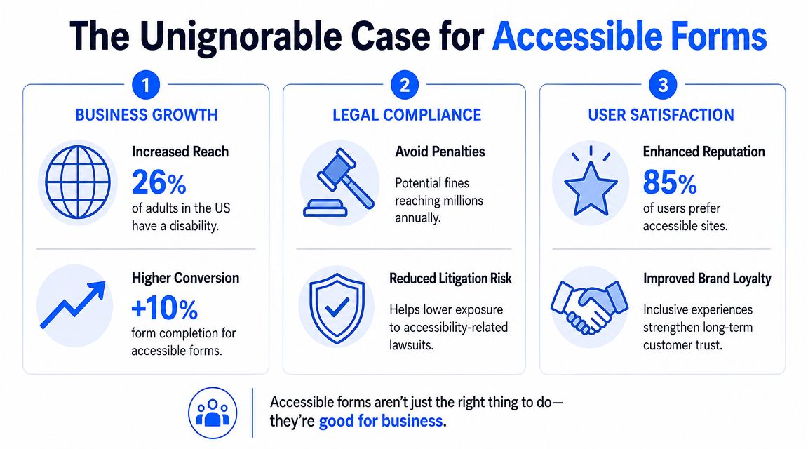
Why the business case is stronger than it looks
Accessible forms improve completion for people using screen readers and keyboards, but the business upside is wider than that. It shows up every time a user is distracted, using one hand, dealing with glare on a phone, or trying to finish quickly between tasks. Marketing teams see this constantly in mobile-first traffic.
The pattern is familiar:
- Lead capture improves when forms explain requirements before submission. Users should not have to guess the password rule, postcode format, or required next step.
- Drop-off falls when dynamic fields behave predictably. If a new question appears after a previous answer, users need clear context and focus that moves to the right place.
- Checkout and sign-up get easier when controls work from the keyboard and by touch. This helps assistive tech users, fast-moving power users, and anyone on a cramped mobile screen.
- Support tickets decrease when errors are specific and attached to the right field. “Something went wrong” creates repeat submissions and frustrated customers.
- Brand trust improves when polished design still lets people finish. A visually refined form that breaks under real-world use feels careless, not premium.
This matters even in a simple contact form template for lead capture. The cost of a small accessibility miss can be a lost enquiry, a duplicate support request, or a prospect who decides your company will be hard to work with.
Teams on WordPress run into this often because the problem is rarely just the form copy. It usually sits in the mix of theme code, plugin output, custom styling, and scripts layered on top. For that stack, mastering ADA compliance for WordPress is a useful resource, especially if your forms depend on third-party components.
Compliance is now an operational issue
The legal side is no longer abstract. The U.S. Department of Justice web accessibility rule says state and local government web content and mobile apps must be accessible. Under that rule, public entities serving 50,000 or more people will need to comply by April 26, 2027. Smaller public entities and special districts will need to comply by April 26, 2028.
Private-sector marketing teams may not be subject to those exact deadlines, but the direction is clear. Accessibility is being treated more like security or privacy. It is part of how digital services are expected to work.
For forms, that expectation is easy to understand. A form is often where someone applies, pays, asks for help, requests a demo, or submits required information. If that interaction fails because the form only works for one kind of user on one kind of device, the exclusion is immediate.
The practical takeaway is simple. Accessible forms reduce friction, protect demand generation work, and lower legal risk at the same time.
Core Principles of an Accessible Form
A common failure looks like this. A paid campaign drives mobile traffic to a polished multi-step form, the fields animate nicely, and completion drops because one question has no real label, the focus disappears after a step change, and the error only shows up in red text. The form looks finished. It does not work reliably.
Good form accessibility starts with structure. That matters even more in mobile-first forms, single-question flows, and lead gen experiences with conditional steps, because users do not have the full page context on screen at once. Each field has to stand on its own, and each transition has to make sense.
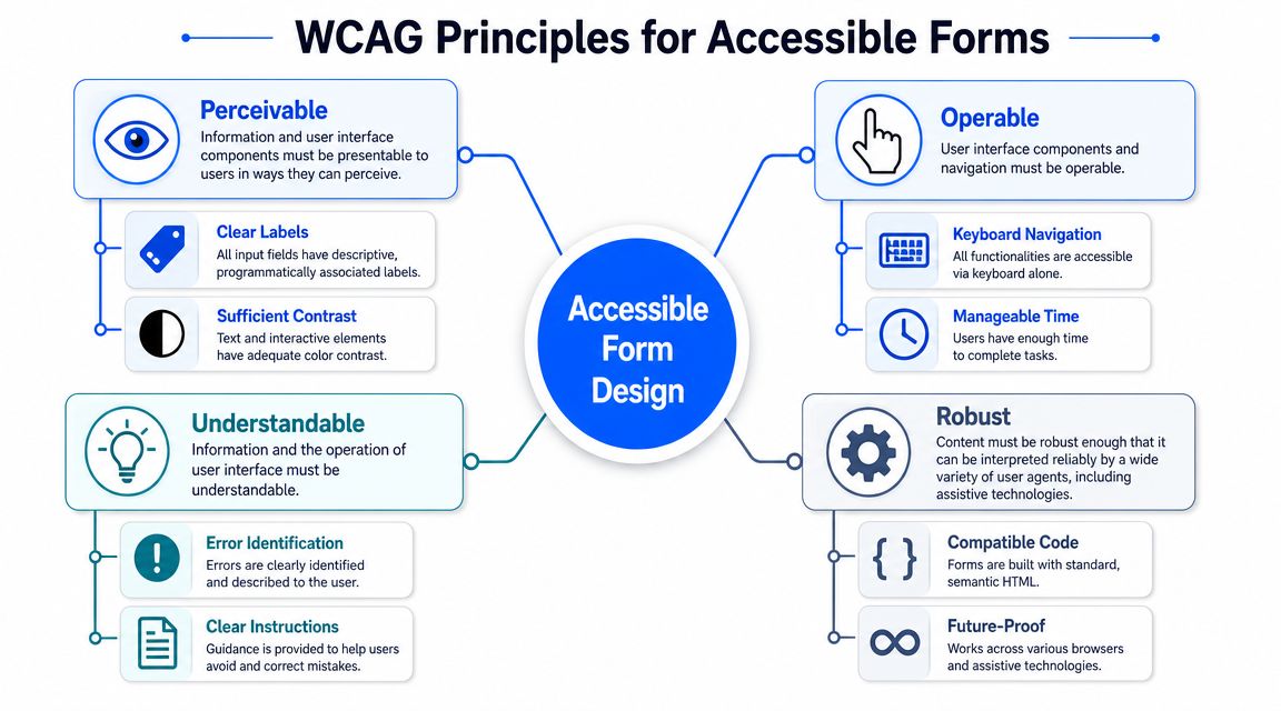
Programmatic labels make fields understandable to assistive tech
Visible text above a field is not enough. The input also needs a programmatic label so screen readers and other assistive tools can identify it correctly.
In practice, that means using native HTML patterns first:
- Connect each label to its input: Use
<label for="email">Email address</label>and match it to the inputid. - Keep one clear label per field: Placeholder text fades, disappears, and often does a poor job as the only instruction.
- Label groups of choices: Radio buttons and related checkboxes need a shared question, not just option text.
This is one of the first things I check in custom design systems. Teams often approve the component based on how it looks in Figma, then discover the rendered HTML is missing the relationship assistive tech needs. A headless form component can help here because it gives the team more control over markup instead of hiding it behind a rigid UI layer.
If you want a simple reference point before adding logic, a basic contact form template for lead capture is useful for reviewing label placement, field order, and helper text.
Semantic HTML carries the meaning
Semantic HTML gives the browser and assistive tech the right cues about what each part of the form does. That reduces guesswork for users and for the code handling the interaction.
The pattern is straightforward. Use a real button for submission. Use a real select when a select is appropriate. Use fieldset and legend for related options so the group question is announced properly. If the only thing tying a set of inputs together is spacing or a border, the form structure is doing too little.
A simple check:
| Need | Better choice | What it solves |
|---|---|---|
| Related radio buttons | fieldset and legend |
Announces the group question clearly |
| Text instruction for a field | Helper text tied to the input | Gives context before entry |
| Required fields | Visible indicator plus text | Avoids relying on color alone |
This matters more on mobile than many teams expect. On a desktop screen, users can scan surrounding content and infer meaning. In a one-question flow on a phone, that extra context is often off-screen.
Keyboard flow has to match the form people see
Keyboard access is not a niche requirement. It is how many users move through forms, and it is also a fast way to catch interaction bugs in dynamic experiences.
Test the path a user takes:
- Start the form: Focus should land in a predictable place.
- Move through fields: Tab order should follow the visual order.
- Use all controls: Checkboxes, radios, dropdowns, and date inputs should work without a mouse.
- Submit and recover: Users should be able to trigger the action, find errors, and continue without losing their place.
Custom components often break here. I see it most in styled selects, modal steps, and conditional fields that appear after a previous answer. The visual design suggests one sequence. The keyboard sequence does something else. That mismatch is frustrating on desktop and much worse on mobile devices paired with assistive technology.
Focus, instructions, and errors need more than color
A branded form can still have a strong focus state. Removing the browser outline without replacing it is a design decision that creates usability debt right away.
Use several cues at once:
- Visible focus styles: A clear outline, border, or shadow that survives theming
- Text-based instructions: Format requirements, examples, and limits shown before submission
- Error text tied to the field: Messages that explain what went wrong and how to fix it
- State shown in words: “Required” and “Optional” should not depend on color alone
Form accessibility usually shifts from theory to conversion work. Clear labels help people start. Clear focus helps them continue. Clear errors help them finish. That applies to a standard contact form, but it matters even more in progressive disclosure flows where each answer controls what appears next.
Handling Advanced Accessibility in Dynamic Forms
Dynamic forms are where accessibility work gets more technical and more important. This is the territory of conditional logic, inline validation, progress steps, popups, and one-question flows. The page changes while the user is on it, so the interface has to explain those changes.
Think of ARIA as stage directions
ARIA helps when the screen changes but the change isn't obvious to assistive technology. The simplest way to explain it to a non-technical team is this: HTML gives you the script, and ARIA adds stage directions.
If an error appears after submission, sighted users may see it instantly. A screen reader user might not. That's why dynamic form guidance recommends linking each error message to its field with aria-describedby and announcing errors with aria-live or role="alert" in accessible form validation best practices.
That pattern does three things well:
- It connects the message to the field: The user hears the error in the right context.
- It announces change when it happens: No page refresh is needed.
- It reduces missed feedback: Users don't have to hunt around to discover what failed.
A good mental model is that ARIA shouldn't replace native form behavior. It should clarify behavior when the interface becomes more dynamic than HTML alone can express.
Error recovery matters more than error display
A lot of forms technically “show errors” and still create a bad experience. The message appears, but the user loses context. The page resets. A hidden step collapses. Previously entered answers disappear. The problem isn't visibility. It's recovery.
The W3C forms tutorials emphasize validation, undo options, progress indication for multi-step flows, instructions that help users correct mistakes, and preserving previously entered data. That's especially important when questions appear or disappear based on earlier answers.
In practice, accessible error handling should answer four questions fast:
| User question | What the form should do |
|---|---|
| What went wrong? | State the error in plain language |
| Where is it? | Move focus to the problem or summary |
| How do I fix it? | Provide specific correction guidance |
| Did I lose my work? | Preserve entered values whenever possible |
If users have to re-enter information after a validation error, the form is punishing them for a design problem.
For complex flows, that means building for the return path, not only the happy path.
Single-question and conditional flows need stricter focus control
Single-question flows can reduce cognitive load because users see one decision at a time. But they also create more opportunities for focus mistakes. When one question disappears and another appears, the next active element has to receive focus deliberately. Otherwise keyboard users may land nowhere useful, or screen reader users may remain in the old context.
The same is true for popups and progressive disclosure. If selecting “Business account” reveals new company fields, those fields need a logical insertion point in both reading order and keyboard order. They can't just appear visually.
If you're prototyping these flows with automation or AI-assisted builders, test whether the generated logic preserves field relationships and focus behavior. A tool like an AI form generator can speed up setup, but dynamic accessibility still needs human review.
A modern form can be interactive without becoming mysterious. The rule is simple: when the interface changes, the user should never have to guess what changed, where they are, or what to do next.
Building Accessible Experiences with VeeForm
Some form builders fight accessibility by default. They prioritize visual customization and interaction flair, then force teams to retrofit keyboard behavior, labels, focus order, and mobile usability afterward. Better tools reduce that cleanup work by making the interaction model simpler in the first place.
Why one-question flows can help
A one-question-at-a-time form can support accessibility when it's built carefully. It reduces clutter, limits the number of decisions on screen, and gives users a clearer sense of what to do next. For long lead-gen or recommendation flows, that's often easier to process than a dense page full of fields.
That doesn't make the pattern automatically accessible. The implementation still matters. The active question needs a clear label. Focus has to move to the next step consistently. Back navigation should work without confusion. Conditional branches shouldn't make users feel like they've fallen into a different form.
A live VeeForm form builder example is useful here because it reflects the kind of interactive, branded, embedded experience marketers deploy, not a stripped-down academic demo.
Mobile form design is where intent gets lost
Mobile is where many “accessible enough” forms stop working. Buttons become too tight. Checkbox rows invite accidental taps. Custom date pickers create focus issues. Error messages end up below the fold, so users don't even know why submission failed.
Recite Me's guidance notes that interactive targets should be at least 44×44 pixels in its discussion of website form accessibility. That recommendation is easy to treat as a design detail, but it changes real outcomes. On a touch device, target size is part of comprehension. If users keep hitting the wrong option, the form isn't functionally clear.
For teams using visual customization heavily, keep these trade-offs in mind:
- Large tap targets beat compact elegance: Especially for checkboxes, radios, and close buttons in popups.
- High contrast branding beats low-contrast subtlety: Placeholder-gray on white might look refined and still be hard to use.
- Simple controls beat clever controls: Native inputs often outperform custom widgets once accessibility is part of the brief.
The strongest form experiences on mobile don't feel “accessible.” They feel effortless.
How to Test and Audit Your Form Accessibility
A form can look polished in a design review and still fail the moment a real user tries to complete it on a phone, with a keyboard, or through a screen reader. That gap shows up often in modern marketing forms because the risky parts are usually dynamic: a field appears after a selection, a popup steals focus, a single-question flow hides context, or validation fires at the wrong time.
Good testing catches those failures before launch. The goal is not a formal audit every time. The goal is a repeatable process your team can run on embedded forms, popups, multi-step flows, and mobile layouts without guessing what “accessible enough” means.
Start with automation, then test the experience
Automated checkers are useful for the first pass. They can catch missing labels, weak contrast, and some markup problems quickly. That saves time and helps teams clean up obvious issues before manual QA starts.
Automation misses the parts that hurt conversion in real-world forms. It cannot tell you whether a conditional question appears with the right context, whether focus moves to the newly revealed field, or whether a shopper understands why a step failed. In dynamic forms, those are often the problems that matter most.
Use automation to create a fix list. Use manual testing to decide whether the form works.
Run a keyboard pass in the real environment
Start with the version people will use. Test the embedded form on the landing page, the popup version, and the mobile viewport. A form can pass in isolation and break once scripts, styling, and conditional logic are live.
Then put the mouse away and complete the form with Tab, Shift+Tab, Enter, and Space.
Check these points:
- Entry: Does focus land in a sensible place when the form opens or when the next step loads?
- Order: Does tabbing follow the visual and logical order of the form?
- Controls: Can you use radios, checkboxes, selects, buttons, and close controls without getting stuck?
- Dynamic changes: When a new field or section appears, can you reach it naturally, and do you understand why it appeared?
- Errors: If validation fails, does the message explain the issue clearly and return you to the right field?
- Completion: After submit, is the confirmation state clear, and does focus move somewhere useful?
Single-question flows, in particular, require extra scrutiny. They often feel clean visually, but they can become disorienting if each new step replaces the previous one without enough context for keyboard and screen reader users.
Use a screen reader as a truth test
A short screen reader pass reveals problems that design reviews miss. It tells you what the form communicates, not what the team intended to communicate.
On Mac, use VoiceOver. On Windows, use NVDA. You do not need expert-level skill to learn a lot from one careful run.
Listen for:
- Clear field names
- Useful instructions read at the right time
- Group context for related options
- Accurate announcements when errors appear
- Clear step changes in conditional or multi-step flows
- Repeated buttons or links with labels that sound identical
ARIA is useful here, but it is not magic. It works like signs added to a building after construction. Good signs help people find the right room, but they do not fix a confusing floor plan. If the form structure is weak, ARIA can clarify parts of it, but it will not rescue a flow that changes state without warning or hides context between steps.
Include a quick human audit
A practical audit does not need to be slow. I usually recommend a short review with three lenses: keyboard, screen reader, and mobile. That combination catches a large share of the issues that block completion.
For high-value flows such as checkout, lead capture, account creation, quote requests, and support intake, test with people who use assistive technology if you can. Compliance checks find code-level issues. Real users show you where the flow becomes confusing, tiring, or easy to abandon.
Your Form Accessibility Checklist
Treat this like a working QA tool, not a recap. Use it before launch, after any major form update, and whenever a campaign team adds conditional logic, a new step, or a mobile-specific layout. That matters most on lead-gen and e-commerce forms, where one small accessibility miss can break an otherwise high-performing flow.
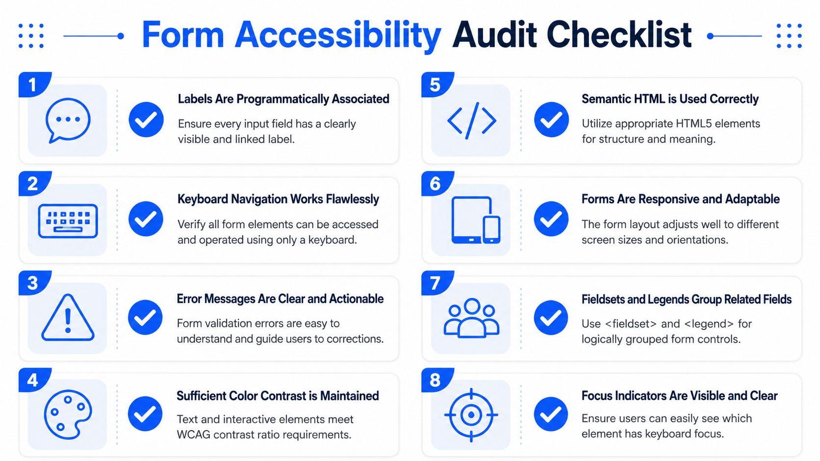
A simple way to use it is to assign each item to a point in the workflow. Designers should catch labeling and instruction issues in review. Developers should verify structure, focus, and announcements during build. QA should test the finished flow on an actual phone, not just a resized browser window. Dynamic forms fail in the transitions, so the checklist should follow the full journey, not only the first screen.
Foundations
- Does every input have a visible label that is also programmatically associated?
- Are related options grouped with semantic structure, such as fieldsets and legends?
- Are instructions placed before the user needs them, not buried after an error?
- Is required status communicated in text, not only by color or an asterisk with no explanation?
Interaction and feedback
- Can the entire form be completed using only a keyboard?
- Is the focus indicator obvious on every interactive element?
- Do validation messages explain the problem in plain language?
- Are error messages tied to the correct field and announced when they appear?
- Does the form preserve entered data when users need to correct mistakes?
Dynamic and mobile-first behavior
- When content appears or disappears, does focus move logically to the next useful element?
- Do multi-step flows show progress and preserve context?
- Are popup forms, slide-ins, and embedded forms all tested separately?
- Are tap targets large enough to use comfortably on a phone?
- Do custom-styled controls behave as well as native controls, or should they be simplified?
One practical rule helps teams use this checklist well. If a form uses single-question screens, progressive disclosure, or conditional branching, test each state change like it is its own screen. That is where accessible forms often slip. The first field may be fine, but the second step may drop context, lose focus, or hide the reason a new question appeared.
If your team wants to build interactive, mobile-first forms without sacrificing usability, VeeForm is worth exploring. It's built for the kinds of lead-gen, quiz, survey, and product recommendation flows marketers commonly launch, and it gives you a practical way to create polished forms while keeping accessibility in view from the start.