You've got traffic. People browse collection pages, open product pages, maybe even add to cart. But too many visitors stall because they're not sure what fits them, what flavor to choose, which routine they need, or which product is worth the price.
That's where a pop up quiz earns its keep.
Used well, it does two jobs at once. It helps shoppers make a decision, and it gives your team cleaner zero-party data than a generic email popup ever will. Used badly, it becomes one more interruptive layer that collects weak emails and vague answers your automation stack can't use. The difference usually comes down to strategy, question design, trigger timing, and what happens after the quiz is completed.
Table of Contents
- Why a Pop Up Quiz Is Your Secret Conversion Weapon
- Map Your Quiz Strategy for High-Quality Leads
- Design Questions That Boost Engagement and Segment Users
- Build a Dynamic Quiz with Conditional Logic
- Deploy Your Quiz with Smart Triggers and Timing
- Analyze Quiz Performance and Integrate Your Data
Why a Pop Up Quiz Is Your Secret Conversion Weapon
A standard popup asks for an email before it's earned. A pop up quiz changes the exchange. Instead of saying “subscribe,” it says “let me help you choose.”
That shift matters. In lead-generation benchmarks, interactive quizzes were reported as 7x more effective than pop-up forms in one experiment, and Interact's 2026 report found an overall quiz-start-to-lead conversion rate of 40.1% according to Riddle Lab's pop-up vs quiz benchmark. For a Shopify store owner, that's the difference between collecting a list of random addresses and building a segmented audience you can market to.
Most stores don't have a traffic problem. They have a decision-friction problem. A shopper lands on a skincare site and sees cleansers, serums, bundles, refills, routines, and ingredient claims. They don't need more products. They need guidance.
Practical rule: If your catalog requires explanation, your pop up quiz should act like a digital sales associate, not a lead gate.
This is also why quizzes fit naturally into broader powerful marketing automation strategies. The quiz becomes the front-end input layer. Your email platform, CRM, and onsite personalization become the follow-up engine. One collects intent. The others turn it into revenue.
A strong quiz also fixes a common email capture mistake. It gives people a reason to answer before asking them to identify themselves. That sequence feels lighter, especially when the experience is built one question at a time. If you want examples of how quiz-style interactions fit into online retail journeys, this ecommerce quiz and form approach is a useful reference point.
Where quizzes beat generic popups
- They solve a real shopper task. “Find my shade,” “Choose my dog food plan,” and “Build my routine” are clearer than “Join our newsletter.”
- They create segment-ready data. Product type, goal, concern, budget range, and purchase intent are more useful than an email alone.
- They reduce blank-page thinking. Many visitors don't know where to start. A quiz narrows the catalog fast.
The stores that win with quizzes don't treat them as decoration. They treat them as a qualification system.
Map Your Quiz Strategy for High-Quality Leads
The biggest mistake I see is building the quiz in the app before deciding what data the business needs. That's backward. Start with the destination, not the interface.
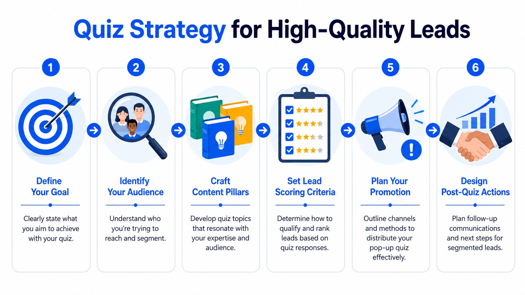
A quiz can have two valid jobs, but you need to choose the primary one.
Pick one primary goal
If the main job is lead capture for segmentation, the quiz should gather details that improve follow-up. Think persona, problem, purchase context, or urgency. The result page matters, but the primary value is what you can trigger afterward in Klaviyo, Mailchimp, HubSpot, or your ad audiences.
If the main job is product recommendation, the flow should reduce choice overload and guide the shopper to a short list, bundle, or single SKU. Lead capture can still happen, but the recommendation logic has to come first or the experience feels self-serving.
Those are different quizzes. One asks, “How should we market to this person?” The other asks, “What should we show this person right now?”
A quiz that finishes with a generic result like “You're a wellness lover” may feel polished and still be useless to your marketing stack.
Reverse-engineer the data you need
The most important idea here is simple. Completion rate isn't enough. The core value of interactive experiences depends on reducing friction while preserving data quality, and many Shopify teams miss that because a quiz can feel engaging while still collecting shallow answers that don't improve routing, personalization, or downstream conversion, as noted in this discussion of friction and data quality in interactive experiences.
That means every question should map to an action.
A useful planning worksheet usually includes:
- Desired outcome: Recommend a product, assign a tag, trigger a flow, route to sales, or collect consent.
- Key segmentation fields: Skin type, scent family, dog size, dietary preference, fit issue, gift intent, price sensitivity.
- Automation use: Welcome flow branch, abandoned browse follow-up, dynamic content block, SMS prompt, retargeting audience.
- Disqualifiers: Answers that signal low fit, low intent, or a need for education before promotion.
Build around segmentation buckets
Most stores don't need endless branching at the planning stage. They need clean buckets that the team can use.
For a perfume store, a practical first version might sort shoppers by:
- Occasion
- Scent preference
- Strength tolerance
- Gift vs self-purchase
For dog food:
- Dog age
- Dog size
- Dietary concern
- Primary owner goal
For fashion:
- Fit challenge
- Style preference
- Use case
- Budget comfort
Each answer should sharpen the next decision. If a response doesn't affect product output, lead score, or messaging, cut it.
Sketch the post-quiz lifecycle before launch
A good quiz doesn't end at the results page. It starts there.
Write down what should happen after each outcome:
- Tag the contact with meaningful attributes.
- Send the right email sequence.
- Personalize the first offer.
- Pass the data into your CRM or customer profile.
- Use outcome groups for campaigns and retargeting.
This step is what separates a novelty quiz from a working growth asset. A high-completion quiz with weak downstream actions won't move much. A tightly scoped quiz with strong segmentation can support product education, merchandising, retention, and paid media audiences all at once.
Design Questions That Boost Engagement and Segment Users
Digital quizzes feel normal to users now because short-form assessment has become common across both education and commerce. During the COVID-19 disruption, school closures affected more than 1.6 billion learners worldwide, which accelerated remote learning and helped normalize short digital assessments across devices, according to this note on global adoption of short-form digital assessments.
That familiarity helps, but it doesn't excuse bad question writing. A shopper will still drop if your quiz feels repetitive, invasive, or obviously built for your benefit instead of theirs.

Write like a consultant, not a survey designer
The fastest way to kill engagement is to sound clinical.
Compare these two skincare questions:
- “What is your primary skin concern?”
- “What's the main thing you want to improve right now?”
Both can collect similar information. The second feels more human. It sounds like an advisor trying to help, not a form trying to classify.
For commerce, good quiz questions usually follow three rules:
- Start easy: Use low-friction questions first, such as preference, goal, or occasion.
- Move into specifics: Ask for the data that sharpens recommendations.
- Delay sensitive asks: Email, phone, and budget questions work better once the shopper feels progress.
Match the question type to the job
Not every answer needs a radio button. The format changes how the question feels.
| Question Type | Best For | Example |
|---|---|---|
| Multiple choice | Fast segmentation | “Which scent family do you usually prefer?” |
| Image choice | Visual preference | “Pick the look closest to your style” |
| Rating | Intensity or priority | “How important is long wear?” |
| Dropdown | Long option lists | “What size does your dog fall into?” |
| Short text | Personal context | “What's the one issue you always run into with jeans?” |
If you want a faster way to prototype formats before building the full flow, an AI form generator for quiz drafting can help structure question variants and answer sets.
Examples that actually segment
A lot of product quizzes ask broad questions that sound interesting but don't improve the recommendation. “What's your vibe?” can be fun. It's weak as a decision input unless your merchandising logic maps to it.
Here's what stronger segmentation looks like:
Perfume
- “When do you wear fragrance most often?”
- “Do you prefer something soft, noticeable, or statement-making?”
- “Are you shopping for yourself or as a gift?”
Dog food
- “How old is your dog?”
- “Any stomach or ingredient sensitivities?”
- “What matters most right now: digestion, energy, coat, or weight?”
Apparel
- “What fit problem do you deal with most?”
- “Where will you wear this most often?”
- “Do you want a safe staple or something more trend-led?”
Good questions pull double duty. They help the shopper feel understood, and they give your team a usable segmentation field.
Keep the flow moving
Shoppers shouldn't feel the quiz getting heavier as they move through it. The design should make progress obvious.
A few practical habits help:
- Use one question at a time. It keeps cognitive load low.
- Keep answer options distinct. Overlapping choices create hesitation.
- Show only necessary copy. Long intros hurt momentum.
- Use images where visuals matter. Fashion, home, and beauty often benefit from visual answer sets.
A product quiz isn't a personality test. It's a guided buying decision. Every screen should make that next decision easier.
Build a Dynamic Quiz with Conditional Logic
Conditional logic is what turns a basic pop up quiz into a useful recommendation tool. Without it, everyone gets the same path. With it, the quiz adapts based on what the shopper tells you.
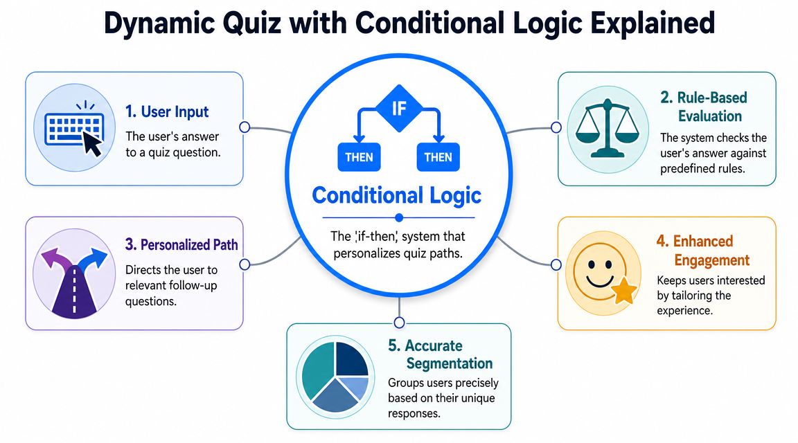
In practice, it's just an if-then system. If the user answers one way, show the next relevant question. If not, skip ahead. That keeps the flow shorter and makes the result feel earned.
A simple logic map for a coffee store
Take a Shopify coffee brand selling beans, subscriptions, and brewing gear. A flat quiz might ask every shopper everything. That creates waste.
A logic-driven version is cleaner:
- Start with “How do you usually brew coffee?”
- If the answer is espresso, ask about roast preference and machine confidence.
- If the answer is French press, ask about body and flavor profile.
- If the answer is gift, skip brewing details and ask about recipient experience level.
- End with a recommendation tied to brew method and taste preference.
That's not advanced software architecture. It's just respecting relevance.
What conditional logic should do
A useful logic setup usually handles three things well:
- Skip irrelevant questions: Don't ask oily-skin follow-ups after someone says their skin is dry.
- Refine outcomes: One answer should narrow products, bundles, or educational content.
- Assign tags in the background: The shopper sees a helpful quiz. Your systems receive structured intent data.
Here's the business payoff. Shorter paths often feel easier, and the data comes in cleaner because users aren't forced through screens that don't apply to them.
Field note: The best logic is usually invisible. If a shopper notices the logic, it often means the flow still feels too mechanical.
Build the logic before you touch the design
Initial efforts often focus on colors, progress bars, and illustrations. Logic deserves the first pass.
A clean workflow looks like this:
- List your end states: Which recommendation categories or lead tags can a user reach?
- Define the decisive answers: Which responses change the path?
- Map branch points: Where should the quiz split, and where should it rejoin?
- Write fallback paths: Decide what happens if a user gives broad or low-signal answers.
This is also the point where tool choice matters. Some teams use dedicated product quiz builders like Octane AI. Others use form-style builders with branching. A tool such as VeeForm can handle conditional logic, one-question-at-a-time flows, and different ending types, which is useful when the same quiz needs to both recommend products and pre-qualify leads.
A quick walkthrough helps if you want to see branching in action:
Keep outcomes operational
Result pages should do more than display a personality label. They should support action.
For each possible ending, decide:
- Which products appear first
- Whether to show one best match or a small set
- Which tag gets pushed into your email platform
- Whether the user enters an educational flow or a promotional flow
When logic, offers, and automation all line up, the quiz stops being a lead magnet and starts behaving like a conversion system.
Deploy Your Quiz with Smart Triggers and Timing
A well-built quiz can still fail if it appears at the wrong moment. Trigger logic decides whether the experience feels helpful or annoying.
That's especially true on mobile. A key unanswered question in e-commerce isn't whether pop-up quizzes work, but which trigger logic, including exit-intent, scroll depth, or time delay, minimizes annoyance on mobile where users increasingly abandon intrusive overlays shown too early, as discussed in this piece on quiz trigger logic and mobile interruption risk.
Match the trigger to the page intent
The trigger should fit the shopper's context.
Homepage traffic often responds better to a time delay or a clear on-page call to action. Visitors are still orienting themselves. Interrupting instantly usually feels premature.
Collection pages are a strong fit for scroll-depth triggers. If someone has already looked through several rows of products, they've shown enough intent to justify help.
Product pages often work best with on-click access. A button like “Find my best match” or “Need help choosing?” gives the shopper control and protects the product page from feeling hijacked.
What each trigger is good at
- Exit-intent: Useful when you want one last attempt to rescue abandoning visitors. Best on desktop, where cursor behavior gives you a clearer signal.
- Scroll depth: Good for collection pages and long-form landing pages. It waits until the visitor has demonstrated interest.
- Time delay: Works when the value proposition needs a little time to land first.
- On-click trigger: Strongest for high-consideration products where shopper control matters.
If you want more examples of popup placement ideas across store journeys, this guide on how to grow your e-commerce business with popups is a practical complement.
Don't deploy the same trigger sitewide just because the app makes it easy. Product pages, blog posts, collection pages, and campaign landing pages have different interruption tolerances.
Mobile needs a separate plan
Mobile quiz deployment is where many stores lose trust.
A few working rules:
- Use smaller entry points first. A teaser tab or button often performs better than a full-screen interruption.
- Avoid instant overlays. Let the visitor engage with the page before asking for attention.
- Protect key browsing actions. Don't cover variant selectors, add-to-cart areas, or sticky navigation.
- Simplify the opening screen. Mobile users need clarity fast.
Desktop and mobile should not share identical timing by default. The same trigger that feels reasonable on a laptop can feel aggressive on a phone.
Test the trigger, not just the quiz copy
A lot of teams A/B test headlines and ignore deployment. That misses a major lever.
Test combinations like:
- Scroll depth on collection pages vs on-click quiz launch
- Exit-intent on desktop vs no popup on mobile
- Time delay on homepage vs embedded callout block
- Trigger after second pageview vs first session page
The right launch condition often determines whether the quiz feels like assistance or friction. Timing is not a cosmetic setting. It changes user intent, data quality, and brand perception.
Analyze Quiz Performance and Integrate Your Data
Once the quiz is live, don't judge it by vibes. Treat it like a measurable user flow.
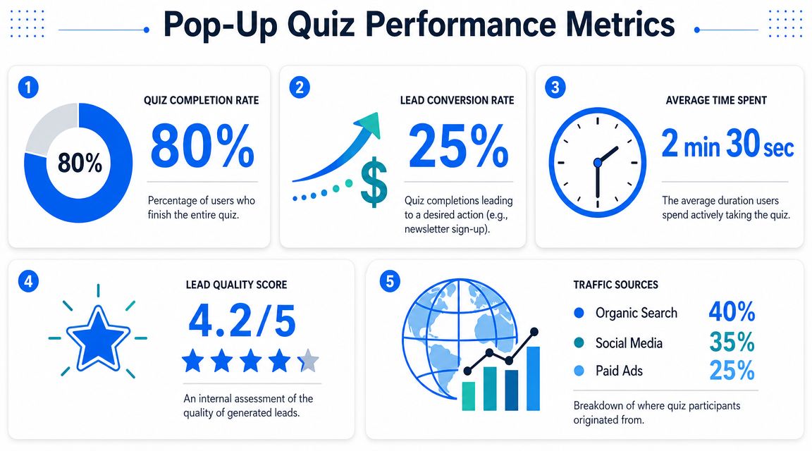
A rigorous way to evaluate a pop-up quiz is to track success as the percentage of users who complete the flow. Nielsen Norman Group notes that success rate is a standard usability benchmark and should be reported with confidence intervals when sampled across users, as explained in its article on success rate as a usability metric.
That matters because raw counts can mislead. A quiz with many starts but poor completion may have weak opening copy, confusing questions, or bad trigger timing. A quiz with fewer starts but stronger completion and better downstream segmentation may be far more valuable.
The metrics that actually matter
A practical quiz dashboard should answer five questions:
| Metric | What it tells you | What to inspect if it drops |
|---|---|---|
| Start rate | Whether the trigger and first screen are compelling | Trigger placement, headline, offer framing |
| Completion rate | Whether users can finish the flow | Question count, wording, branch complexity |
| Lead capture rate | Whether the opt-in ask is earning the email | Timing of form gate, incentive, result promise |
| Outcome distribution | Which segments dominate | Merchandising mix, question bias, missing paths |
| Assisted revenue signal | Whether recommendations influence sales | Result-page relevance, follow-up automation, attribution setup |
The key is to connect each metric to a decision. Don't just admire a dashboard.
Audit for data quality, not only volume
Many programs plateau. They celebrate a lot of completed quizzes and ignore whether the answers are useful.
Look at the response set closely:
- Are most users selecting the first answer option?
- Are “other” choices swallowing too much intent?
- Are important outcomes underrepresented because the questions steer users elsewhere?
- Are sales teams or retention teams using the tags created by the quiz?
If the quiz can't change an email flow, an ad audience, or a product recommendation block, the data isn't finished yet. It's just collected.
Connect the quiz to your marketing stack
The payoff comes when response data moves into the rest of your systems.
For most Shopify brands, that means pushing quiz fields into:
- Email platforms such as Klaviyo or Mailchimp for segmented welcome and browse flows
- CRMs for contact enrichment and lead qualification
- Customer profiles for future personalization onsite
- Ad platforms through synced audience logic where your setup allows it
A simple example looks like this:
- User completes dog food quiz.
- Quiz passes age, size, and dietary concern into the contact record.
- Email flow sends the right feeding guide and product picks.
- Result page shows matching products immediately.
- Future campaigns use those same fields for more relevant messaging.
If you need a structured way to capture and standardize quiz outputs before passing them into the rest of your stack, a data collection form template is a useful model for how fields and mappings should be organized.
Review the full lifecycle monthly
Quiz optimization shouldn't stop at front-end edits. Review the entire system:
- Entry trigger
- Completion friction
- Opt-in placement
- Recommendation relevance
- Tag structure
- Email branch performance
- Customer support feedback
- Revenue by outcome group
That's how a pop up quiz becomes more than a conversion trick. It becomes a repeatable source of segmented intent data your team can use across acquisition, merchandising, retention, and customer experience.
If you want to build a pop up quiz without custom code, VeeForm is one option for creating one-question-at-a-time quizzes, product recommendation flows, and popup forms that can be embedded on Shopify and connected to your broader marketing workflow.
