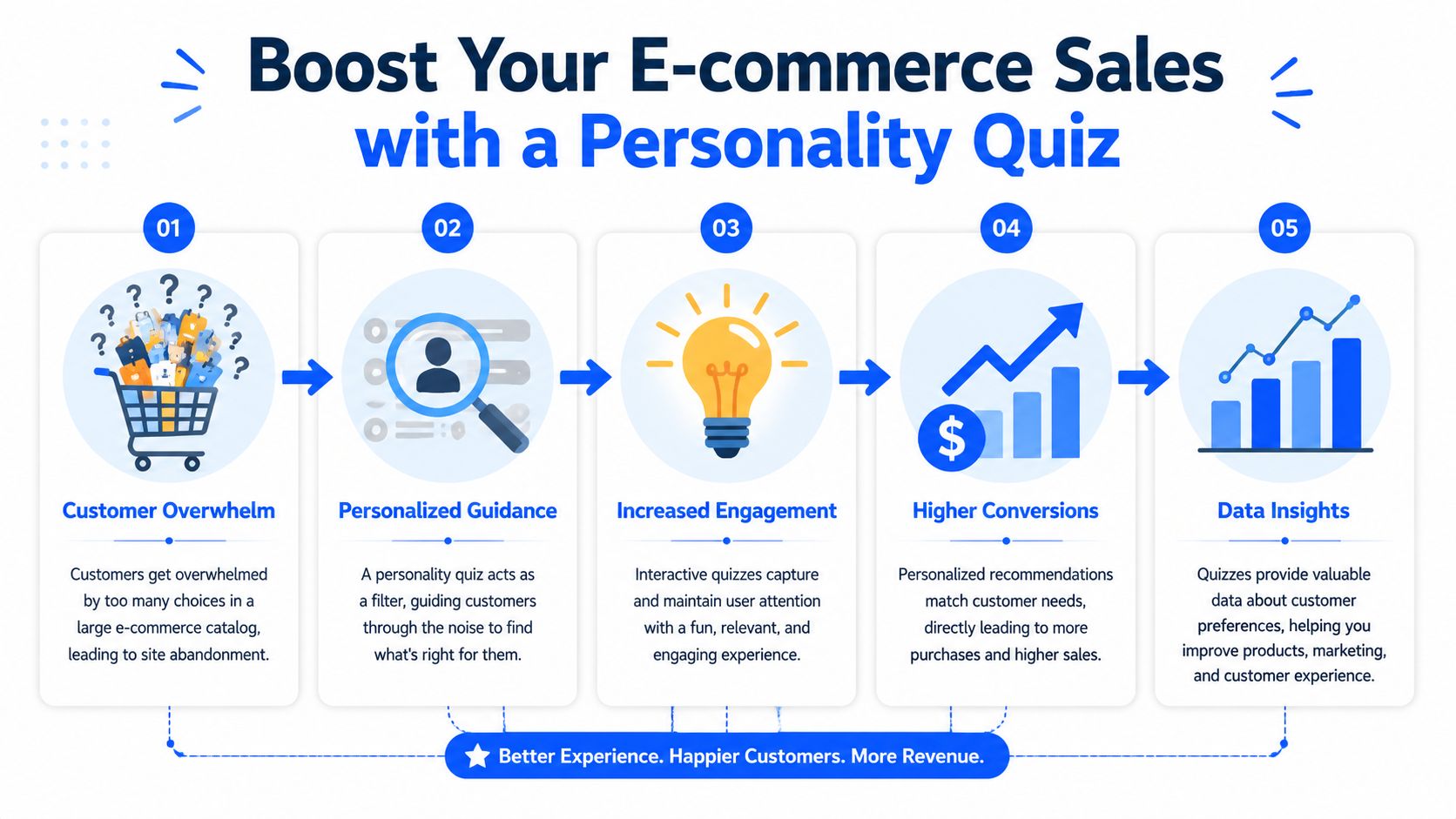
If you run a Shopify store with more than a handful of products, you've seen the pattern. A shopper lands on a collection page, clicks around for a minute, opens two or three product tabs, then disappears because they're not sure what fits them.
That's the primary use case for a personality quiz. Not entertainment. Not “engagement” for its own sake. A quiz gives uncertain buyers a guided path to the right product, and it gives your team cleaner customer data than a generic popup ever will. When people answer a few well-written questions, they tell you what they want, how they shop, and what kind of recommendation they'll trust.
Table of Contents
- Why Your E-commerce Store Needs a Quiz
- Planning Your Quiz for Maximum Impact
- Writing Questions That Engage and Qualify
- Designing Smart Scoring and Logic
- Creating Endings That Drive Conversions
- Deployment Analytics and Optimization
Why Your E-commerce Store Needs a Quiz
A large catalog doesn't automatically create more sales. It often creates more hesitation. The shopper who might have bought from you today gets stuck comparing variants, ingredients, styles, or bundles, then leaves because making the wrong choice feels expensive.
A personality quiz fixes that by replacing browsing with guided selection. Instead of asking a visitor to understand your product architecture, you ask a few simple questions and translate their answers into a recommendation they can act on.
Choice paralysis is a conversion problem
On Shopify stores, this shows up in familiar categories. Perfume shoppers don't know where to start with notes and wear occasions. Apparel shoppers don't know which fit matches their style. Dog food shoppers don't know whether to prioritize breed, age, sensitivities, or activity level.
That's why quiz strategy has shifted. Recent how-to guidance on quiz building highlights lead qualification and e-commerce recommendations as the important direction, with its value primarily coming from quiz logic that segments shoppers by intent and product fit, rather than treating the quiz as a light engagement feature in isolation, as described in Jotform's guide to making a personality quiz.
The stores that get the most from quizzes don't treat them like side content. They use them the same way they use high-impact e-commerce strategies. As a conversion system tied to merchandising, lead capture, and post-purchase retention.
A quiz qualifies leads before your email flow does
An email popup tells you almost nothing beyond the fact that someone wanted a discount. A quiz can tell you whether a shopper is buying for themselves or as a gift, whether they want a simple staple or something exploratory, and whether they need budget-friendly options or premium guidance.
That changes what happens after the opt-in.
Practical rule: If your store sells products that need interpretation, a quiz should sit closer to the top of your funnel than a generic lead form.
On a Shopify storefront, that means placing the quiz where buyers feel uncertainty. Category pages, collection landing pages, PDP support sections, and recommendation banners all work better than hiding it in the footer. If you want examples of how stores use guided experiences as part of their sales flow, browse e-commerce quiz and form use cases.
A good quiz doesn't just increase interaction. It narrows the decision, frames the recommendation, and gives your retention team cleaner segments to work with later.
Planning Your Quiz for Maximum Impact
Most low-performing quizzes fail before the first question is written. The problem isn't software. The problem is fuzzy strategy.
If you don't know what the quiz is supposed to do, the result is usually a cute experience that generates vague answers and weak recommendations.
Start with one business goal
Pick one primary objective first. You can support secondary outcomes later, but your quiz needs one job.
A few common examples on Shopify:
- Lead capture: The quiz collects email addresses and tags subscribers by product interest.
- Product recommendation: The main goal is helping shoppers find the right SKU, bundle, or collection.
- Lead qualification: The quiz separates casual browsers from people with a clear problem to solve.
- List segmentation: The quiz feeds your email platform with meaningful attributes for customized campaigns.
When teams try to do all of that equally, the questions become messy. A skincare brand shouldn't ask half the quiz about product preferences and the other half about lifestyle trivia unless both affect the recommendation logic.
Define outcomes before you write questions
The strongest process starts with the constructs you want to measure, then builds an item bank, then tests the draft with the intended audience to see whether the questions separate respondents into useful groups. Truity's assessment-development overview lays out that sequence in its article on how personality tests are made.
That matters in e-commerce because your “personality types” usually aren't psychological identities. They're buying archetypes tied to product fit.
For a skincare brand, that might look like this:
| Outcome | What it means in the store |
|---|---|
| Barrier Repair Focused | Needs gentle basics and low-irritation recommendations |
| Breakout Control Focused | Wants clarifying products and a routine with simpler decision paths |
| Glow Seeking | Responds to brightening language and visible-results messaging |
| Minimal Routine Buyer | Prefers fewer products, lower complexity, and bundles |
These outcomes should be distinct enough that a shopper sees their result and thinks, “Yes, that sounds like me, and these products make sense.”
Use a skincare example to keep the logic grounded
Once the outcomes are clear, build a rough question bank around signals that are key to recommendations:
- Skin behavior: How does their skin usually feel by midday?
- Sensitivity: How often do new products cause irritation?
- Routine preference: Do they want a detailed regimen or a simple one?
- Primary goal: Calmness, clarity, glow, or maintenance?
Notice what's missing. Fluff. Questions that feel fun but don't move the recommendation forward.
Draft twice as many potential questions as you need, then cut the ones that don't help sort people into clearer buying groups.
That's usually the difference between a quiz that feels sharp and one that feels random. If you're learning how to make a personality quiz for commerce, planning the outcomes is the part that protects every later step.
Writing Questions That Engage and Qualify
A shopper lands on your Shopify store, starts the quiz, answers two vague questions, and bails. You pay for the click, but you get no email, no recommendation, and no sale. That usually comes back to question quality.
Strong quiz questions do two jobs at once. They keep the shopper moving, and they collect buying signals you can use for product recommendations, email segmentation, and follow-up flows.

Keep the quiz short enough to finish
Short quizzes convert better because the value is clear. The shopper sees a fast path to a useful recommendation. Long quizzes feel like work unless the brand has already earned a lot of trust.
A good target for most e-commerce stores is a compact sequence of questions that can be answered in under two minutes. That is usually enough to sort shoppers into meaningful product paths without creating drop-off halfway through.
The first few questions matter most. Start with easy, low-friction prompts a shopper can answer from instinct. Save the more specific qualifying question for the middle, once they are already committed.
On Shopify stores, I usually write the question order like this:
- Start with a problem they already feel
- Follow with a preference or habit
- Add one qualifier that sharpens product fit
- End with a practical buying constraint, such as routine length, flavor preference, or budget comfort
That order works because it feels like shopping help, not a form.
Write answer choices that segment buyers cleanly
The biggest mistake is writing answers that all sound equally true. If two options overlap, your scoring gets muddy and the result page feels generic.
Each answer should point toward a different recommendation angle. For a perfume quiz, that means separating taste in a way that maps to inventory and merchandising.
Question: What kind of scent do you usually reach for?
- Soft and clean
- Warm and comforting
- Rich and noticeable
- Fresh and outdoorsy
That question qualifies well because each answer suggests a distinct scent family and a different collection page or bundle. It also avoids the trap of sounding like there is one correct answer.
If you want help building a first draft faster, an AI form generator for product recommendation quizzes can give you a starting structure. The useful part is speed. The trade-off is generic wording, so revise every question until it matches your catalog, price point, and brand voice.
Ask for inputs a merchandiser can actually use
Good quiz questions reduce decision fatigue for the shopper and improve downstream conversion for the store. That means every question needs a job.
For a skincare brand, useful questions often cover:
- current skin concern
- sensitivity level
- routine complexity preference
- texture or formula preference
- desired result timeline
For a dog food brand, useful questions often cover:
- age or life stage
- digestion sensitivity
- activity level
- feeding priority
- format preference, such as dry, wet, or mixed
Those inputs are commercially useful because they support product selection, bundle logic, upsells, and segmented email flows. A result like “Glow Seeking” becomes much more profitable when you also know the shopper wants a simple routine and avoids fragranced formulas.
Bad vs good question design
Weak questions collect agreement. Strong questions collect intent.
Bad: “Do you care about your dog's nutrition?”
Nearly every qualified buyer will say yes, so the answer tells you nothing.
A better version:
Good: “Which feeding goal matters most right now?”
- Easier digestion
- Weight support
- More energy for active days
- Simple everyday nutrition
Now the shopper is sorting themselves into a recommendation path you can sell from.
The same fix works across categories. In apparel, skip “Do you want clothes that fit well?” Ask which fit problem happens most often. In supplements, skip “Are you interested in wellness?” Ask what routine they can realistically maintain.
Sample e-commerce quiz question templates
| Niche | Question Template |
|---|---|
| Skincare | Which result matters most to you right now? |
| Perfume | What kind of impression do you want your scent to leave? |
| Apparel | Which outfit problem are you trying to solve most often? |
| Dog food | What's your top priority when choosing food for your dog? |
| Coffee | When do you most rely on coffee during the day? |
| Supplements | What routine feels realistic for you to stick with? |
A few writing rules improve performance fast:
- Use shopper language. Ask about goals, habits, and frustrations, not internal product terminology.
- Avoid answer overlap. If two choices feel similar, the result will feel less trustworthy.
- Keep the emotional tone aligned with the brand. Premium skincare, playful pet brands, and technical supplement stores should not sound interchangeable.
- Cut any question that does not change the recommendation. If the answer does not affect product matching, email segmentation, or lead qualification, remove it.
One quick test catches a lot of weak copy. Read the quiz straight through out loud. If it sounds like customer research, rewrite it. If it sounds like guided shopping, you are close.
Designing Smart Scoring and Logic
Scoring is the engine. If the question copy is strong but the logic is sloppy, the results will feel random, and random recommendations don't convert.
The simplest structure is also the most reliable.
Use one variable per outcome
A common implementation pattern is to use one variable per outcome, assign points to those variables on each answer, and route respondents to the result page whose variable is highest. Published build guides also warn that quizzes often need a separate email-capture page and separate result pages, and that page-order mistakes can break scoring if logic is inserted in the wrong place, as explained in Tally's walkthrough on creating a personality quiz with scoring logic.
That means your setup might look like this:
- SensitiveSkin
- BreakoutControl
- GlowSeeking
- MinimalRoutine
Each answer adds points to one or more of those variables. At the end, the highest score determines the result.
A simple dog food quiz scoring model
Say your dog food store has four recommendation paths:
| Outcome variable | Recommendation angle |
|---|---|
| Sensitive Digestion | Gentle recipes and simplified ingredients |
| Active Performance | Higher-energy formulas |
| Weight Support | Portion-conscious and satiety-oriented options |
| Everyday Essential | Straightforward daily nutrition |
Now map answers to outcomes.
Question: What best describes your dog's routine?
- Mostly lounging and short walks
- Constant movement and lots of play
- Prone to stomach issues
- Fairly steady and easy to feed
Possible scoring:
- Lounging adds points to Weight Support
- Constant movement adds points to Active Performance
- Stomach issues adds points to Sensitive Digestion
- Steady routine adds points to Everyday Essential
Not every answer needs to add the same weight. Some answers are stronger signals than others. If a buyer tells you their dog is prone to digestive issues, that answer may deserve more influence than a softer preference-based question.
Your logic should mirror decision importance. Don't give a light style preference the same scoring weight as a major product-fit constraint.
A visual walkthrough helps if you're building this for the first time:
Where conditional logic helps and where it hurts
Conditional logic is useful when a previous answer changes what you should ask next. In a clothing quiz, if someone says they're shopping for workwear, the next question can focus on fit or dress code. If they say they're shopping for weekends, the next question can shift toward comfort and silhouette.
Use it sparingly.
Too much branching makes maintenance harder, especially when your Shopify catalog changes. It also creates reporting headaches because fewer people see the same sequence of questions.
Good uses of conditional logic:
- Gift vs self-purchase: Different recommendation paths
- Beginner vs expert buyer: Different wording and educational depth
- Hard exclusions: Allergies, sensitivities, sizing constraints, or budget fit
Bad uses:
- Novelty branches: They feel clever but don't improve recommendation quality
- Micro-personalization too early: It complicates setup without improving the result
- Frequent page insertions: Often lead builders to accidentally break scoring logic
If you're learning how to make a personality quiz that sells, keep the logic boring and dependable. Shoppers don't care how complex the backend is. They care whether the result feels right.
Creating Endings That Drive Conversions
Most quizzes waste the highest-intent moment in the entire flow. The user has finished, they're curious, and they're ready to act. Then the result page gives them a cute label, two sentences of description, and no strong next step.
That's a missed sale.
Your results page is the sales page
The result should do more than name a type. It should explain the recommendation and remove friction from buying it.
If a skincare shopper lands on “Barrier Repair Focused,” don't stop at describing what that means. Show the cleanser, serum, and moisturizer that match that profile. If a fashion shopper gets “Polished Minimalist,” take them to a curated collection with the fit, colors, and staples that match that result.
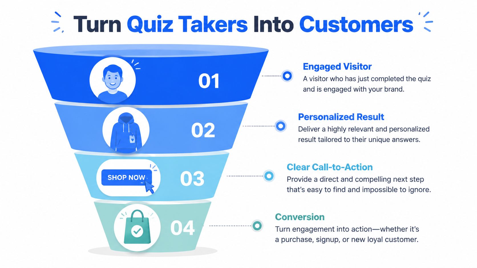
A quiz ending should answer the buyer's next question before they ask it: “What should I buy now?”
What a high-converting ending includes
A strong result page usually has these elements:
- Clear type label: Give the outcome a name that feels specific, not gimmicky.
- Short explanation: Describe the shopper's preferences or needs in plain language.
- Product picks: Recommend exact products, not broad categories.
- Reason for the match: Explain why these items fit the answers they gave.
- Single next action: “Shop your routine,” “See your bundle,” or “Browse your matches” works better than several competing buttons.
If you want to place lead capture before the full result, use an opt-in screen that offers additional value instead of blocking access without context. A dedicated lead capture form template can help structure that step cleanly.
Turn outcomes into segmented follow-up
The result page is only half the payoff. The rest comes after the email capture.
A good quiz turns one generic subscriber list into useful groups:
- By intent: Problem-solving shopper, explorer, gift buyer
- By product category: Fragrance family, skin concern, apparel fit
- By complexity preference: Wants a bundle, wants one hero product, wants education first
Those segments make email and SMS follow-up much sharper. The “Glow Seeking” skincare result should not get the same first message as the “Minimal Routine Buyer.” Their objections, preferred offers, and ideal product set are different.
A result page should feel like a handoff into the next stage of the funnel, not the end of an interaction.
Deployment Analytics and Optimization
A quiz can look healthy on launch day and still underperform as a sales tool. I see this often on Shopify stores. The completion rate looks fine, but the result page sends weak traffic to products, or the email capture brings in contacts that never buy. Deployment is where a quiz becomes part of the funnel instead of a nice interactive feature.
Choose the right placement on Shopify
Placement changes the quality of quiz traffic. A homepage quiz usually gets colder visitors who still need context. A quiz on a collection page reaches shoppers who already know the category and want help choosing. A dedicated landing page often works best for paid traffic because the message, quiz promise, and product path can stay tightly aligned.
On Shopify, five placements tend to cover the highest-value use cases:
- Collection page embed: Strong for category discovery, such as skincare, supplements, or denim fits
- Homepage entry point: Useful if the quiz supports the store's core value proposition
- Button-triggered overlay: Good for letting visitors opt in without interrupting browsing
- Exit-intent popup: Better for hesitant shoppers than first-time product education
- Dedicated landing page: Best for ads, creator traffic, and campaign-specific offers
Use one primary placement first. If the same quiz appears everywhere on day one, attribution gets messy and optimization slows down. Start where buyer intent is strongest, then expand after you know which traffic source completes the quiz and clicks through to products.
What to watch after launch
Track the points where buying intent weakens, not just where traffic enters.
The core metrics are straightforward:
- Quiz start rate: Are visitors noticing and opening it?
- Completion rate: Are they reaching a result without friction?
- Drop-off by question: Which question causes hesitation or exits?
- Email opt-in rate: Are shoppers willing to trade contact details for follow-up value?
- Result distribution: Are outcomes spread in a believable way?
- Result-page click-through: Are shoppers moving from the recommendation to a product or collection page?
- Revenue by result type: Which outcomes produce the highest conversion rate or average order value?
Two metrics matter more than they get credit for. Drop-off by question shows where qualification is becoming work. Revenue by result type shows whether your logic is steering high-intent shoppers toward the right products or just producing neat labels.
A skewed result spread usually points to scoring issues. If one result takes most of the traffic, the quiz is not segmenting well enough to support product recommendations or useful email flows. If one question causes a sharp exit, shorten it, make the answer choices clearer, or move it later in the quiz.
Build a real optimization loop
Small changes beat full rebuilds.
Change one question. Test one CTA. Swap one product set on one result page. Then compare performance over enough traffic to see whether the change improved click-through, opt-in rate, or sales.
This matters on Shopify because quiz performance connects to downstream store metrics. A revised result page might lower clicks but raise conversion rate because the recommendation is more specific. A broader quiz entry point might increase starts but lower revenue per completion because less-qualified visitors are entering. Those are normal trade-offs. Optimize for qualified product discovery and revenue, not quiz engagement in isolation.
If you want a no-code way to build and test quiz funnels on Shopify, VeeForm is one option for creating product recommendation flows, lead capture forms, and conditional-logic quizzes with embeddable deployment and analytics.