You've got a product catalog that makes sense to your team but feels overwhelming to a new visitor. A skincare shopper doesn't know which routine fits their skin type. A perfume buyer can't smell through a screen. An apparel customer lands on a collection page with too many filters and too little guidance. They browse, hesitate, and leave.
That's the moment when it makes sense to embed a quiz. A good quiz turns a passive page into a guided experience. Instead of asking visitors to sort through your catalog alone, you ask a few focused questions, narrow the path, and move them toward the right product, offer, or next step.
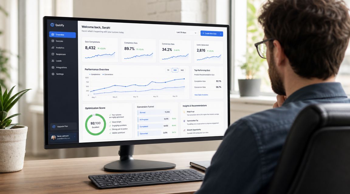
Table of Contents
- Why You Should Embed a Quiz on Your Site
- Choosing the Right Quiz Embed Method
- A Practical Guide to Embedding Your Quiz
- Connecting Your Quiz to Your Marketing Stack
- Best Practices for High-Converting Quizzes
- Troubleshooting Common Quiz Embed Issues
Why You Should Embed a Quiz on Your Site
Most stores don't have a traffic problem first. They have a decision problem. Visitors arrive, but the page doesn't help them choose. Product grids, category menus, and static buying guides can only do so much when the customer still doesn't know what fits their needs.
A quiz solves that by changing the interaction model. Instead of presenting everything at once, you ask one useful question at a time. That keeps attention on the page and gives you information you can use for lead qualification, segmentation, and product recommendations.
The business case is strong. In a widely cited Demand Metric benchmark, interactive content generated conversion rates that were 70% higher than passive content, and 88% of marketers said interactive content made their brand differentiate itself from competitors (interactive content benchmark reference). That's why quizzes show up so often in lead generation, personalized shopping flows, and recommendation engines.
Where quizzes fit in a growth strategy
A quiz works best when you treat it like a conversion asset, not a novelty.
- For product discovery: Use it when customers need help narrowing options, such as fragrance families, dog food formulas, or sizing preferences.
- For lead capture: Ask for email after the user has invested effort and wants personalized results.
- For segmentation: Use answer choices to tag contacts by need, intent, concern, or budget.
- For sales enablement: Route high-intent respondents to the right landing page, collection, or booking flow.
If you're refining broader digital marketing lead strategies, quizzes sit in a useful middle ground between a simple signup form and a full sales conversation. They qualify attention before your team spends time on follow-up.
Practical rule: If your customer regularly asks “Which one should I choose?”, that's a quiz opportunity.
Teams that want a no-code option often use tools built for interactive form flows rather than generic forms. One example is marketing quiz and form templates, which can be adapted for product finders, lead capture, and qualification paths.
Choosing the Right Quiz Embed Method
The mistake I see most often isn't the quiz itself. It's the placement. A strong quiz can still underperform if it shows up in the wrong format at the wrong moment.
Your embed method changes how disruptive the quiz feels, how much context the page keeps, and what kind of conversion behavior you're asking for. The three formats that matter most are inline, popup, and button-triggered or dedicated page flows.
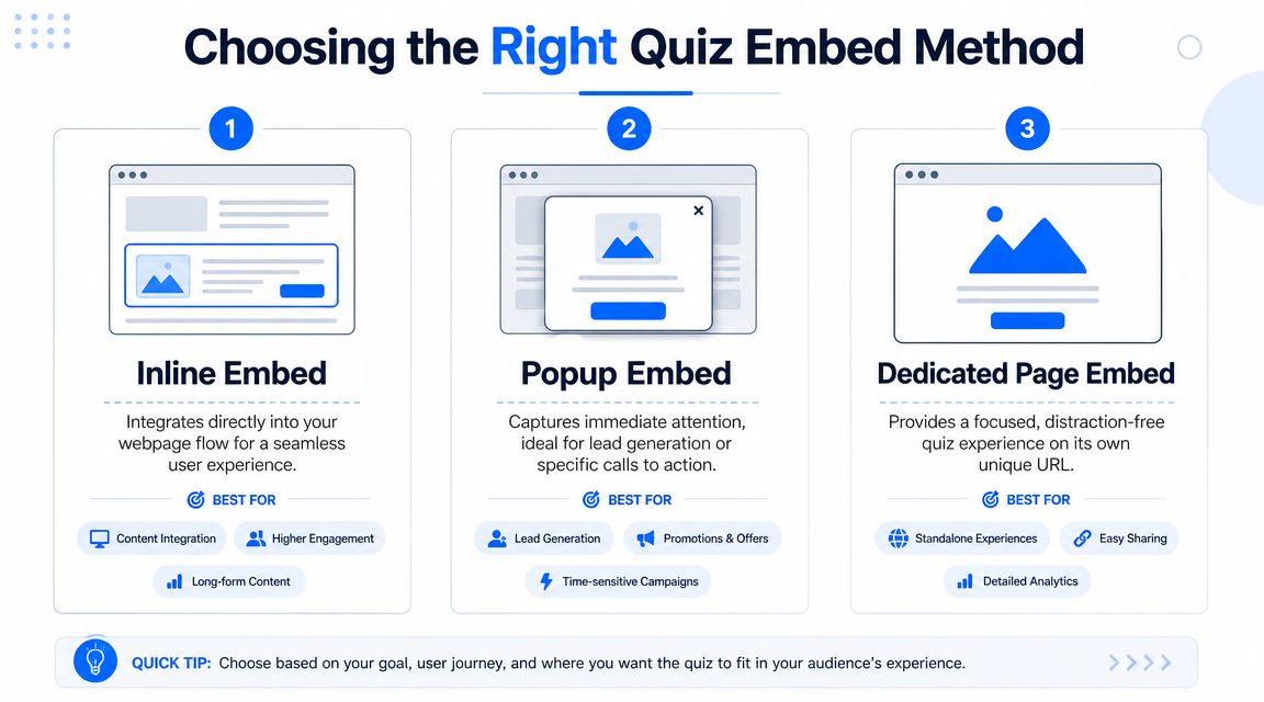
Inline embeds
An inline embed places the quiz directly inside the page layout. This is the cleanest option when the quiz is part of the buying journey, not an interruption.
Use inline when:
- The quiz supports product selection: Collection pages, landing pages, and PDP support modules are common placements.
- You want context to remain visible: The visitor can still see your headline, trust signals, and surrounding copy.
- The quiz is central to the page goal: If the page exists to help people choose, the quiz should be visible without extra clicks.
What doesn't work as well is hiding an important product finder too far down the page. If the quiz is the key conversion mechanic, don't bury it below generic brand copy.
Popup embeds
A popup embed interrupts the page on purpose. That can work, but only when the offer is strong and the timing is disciplined.
Popup quizzes fit when:
- You're capturing leads tied to a clear promise: “Get your routine,” “Find your fit,” or “See your product match.”
- You need attention fast: Exit-intent, timed triggers, or scroll-based triggers can surface the quiz before the session ends.
- The quiz is short: A popup isn't the place for a long assessment with heavy explanation.
The trade-off is obvious. Popups get noticed, but they can also feel intrusive. If the first screen asks too much or appears too early, visitors close it before they understand the value.
Button-triggered or dedicated page flows
This model starts with a button, teaser, or CTA that opens the quiz in a modal or sends the visitor to a standalone page. It's often the most flexible option.
Choose it when:
- You need stronger intent: The click acts as a micro-commitment.
- The quiz deserves focus: A dedicated page strips away distractions and gives the experience room.
- You're working around platform limits: Some platforms handle links more cleanly than embeds.
A button-triggered flow usually outperforms a forced interruption when the user needs a clear reason to start.
Here's the comparison I use when planning placements:
| Embed Method | Best For | User Experience | Conversion Impact |
|---|---|---|---|
| Inline | Product finders, recommendation flows, educational landing pages | Seamless and contextual | Strong when the quiz is core to the page's purpose |
| Popup | Lead capture, exit-intent offers, short qualification flows | High attention, more interruptive | Useful when the offer is compelling and timing is controlled |
| Button-triggered or Dedicated Page | Hero CTAs, focused assessments, platform-limited environments | Intent-based and cleaner | Strong when visitors need a reason to opt in before starting |
The right choice depends less on design preference and more on visitor intent. If the page already has strong commercial intent, inline usually wins. If you need to interrupt indecision, a popup can help. If the quiz needs room or your platform is restrictive, a button or dedicated page is often the safer route.
A Practical Guide to Embedding Your Quiz
The technical side is simpler than commonly believed. The part that changes from site to site isn't the quiz logic. It's the host platform's editor and what that editor allows. That portability issue matters because one platform may accept an iframe embed, while another may prefer or require a share link instead of embedded code, especially in builders with stricter content blocks (platform portability guidance).
Before you paste anything into a page, decide three things:
- Placement: Inline section, popup trigger, or button to a dedicated page.
- Conversion point: Email capture before results, after results, or not at all.
- Destination: Product page, collection page, booking page, or follow-up flow.
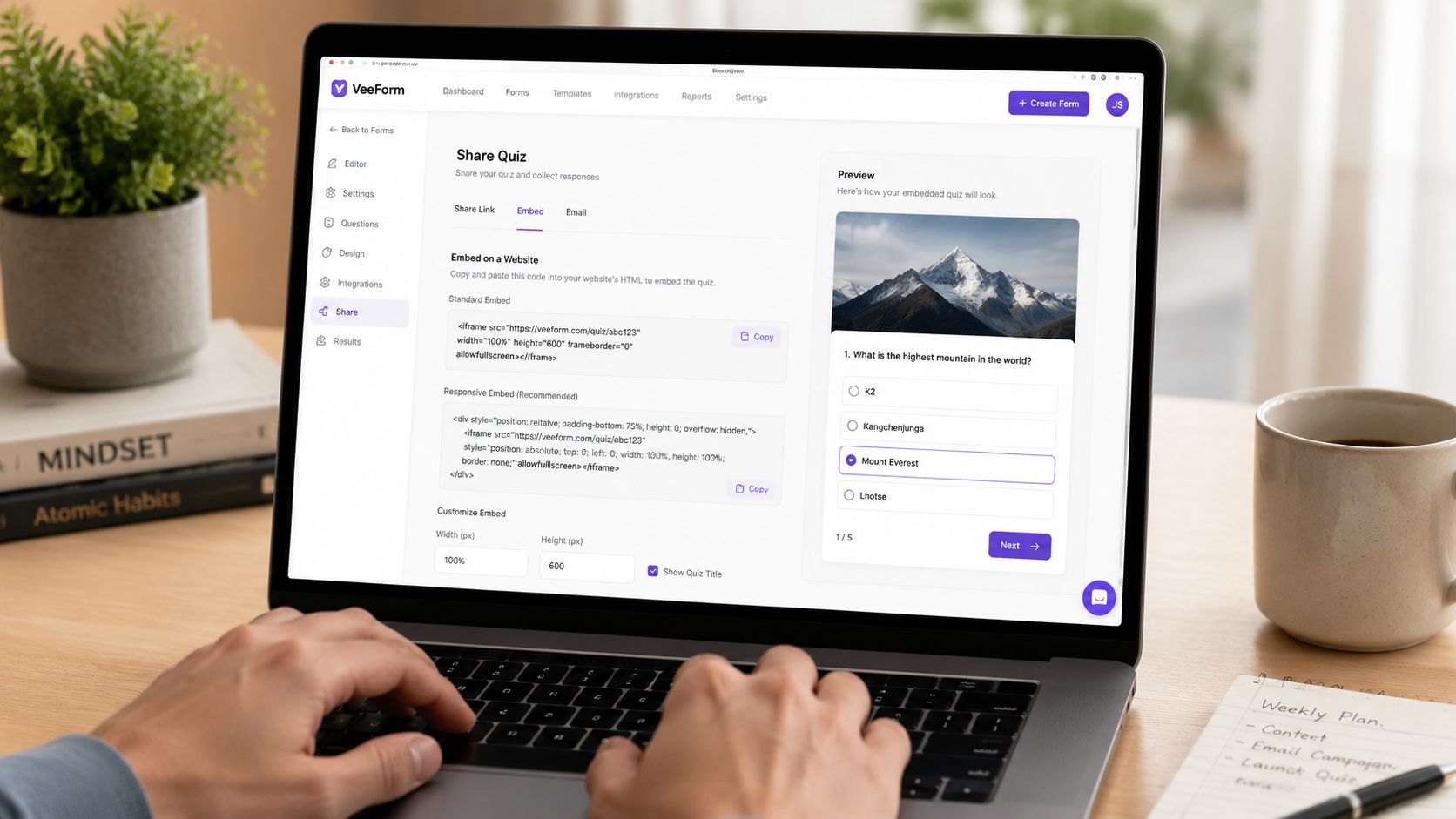
If you're building the quiz from scratch, a no-code generator like AI form and quiz creation can speed up the first draft. The embed steps below still apply regardless of the quiz tool.
Embedding on Shopify
Shopify is ideal for quizzes that support product discovery, bundle selection, and email capture. The cleanest placements are homepage sections, collection pages, dedicated landing pages, or PDP blocks.
Typical workflow:
- Build and publish the quiz in your chosen tool.
- Copy the embed code if Shopify supports the placement you want, or copy the share URL if you're using a button or page link.
- In Shopify, open Online Store and go to the page, theme section, or custom liquid area where the quiz should appear.
- Paste the code into a custom HTML or custom liquid block.
- Save, preview, and test on desktop and mobile.
<iframe src="YOUR-QUIZ-URL" width="100%" style="min-height:700px;border:0;" loading="lazy"></iframe>
Use a page-level embed when the quiz is central to conversion. Use a button-triggered approach in a hero banner when you want a cleaner first screen.
Embedding on WordPress
WordPress gives you flexibility, but the workflow depends on whether you're using the Block Editor, a classic editor, or a builder theme.
The simplest route is:
- Add a Custom HTML block where the quiz should appear.
- Paste the embed code.
- Preview the page before publishing.
- Check that caching, optimization plugins, or script blockers aren't interfering.
If your site relies heavily on plugins and custom blocks, plugin conflicts can affect how scripts or iframes render. If you need a refresher on WordPress setup basics, this guide on how to install plugins is a practical reference before you start debugging the wrong issue.
Embedding in page builders like Webflow or Squarespace
Page builders are where many teams get tripped up because the visual editor looks simple, but the actual embed rules vary.
For Webflow, you'll usually:
- Drag in an Embed element.
- Paste the iframe or script code.
- Adjust wrapper spacing and responsive behavior.
- Publish and test the live page.
For Squarespace, the standard pattern is similar:
- Add a Code Block.
- Paste the embed code.
- Adjust height if the quiz appears cramped.
- Test mobile spacing and surrounding section padding.
Here's a common safe starting point for wrapper styling:
<div style="width:100%;max-width:100%;overflow:hidden;"><iframe src="YOUR-QUIZ-URL" width="100%" style="min-height:700px;border:0;"></iframe></div>
A short walkthrough helps if you want to see the flow in action:
Embedding in custom HTML
If you control the site markup directly, you've got the fewest constraints and the most responsibility.
Use this checklist:
- Wrap the iframe responsively: Avoid fixed-width containers.
- Set a realistic minimum height: Quizzes often need more vertical room than a signup form.
- Avoid clipping: Parent containers with hidden overflow can cut off the experience.
- Test events and submissions: A nice-looking embed means nothing if answers don't record.
Don't judge the embed by desktop preview alone. The failure mode usually shows up on phones, inside narrow content columns, or in cached page versions.
If your platform refuses embedded code, switch to a linked quiz page or button-triggered flow instead of forcing a broken implementation. The method matters less than getting a complete, usable path live.
Connecting Your Quiz to Your Marketing Stack
A quiz by itself is only half useful. Its core value appears when response data moves into analytics, email, CRM, and reporting systems fast enough to support follow-up.
The technical baseline for web embedding is straightforward. An effective approach uses a responsive iframe, a unique quiz URL, and URL parameters for user attribution, which helps you send results into your own database or a platform API (iframe and URL parameter guidance). That's the point where an embedded quiz stops being a page element and starts acting like part of your pipeline.
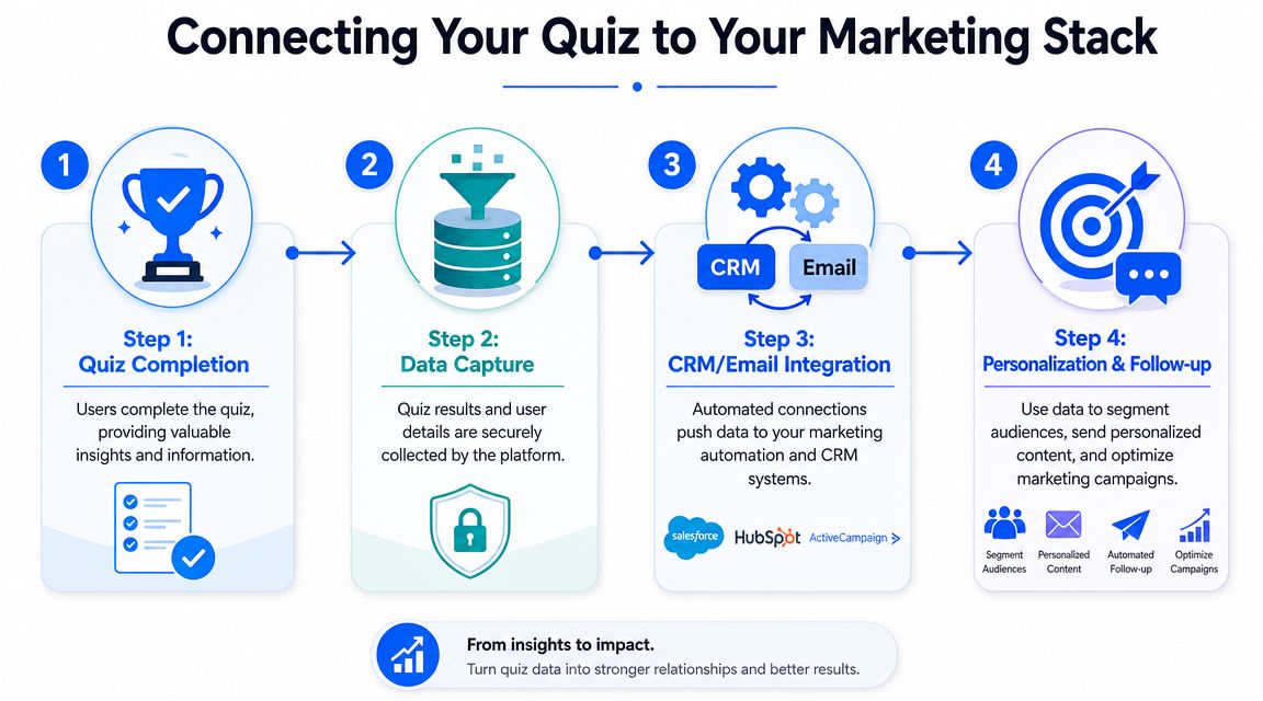
Track the quiz as a funnel, not a widget
In practice, I treat a quiz like a micro-funnel with distinct stages:
- Quiz viewed: The embed rendered and the visitor saw it.
- Quiz started: The user engaged with the first question.
- Quiz completed: The visitor finished the path.
- Lead captured: Contact details were submitted.
- Outcome clicked: The visitor chose a recommendation, product link, or CTA.
Those stages belong in your analytics setup, including GA4 if that's your main reporting layer. Without event tracking, you can't tell whether the issue is visibility, starts, completion, or result-page performance.
A common example is a skincare quiz. If users start but rarely finish, the problem is usually friction in the flow. If they finish but don't click through, the result page or offer is weak.
Pass identity and answer data into your CRM
Here, quiz data becomes commercially useful. If a visitor answers “dry skin,” “sensitive,” or “fragrance-free,” that information should travel with the contact record so your team can personalize follow-up.
That can look like:
- CRM tagging: Create tags or properties based on answer logic.
- Email segmentation: Send different flows based on customer need or product fit.
- Sales routing: Push high-intent leads to a rep or booking sequence.
- Ad audience building: Use quiz-derived segments for retargeting where allowed by your stack and policies.
If your organization is already connecting marketing and sales systems, this Salesforce and HubSpot integration guide is a useful example of the broader integration mindset. The quiz shouldn't sit outside that architecture.
A straightforward way to support attribution is to pass identifiers through the quiz URL, then store results against those identifiers when the submission comes through. For lead capture use cases, a template like lead capture form flows can be adapted into a quiz entry point and connected into the rest of the stack.
The operational question isn't “Can we embed the quiz?” It's “Where do the answers go, who uses them, and what action happens next?”
When teams skip that part, they collect responses but don't gain advantage. When they wire it properly, quiz answers shape campaigns, recommendations, and follow-up without manual sorting.
Best Practices for High-Converting Quizzes
A working quiz isn't automatically a productive one. Plenty of embeds look polished and still create friction, weak intent, or vague results. The difference usually comes down to pacing, clarity, and what happens after the final answer.
Reduce friction from the first screen
The opening screen has one job. It has to make the quiz feel easy and worth starting.
Use these principles:
- Lead with the outcome: “Find your routine” works better than a generic “Take our quiz.”
- Keep early questions simple: Start with low-effort choices before asking for detailed preferences.
- Use one question at a time: This keeps the screen clean and lowers cognitive load.
- Design for thumbs: Buttons need to be easy to tap, and text needs to be readable without zooming.
For quizzes tied to video or guided content, placement matters too. A proven pattern is to insert quiz questions at key instructional timestamps, write feedback for both correct and incorrect answers, and test the final experience before launch. Technical guidance also emphasizes H.264 compression, 1080p for desktop, at least 720p for mobile, clear audio, and chapter markers where supported because delivery problems can hurt completion and comprehension even when the questions are strong (video quiz implementation guidance).
Make the result page do real selling work
Too many quizzes end with a vague personality result and no useful next step. That wastes the intent the user just showed.
A result page should do one of these jobs clearly:
- Recommend a specific product or curated set.
- Capture the lead in exchange for personalized results.
- Send the visitor to the next commercial action.
The copy matters. So does the transition. If the quiz says someone needs a lightweight moisturizer for dry and sensitive skin, the next screen should reflect that exact language in the recommendation and CTA.
A few additional habits improve performance:
- Use relevant images: They hold attention and make the result feel tangible.
- Limit answer overload: Too many near-identical options slow people down.
- Write answer labels like a merchandiser: Customers choose what they understand quickly.
- Test headlines and CTAs: Even small changes in framing can change who starts and who clicks through.
A high-converting quiz doesn't feel like a form. It feels like help.
That's the standard to aim for. If the interaction feels like work, visitors bail. If it feels like useful guidance, they continue.
Troubleshooting Common Quiz Embed Issues
Most embed problems aren't caused by the quiz tool itself. They're caused by the page environment around it. Theme wrappers, script conflicts, mobile spacing, and platform restrictions create most of the failures I see.
The quiz doesn't appear
Start with the obvious checks first:
- Confirm the quiz is published: Draft or private states can prevent rendering.
- Verify you pasted the right item: Some platforms need an iframe code block. Others need a share link.
- Check page caching: A stale cached version can hide your latest changes.
- Disable blockers during testing: Browser extensions sometimes interfere with embedded content.
If the page builder strips code automatically, move the embed into the platform's proper code block or switch to a button that opens the quiz on its own page.
The embed is cut off or sized wrong
This is usually a container problem, not a quiz problem.
Fix it by checking:
- Iframe height: Increase the minimum height until the full quiz fits naturally.
- Parent container overflow: Hidden overflow can clip the bottom or sides.
- Fixed-width wrappers: Replace them with responsive width settings.
- Section padding: Tight theme spacing can make the embed look broken even when it technically loads.
A clipped iframe makes users think the quiz is unfinished. Treat sizing as part of conversion, not just front-end polish.
The mobile experience feels broken
Mobile failures are expensive because they stop completion entirely.
Review these points:
- Touch targets: Buttons should be easy to tap.
- Readable text: Users shouldn't need to zoom.
- Web view support: In-app browsers can behave differently from standard mobile browsers.
- Real device testing: Don't rely on desktop resize mode alone.
When a quiz works on desktop but fails on phones, the issue is often spacing, touch behavior, or a script that doesn't behave well inside the mobile environment.
Submissions or results aren't being recorded
If the quiz completes visually but no data appears, trace the flow in order:
- Submit a test response yourself.
- Confirm the thank-you or result step loads.
- Check whether the integration is active.
- Verify that any URL parameters or identifiers are being passed correctly.
- Review whether the destination system expects a different field mapping.
Test the entire path as a user would. Start, answer, submit, and confirm where the data lands.
That full-path check catches more issues than staring at embed code in isolation.
If you want to launch a lead-gen quiz without wrestling with custom development, VeeForm is one option for building quizzes, forms, and recommendation flows that can be embedded inline, triggered by buttons, or used as popups across commerce and lead capture pages.