You're probably here because you need a simple way for people to contact you. Maybe you run a portfolio site, a SaaS landing page, or a Shopify store, and adding an email me button feels like the fastest fix.
It is fast. It's also one of those small website choices that can create friction, invite spam, and leave you blind to what happens after the click. A button that looks harmless can become a weak point in your lead flow.
A better way to think about an email me button is this: it isn't just a link. It's a contact touchpoint. It shapes how easy it is for someone to reach you, what information they send, and whether you can do anything useful with that interaction afterward.
Table of Contents
- Why Your Simple Email Button Might Be Costing You Leads
- Method 1 The Basic HTML mailto Link
- Method 2 A JavaScript-Enhanced Contact Button
- Method 3 The Smart No-Code VeeForm Button
- Comparing Your Email Me Button Options
- Essential Best Practices for Any Contact Button
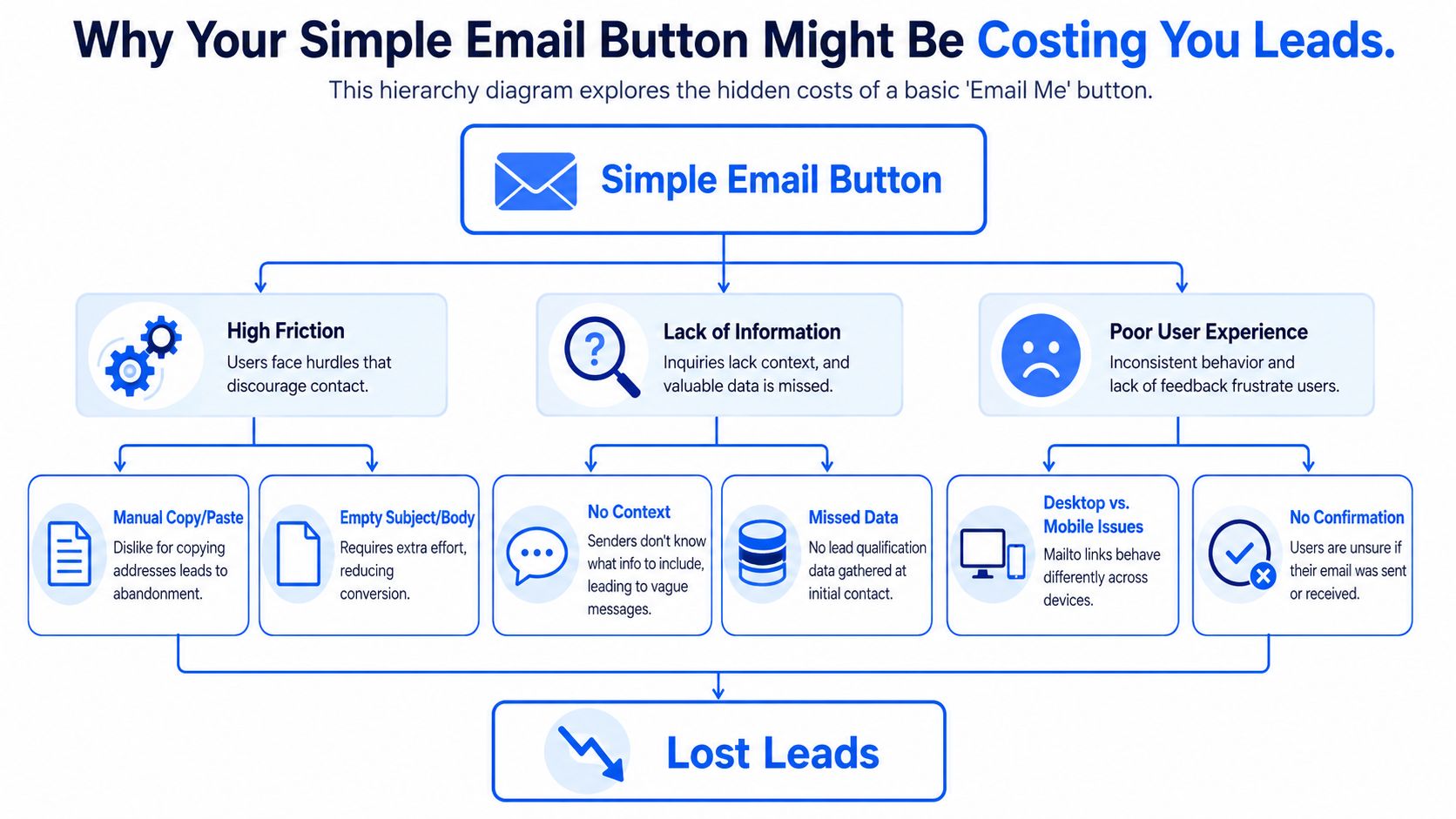
Why Your Simple Email Button Might Be Costing You Leads
Most site owners treat the email me button as a tiny design element. In practice, it does a lot of work. It asks a visitor to stop browsing, decide what to say, trust that the click will behave correctly on their device, and send a message without much guidance.
That's a fragile flow.
A basic text link or plain email prompt looks lightweight, but the interaction often feels heavier than it should. Campaign Monitor reported that using a call-to-action button instead of a simple text link increased click-throughs by 28%, and the same article notes an average email click-to-open rate of about 14.10%, which shows how much response can shift when the CTA is easier to notice and use (Campaign Monitor on email buttons and click-throughs).
Three levels of an email me button
There's a useful progression here.
- Basic link: A
mailto:button is quick to publish and easy to understand. - Enhanced button: JavaScript can hide your address from casual scraping or make copying easier.
- Professional contact flow: A button can trigger a form, collect useful details, and give you cleaner follow-up data.
Each upgrade solves a different problem. The first gets something online. The second reduces a bit of friction. The third turns contact into a process you can manage.
A contact button shouldn't just create a way to send a message. It should help the right person send the right message with the least effort.
The hidden cost is usually context
When someone clicks a plain email me button, you often get a blank draft. No structure. No routing. No hint whether they're a buyer, a support request, a partnership inquiry, or a random question.
That hurts response quality. It also makes prioritization harder for teams handling inbound demand.
If email deliverability is already part of your concern, it's worth reviewing how to stop email from going to spam in Gmail. A contact path only works when messages reliably land where they should.
For businesses that need qualification up front, a structured lead capture form template is often closer to the actual job than a bare email link.
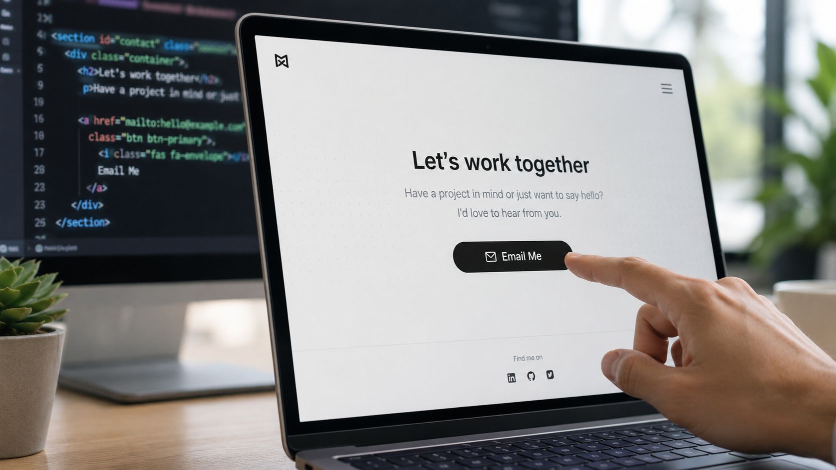
Method 1 The Basic HTML mailto Link
If you need an email me button live in the next five minutes, mailto: is still the shortest path. It uses a normal HTML link, and clicking it asks the visitor's device to open their default email app with your address prefilled.
That simplicity is why people keep using it.
The fastest possible setup
Here's the bare version:
<a href="mailto:[email protected]">Email Me</a>
If you want it to look like a button:
<a href="mailto:[email protected]" style="display:inline-block;padding:14px 22px;background:#0066ff;color:#ffffff;text-decoration:none;border-radius:8px;font-weight:600;">
  Email Me
</a>
This works well enough on many websites. Click it, and the user gets a draft message addressed to you.
A slightly better mailto version
You can prefill parts of the message so the user isn't starting from zero:
<a href="mailto:[email protected]?subject=Project%20Inquiry&body=Hi%2C%20I%27d%20like%20to%20ask%20about%20your%20services.">
  Email Me
</a>
That small improvement matters because a blank draft creates decision fatigue. If you give people a subject line and opening prompt, they're more likely to finish the message.
A contact page can also pair the button with a fallback form, such as a simple contact form template, for visitors who don't want to leave the browser.
Where this method breaks down
The biggest problem with mailto: isn't the code. It's the user experience around the code.
- It depends on local email setup: If the visitor doesn't use a desktop mail client, the click can feel broken or confusing.
- It exposes your email address: That can invite scraping and unwanted inbound mail.
- It gives you no structure: You don't control what information comes in.
- It gives you no analytics: You can't meaningfully measure intent, abandonment, or message quality.
Practical rule: Use
mailto:when speed matters more than process. Don't use it when contact requests affect sales, support, or lead routing.
One more point gets overlooked. In email design, a technically reliable CTA should be built as a bulletproof button using HTML and CSS rather than an image, because image-only buttons can disappear when images are blocked and can create accessibility issues. Litmus recommends a table-based wrapper and a styled link so the full area stays clickable across clients such as Gmail and Outlook (Litmus guide to bulletproof buttons in email design).
That advice comes from email newsletters, but the principle carries over: don't fake a button with an image when a real clickable element will do the job better.
If you want a visual walk-through of basic button behavior and implementation, this short demo helps:
Method 2 A JavaScript-Enhanced Contact Button
If mailto: feels too exposed, JavaScript gives you a middle ground. You still keep things lightweight, but you can avoid printing a raw email address into the page and make the interaction more polished.
This is useful when you want a human-friendly contact button without committing to a full form workflow yet.
Option one reveal the address on click
A simple pattern is to store parts of the email in JavaScript and assemble them after the visitor clicks:
<button id="emailBtn">Email Me</button>
<p id="emailText" aria-live="polite"></p>

<script>
  document.getElementById('emailBtn').addEventListener('click', function () {
    const user = 'hello';
    const domain = 'example.com';
    const email = user + '@' + domain;
    document.getElementById('emailText').innerHTML =
      '<a href="mailto:' + email + '">' + email + '</a>';
  });
</script>
This won't stop determined scrapers, but it can reduce casual harvesting. It also avoids placing the full address directly in the initial markup.
Option two copy the email address to the clipboard
In many cases, copying is better than opening a mail app. People may want to paste your address into Gmail, Apple Mail, Outlook, or a support system they already use.
<button id="copyEmailBtn">Copy Email Address</button>
<p id="copyStatus" aria-live="polite"></p>

<script>
  document.getElementById('copyEmailBtn').addEventListener('click', async function () {
    const email = '[email protected]';
    try {
      await navigator.clipboard.writeText(email);
      document.getElementById('copyStatus').textContent = 'Copied!';
    } catch (err) {
      document.getElementById('copyStatus').textContent = 'Copy failed. Please try again.';
    }
  });
</script>
The aria-live="polite" message matters here. Without it, screen reader users may never hear that the action succeeded.
If you use a copy button, always give visible and screen-reader-friendly confirmation. Silent interactions feel broken.
What this improves and what it still misses
JavaScript improves presentation and adds a bit of control. It can:
- Reduce scraping exposure: Your address isn't always sitting plainly in the HTML.
- Improve flexibility: You choose whether to reveal, copy, or launch an email draft.
- Keep the page feeling modern: Feedback like “Copied!” reduces uncertainty.
It still doesn't solve the business side of the problem.
You're not collecting structured details. You're not qualifying inquiries before they reach your inbox. You're not creating a clean record of what happened before the user sent the email. For personal sites, that may be fine. For teams with sales or support workflows, it usually isn't.
Method 3 The Smart No-Code VeeForm Button
At some point, the email me button stops being a coding question and becomes an operations question. What do you need from the person contacting you? Where should that inquiry go? What should happen after they click?
That's where a form-triggered button is more useful than an email-triggered one.
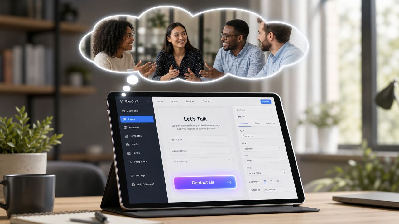
Why a form-triggered button changes the job
A modern contact button can open a popup or embedded form instead of an email draft. That keeps users on the site and lets you ask for the information you need before the message gets sent.
That matters because inquiry quality usually depends on prompt quality. If you ask “What do you need help with?” you'll get broad answers. If you ask a few targeted questions, you can separate support from sales, collect product context, and route the inquiry without extra back-and-forth.
For no-code setup, VeeForm is one option that lets teams create popup forms, embed forms on-page, and trigger them from buttons. It supports conditional logic, response tracking, and CRM or marketing-tool syncs, which makes it more useful than a plain email action when lead capture is the goal.
A practical setup for service sites and Shopify stores
A strong form-based email me button usually follows this pattern:
- Start with the intent question: Ask whether the visitor wants pricing, support, a demo, wholesale information, or something else.
- Use conditional follow-ups: Show the next question based on the previous answer so the form stays short.
- Collect routing details early: Product name, order context, timeline, or budget range can help your team prioritize.
- End with a clear confirmation: Users should know the submission worked and what happens next.
That same approach works well for Shopify. A store with lots of products can trigger a compact contact form from a “Need help choosing?” button. A perfume brand can ask about scent family or gifting. A clothing store can sort sizing questions from returns. A pet food shop can separate ingredient questions from subscription issues.
Working rule: If the same inbox handles different kinds of requests, don't make visitors guess what to write. Ask for the context upfront.
The other advantage is protection. A form-triggered button doesn't expose your email address publicly in the same way a raw mail link does. It also creates a cleaner handoff into whatever system your team already uses.
This approach isn't just about convenience. It produces better inbound conversations because the button doesn't drop the user into a blank message window. It guides them into a structured path with fewer dead ends.
Comparing Your Email Me Button Options
The right setup depends on what you need the button to do. If all you want is a visible contact link, the simplest route may be enough. If contact requests are tied to sales, support, or qualification, the trade-offs become clearer very quickly.
Email Me Button Method Comparison
| Feature | HTML mailto Link | JavaScript Enhanced | VeeForm Popup |
|---|---|---|---|
| Setup speed | Fastest | Moderate | Moderate |
| Technical skill | Low | Low to medium | Low |
| Exposes email address | Yes | Less directly | No public email required |
| Opens email app | Yes | Optional | No |
| Structured data collection | No | No | Yes |
| Lead qualification | No | No | Yes |
| Analytics visibility | None | Minimal | Built for submissions and tracking |
| User guidance | Low | Low to medium | High |
| Best fit | Personal sites, quick contact links | Personal sites wanting a cleaner interaction | Businesses that need routing, qualification, or support intake |
A simple rule helps here.
- Choose mailto when speed is the only priority.
- Choose JavaScript enhancement when you want a slightly smoother interaction without changing your workflow.
- Choose a form-triggered button when contact requests matter enough to organize.
If your button sits on a service page, pricing page, product page, or customer support area, the form-based option usually aligns better with the core business need.
Essential Best Practices for Any Contact Button
A contact button can fail even when the implementation is technically correct. Sometimes the code works perfectly and the button still underperforms because it's too small, too vague, too hidden, or too hard to use with assistive tech.
Make the button easy to see and tap
Placement matters first. Guidance for email CTAs consistently recommends putting the primary action above the fold when possible, keeping it visually prominent, and giving it enough whitespace so it doesn't compete with nearby elements. The same guidance recommends touch-friendly sizing, with minimum targets around 44 to 48 px high and width and height guidance in the 42 to 72 px range. Some standards also specify 48 dp by 48 dp. Short CTA copy usually works best at about 1 to 5 words because it scans faster in busy layouts (Stripo guide to HTML email buttons).
Those recommendations come from email CTA practice, but they translate well to websites. A contact button should look tappable, not decorative.
Write copy that reduces hesitation
“Email me” is acceptable, but it isn't always the clearest option.
Try labels that match intent:
- For sales pages: Ask a question, Get in touch, Request details
- For service businesses: Start your project, Ask about pricing
- For stores: Need help choosing, Contact support
- For founder or portfolio sites: Let's talk, Email me
The button text should tell the user what happens next. If the click opens a form, the page around it should say so. If it copies your email address, the microcopy should make that obvious.
Treat accessibility as part of conversion
Accessibility often gets ignored in email me button tutorials, but it's a practical conversion issue. Guidance from Greater Public recommends using real HTML text instead of image-based CTAs, making sure buttons have enough contrast, staying understandable when images are off, and avoiding designs that rely on color alone. It also calls out the importance of descriptive link text, semantic markup, and sufficient whitespace for usability across screen readers, low-vision contexts, and mobile use (Greater Public on accessible email design).
A few habits go a long way:
- Use real text: Don't turn your contact CTA into a graphic.
- Name the action clearly: “Contact sales” is better than “Click here.”
- Support keyboard users: The button should receive visible focus.
- Keep states obvious: Hover styling is fine, but don't rely on hover alone.
- Separate competing actions: One primary button is easier to understand and tap than several lookalike buttons crowded together.
Really Good Emails also found that the average CTA button height was 47.9 pixels, with the biggest clusters at 47 pixels and 50 pixels, which reflects how marketers have gravitated toward button sizes that are easy to tap while still fitting standard layouts (Really Good Emails on CTA button sizing).
Good button design is usually quiet. The user notices that it was easy, not that it was clever.
If your current email me button feels too basic for the volume or quality of inquiries you need, a form-based workflow is worth testing. VeeForm lets you trigger a contact form from a button, keep users on-site, and collect the context your team needs before the conversation starts.