You've sent a customer survey, watched traffic come in, and still ended up with a depressing number of completed responses. That usually isn't a traffic problem. It's a design and distribution problem.
Teams frequently try to fix low response by asking more loudly. They send another blast, add a popup, or rewrite the subject line. Sometimes that helps. More often, it just exposes the underlying issue. The survey is too broad, too long, badly timed, or aimed at the wrong segment.
If you want to learn how to increase survey response rate in a way that holds up, treat the survey like a conversion flow. Every step matters. Who sees it, when they see it, how much effort it feels like, and what they get in return all shape completion.
Table of Contents
- Rethink Your Survey Before You Build It
- Design for Completion Not Just Questions
- Master the Art of the Ask
- Put It All Into Practice with VeeForm on Shopify
- From Data to Action and Iteration
- Your Quick-Answer Survey FAQs
- How many questions should a survey have
- Are prize draws as effective as guaranteed incentives
- How many reminders are too many
- What is a good survey response rate
- Should every survey be personalized
- What hurts response rates fastest
- Is one-question-at-a-time actually better
- Should you ask optional open-ended questions
Rethink Your Survey Before You Build It
A Shopify team launches a survey the same way it launches a popup. Fast, with good intentions, and with too many stakeholders adding “just one more question.” Then the response rate comes back weak, and the team blames timing, incentives, or channel. In practice, the problem usually starts earlier. The survey had no single job.
A survey should support one decision. That rule filters out a lot of noise.
If the answer will not change what the team does next, cut the question. For a post-purchase flow, that might mean choosing one objective such as uncovering purchase hesitation, checking whether delivery expectations were clear, or learning how shoppers discovered the product. Trying to cover all three in one form usually gives you thinner answers and lower participation.
Relevance starts with segmentation
Response rate is often a targeting problem before it becomes a copy or design problem. A first-time buyer, a repeat customer, and a cart abandoner are all in different moments. Sending them the same survey asks them to do extra interpretation before they even answer.
For Shopify merchants using VeeForm, the better approach is to build around the shopper moment first, then choose the template and logic that match it. A sample survey questionnaire template gives you a clean starting point, but the essential work is narrowing the audience before you add fields.
Use context to decide what belongs in the form:
- Post-purchase buyers: Ask what nearly stopped the order, what information they needed, or what gave them confidence.
- Cart abandoners: Ask about price concerns, shipping friction, product fit, or unanswered questions.
- Returning customers: Ask about satisfaction, reorder intent, and how this purchase compared with prior ones.
- Email subscribers who have not bought: Ask what is blocking the first purchase, not whether they are happy with the product.
Good surveys feel specific. Generic surveys feel like homework.
If you want examples before building your own, these top customer feedback templates are useful for pressure-testing whether your survey matches the customer moment you are targeting.
Benchmark against the survey you are actually sending
“Good response rate” is only useful if you attach it to a survey type, audience, and trigger. A broad list survey and a post-purchase survey should not be judged the same way. Neither should an on-site intercept and a customer research study.
That planning choice affects the build from the start. Broad outreach usually lives or dies on relevance and invitation clarity. Post-purchase surveys depend more on timing and a tight objective. On-site surveys need strong context. Research surveys often need a stronger value exchange.
A simple planning table keeps that grounded:
| Survey setup | What usually matters most |
|---|---|
| Broad list survey | Relevance and invitation clarity |
| Post-purchase survey | Timing and a focused objective |
| On-site intercept | Context and low friction |
| Customer research survey | Audience fit and a clear reason to respond |
The practical takeaway is simple. Higher response rates start with better survey decisions before you open VeeForm and build anything. Choose one goal, match it to one audience, and write questions for that moment only.
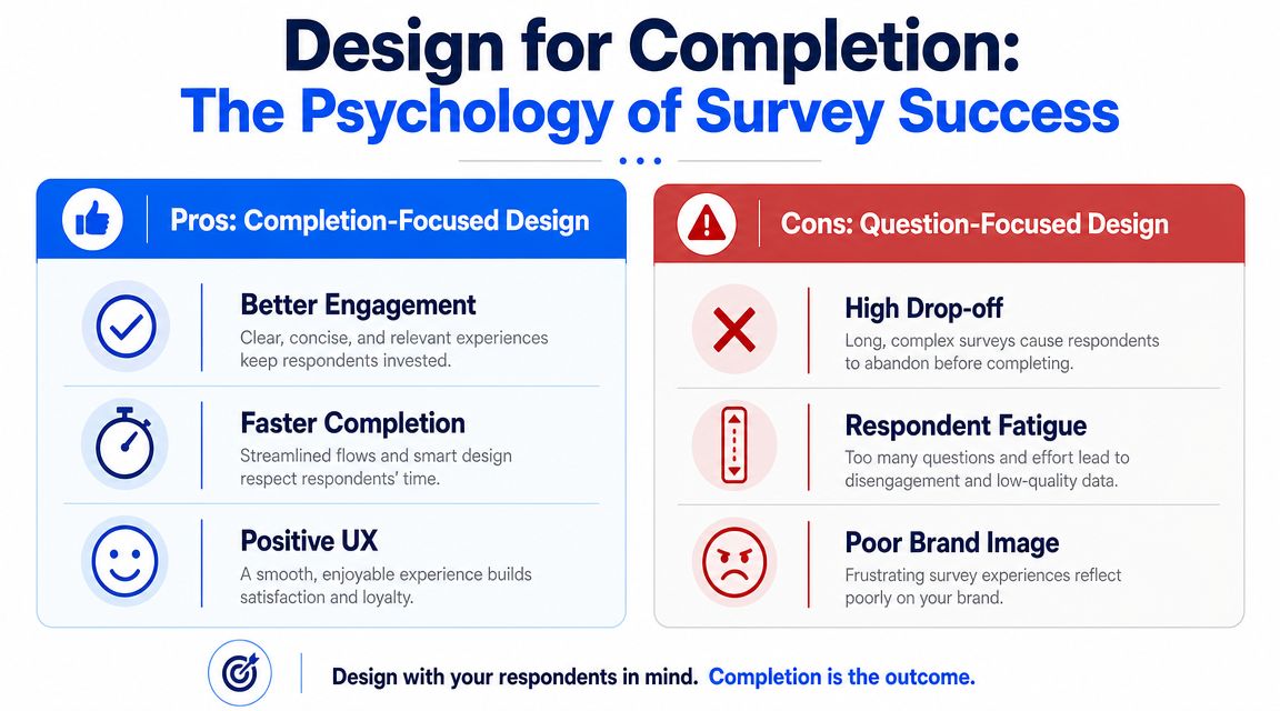
Design for Completion Not Just Questions
A shopper opens your post-purchase survey on their phone while waiting for coffee. They will give you about 30 seconds to prove it is easy to finish. Design around that moment, and completion rates improve. Design around everything your team wants to know, and people drop.
Start with a shorter promise
Perceived effort matters before the first answer. Qualtrics reports that surveys lasting more than 12 minutes tend to reduce response rates, recommends telling respondents a mobile survey will take no more than 9 minutes, and says personalization can increase response rates by up to 48% in some cases.
That does not mean every survey must be tiny. It means the scope has to match the moment. A post-purchase pulse can be short and direct. A deeper customer research survey can be longer, but only if the respondent understands why it is worth their time.
A practical rule I use is simple. If the intro needs too much explanation, the survey is trying to do too much.
Use these edits before you publish:
- Cut duplicate intent: If two questions lead to the same decision, keep one.
- Move profiling later: Ask for demographic or account details after the core feedback, if you still need them.
- Use plain language: Product jargon slows people down and increases misreads.
- Ask one thing per question: Combined questions create hesitation and muddy the answer.
If you need a starting structure, these top customer feedback templates are useful because they map survey formats to specific customer moments instead of pushing one oversized template onto every use case.
Make mobile the default
As noted earlier, mobile dominates survey completion for many audiences. For Shopify merchants, that changes the build in concrete ways.
Short prompts work better. Tap targets need space. Intro copy has to earn its place. One awkward question type can cost more completions than three well-written ones.
The patterns that hurt mobile completion show up fast:
- Matrix questions force scanning and feel heavy on a phone.
- Long dropdowns slow the interaction and hide options.
- Dense opening text gets skipped, then the respondent lacks context.
- Multiple questions on one screen increase effort and raise abandonment.
In VeeForm, the safer default is one question per step. It feels lighter because it is lighter for the respondent. Progress is obvious, and each screen asks for one decision only.
Reduce friction one screen at a time
Completion-focused surveys remove effort screen by screen. That is where tools and design choices start to matter.
For example, if a shopper says the main issue was shipping cost, the next question should explore shipping. It should not ask about product quality, site speed, and packaging first. Conditional logic keeps the path relevant and shorter, which improves both completion rate and answer quality.
A practical flow looks like this:
Open with the easiest relevant question
Start with something low effort and tied to the moment, such as “Did you find what you were looking for?” or “What nearly stopped your purchase?”Branch only where it helps
Show follow-up questions based on the previous answer. Do not send every respondent through every branch.Use answer recall carefully
Referencing a prior answer can make the survey feel more responsive, but only if it shortens the path or clarifies the next question.Stop once you can act
If the team already has enough information to improve shipping messaging, fix the PDP, or review checkout friction, end the survey.
That trade-off matters. Every added question can give you more detail, but it also lowers the odds that the respondent reaches the end. Strong survey design means choosing the smallest set of questions that still supports a decision.
For teams building quickly inside Shopify, VeeForm helps because you can start from a focused structure instead of a blank page. An AI form generator for drafting goal-based survey flows can speed up the first version. The higher-performing version usually comes from editing hard after that first draft, trimming screens, simplifying wording, and removing any question that does not change what you will do next.
Master the Art of the Ask
A strong survey can still fail because the invitation does too much, too little, or arrives in the wrong context.
Response rate isn't just a survey design metric. It's also a conversion metric for the ask itself. The channel, the timing, the framing, and the follow-up sequence all shape whether someone starts and finishes.
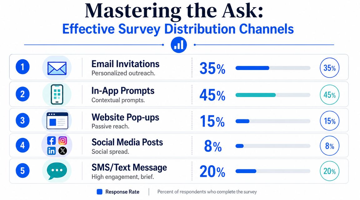
Distribution is part of response rate optimization
The biggest mistake here is relying on one channel because it's easy. Email is convenient, but convenience for the team isn't the same as convenience for the respondent.
The strongest evidence supports mixed-mode outreach rather than single-channel collection. A systematic review of 40 experimental studies found that monetary incentives were associated with a median response-rate increase of 12 percentage points, and that mixed-mode strategies such as mail followed by telephone performed best overall. The same review also found that adding a web mode to mail-telephone designs could lift response rates by another 2–5 percentage points while keeping costs lower than telephone-only follow-up.
For a Shopify merchant, that doesn't mean copying an offline research protocol exactly. It means applying the principle. Don't depend on a single touchpoint if the feedback matters.
A practical ecommerce version looks like this:
| Customer moment | First ask | Follow-up |
|---|---|---|
| Post-purchase | Email invite | Reminder with refreshed copy |
| Cart abandonment | On-site intercept | Email if identity is known |
| Support resolution | Follow-up email | In-account prompt |
| Repeat purchase journey | Post-purchase page embed | Later reminder |
The reason mixed-mode works is straightforward. People miss messages for different reasons. A second contact in a different context recovers attention that the first message never had.
For teams working on better creator-facing messaging and hooks around invites, this piece on Direct AI insights for creators is helpful as a framing resource. The channel may be different, but the lesson carries over. Strong asks match audience context and format.
Incentives work when they are clear and proportional
A lot of marketers resist incentives because they worry the responses will be “bought.” That's usually the wrong concern. The bigger risk is asking for time without offering enough value in return.
The evidence is strong enough to treat incentives as a serious lever, not a gimmick. Monetary incentives have some of the best backing in response-rate research. But implementation matters. The reward should feel transparent, modest, and appropriate to the ask. If the survey is short, the incentive should feel simple. If the survey asks for more effort, the exchange should be clearer.
What tends to work better than vague reward language:
- Guaranteed value: Clear, direct, and understood immediately.
- Upfront visibility: Mention the incentive in the invitation, not buried at the end.
- Simple redemption: Don't create extra steps after completion.
- Reasonable alignment: The reward should match the effort without distorting intent.
If the incentive is confusing, the survey feels risky. If the incentive is clear, the decision becomes easy.
Reminders should rescue attention not create annoyance
Reminders work best when they behave like a second chance, not a repeat broadcast. Qualtrics recommends 1–3 reminders with refreshed wording, and that guidance aligns with what practitioners see in the field. The point of the reminder is not to resend the same line. It's to remove hesitation that blocked the first response.
Good reminder copy usually changes one of these elements:
- Subject or opening line to feel new rather than duplicated
- Reason for participating so the value is clearer
- Time framing so effort feels bounded
- Audience fit so the message feels more personal
What doesn't work is hammering the same generic ask over and over. People don't respond because you sent the fifth version. They respond because one message finally felt relevant, timely, and easy enough to act on.
Put It All Into Practice with VeeForm on Shopify
Theory matters. Store execution matters more.
For Shopify merchants, the best survey setup usually comes from matching one survey to one shopper moment, then removing every bit of extra friction. That means no giant form on a generic “feedback” page, no catch-all questionnaire, and no long path for people who only need to answer two relevant questions.
A good build starts with the interface itself.
Build the survey around one shopper moment
Pick the moment first, then the template.
For example, a Shopify store might create separate flows for post-purchase feedback, exit-intent abandonment, product recommendation quizzes, or support deflection. Each one has a different job. The post-purchase survey shouldn't ask the same questions as an exit-intent popup because the customer's mindset isn't the same.
A practical build sequence inside a commerce survey tool looks like this:
- Choose a mobile-friendly template that already uses a one-question-at-a-time format.
- Write a short opening line tied to the shopper moment.
- Add only the core decision questions needed for action.
- Set a fast ending with a thank-you, redirect, or next-step message.
Modern CX guidance emphasizes short, interactive, one-question-at-a-time formats and strong conditional logic to reduce the burden on respondents. That principle matters most on Shopify, where shoppers are often moving quickly and have low patience for friction.
Use logic to remove unnecessary work
Conditional logic is one of the most effective survey features because it cuts dead weight without hiding the questions that matter.
If a customer says they almost abandoned because of shipping cost, send them into a short shipping branch. If they say they couldn't choose between products, show a different follow-up. If they report no issue at all, end the survey sooner.
That creates two wins at once:
- Higher completion, because fewer respondents see irrelevant questions
- Better data, because follow-ups are tied to actual context
Answer recall improves this even more. When a later prompt references what the shopper already selected, the flow feels responsive rather than repetitive.
For merchants building within ecommerce workflows, the VeeForm ecommerce setup shows how these survey experiences fit into store journeys like embeds, popups, and lead capture flows.
Launch where intent is strongest
Where the survey appears is just as important as how it's written.
An exit-intent popup works best when you need quick feedback from abandoning visitors. A post-purchase page embed works well when the customer has just completed a decision and still remembers what almost blocked it. A link in an email can work after delivery or support resolution, when context is fresh.
Here's a short walkthrough before launch:
- For cart abandoners: Use an exit-intent popup with one immediate question and one optional follow-up.
- For recent buyers: Embed the survey on the thank-you page or in a post-purchase email.
- For support flows: Trigger a short feedback form after the issue is marked resolved.
- For product discovery: Use a quiz format that doubles as both guidance and feedback capture.
A quick visual demo helps if you want to see the flow in action:
The practical rule is simple. Put the survey where the memory is freshest and the effort feels smallest.
From Data to Action and Iteration
Collecting responses isn't the finish line. It's the start of a tighter feedback loop.
The teams that improve survey performance over time don't just read answers. They study the survey itself as a conversion path. Where do people stop? Which branch gets completed? Which audience segment responds consistently and which one ignores the ask?
Look for friction not just answers
A survey dashboard should help you spot behavioral issues, not just summarize feedback themes.
If respondents abandon after a specific question, that question needs inspection. It may be unclear, too open-ended, too personal, or merely irrelevant at that stage. If one channel produces starts but not completions, the problem might be message alignment rather than traffic quality.
A useful review rhythm looks like this:
- Check completion by entry point: Email, popup, embed, or direct link
- Review drop-off by question: Find where momentum breaks
- Compare segments qualitatively: New customers may respond differently from repeat buyers
- Export and enrich: Push useful survey fields into your CRM or marketing stack so future messages are more relevant
If you also analyze store behavior, pairing survey feedback with actionable GA4 insights for Shopify helps connect stated intent with on-site actions.
The best survey optimization often starts with one uncomfortable discovery. The question you cared about most may be the one causing people to leave.
Use each survey to improve the next one
AHRQ emphasizes two overlooked levers for response rates: improving sample accuracy with updated contact information and using repeated outreach to improve contact and conversion. That matters because every survey creates data you can use to make the next one better.
Someone who responded in the past gave you more than an answer. They also revealed contact preferences, timing patterns, and areas of interest. That should shape future targeting and message design.
Closing the loop matters too. If customers never hear what changed, future surveys feel extractive. If they see that feedback influenced shipping content, product pages, support policy, or sizing guidance, trust increases. People are more willing to respond when prior effort clearly mattered.
That's the part many teams miss. Survey response rate isn't only about getting the next click. It's about building a system where customers believe responding is worth their time.
Your Quick-Answer Survey FAQs
How many questions should a survey have
Fewer than you think. The right number depends on the decision you need to make, not on how many things your team is curious about. For a simple post-purchase or support survey, keep it tight and focused. For broader research, use logic so each respondent only sees what applies to them.
Are prize draws as effective as guaranteed incentives
Usually, guaranteed value is easier for people to understand and trust. AHRQ guidance and modern CX guidance both lean toward modest, transparent incentives rather than overpaying or relying on prize draws. If you use an incentive, make it clear and straightforward.
How many reminders are too many
Qualtrics recommends 1–3 reminders with refreshed wording, and that's a practical ceiling for most survey campaigns. The key is to change the framing, not just resend the same message. If the response isn't worth one or two thoughtful follow-ups, it probably isn't worth a long campaign.
What is a good survey response rate
It depends on the audience and survey purpose. Kantar's benchmark says 5–30% is typically good and 50%+ is excellent. Use that as context, not as a universal target. A targeted survey sent at the right moment can outperform a much larger but less relevant send.
Should every survey be personalized
Yes, if personalization is authentic. Personalization works best when it reflects known context such as customer segment, purchase state, or previous answer. Superficial personalization doesn't help much. Relevant personalization does because it reduces the feeling of being sent a generic form.
What hurts response rates fastest
Three things usually do the damage first:
- Length: If the survey feels long, people delay or quit.
- Irrelevance: If the questions don't match the customer's situation, they disengage.
- Bad timing: If the ask arrives too late or in the wrong channel, the moment is gone.
Is one-question-at-a-time actually better
In many cases, yes. It lowers cognitive load, feels faster, and works better on mobile. That doesn't mean every survey must look conversational, but it does mean respondents should never feel like they're staring at a wall of fields.
Should you ask optional open-ended questions
Yes, but be selective. Open text is valuable when you need nuance. It becomes a problem when you ask for essays from everyone. Use it after a closed question has already identified the relevant issue, or place it near the end as optional context.
If you want a faster way to turn these ideas into live, mobile-friendly survey flows on Shopify, VeeForm is a practical place to start. It lets you build one-question-at-a-time forms, surveys, quizzes, and popups without code, so you can launch quickly, reduce friction, and improve completion with cleaner logic and better on-site timing.