You're probably here because a Shopify task that should have taken an hour is turning into a mini project. You want a product recommendation quiz for a large catalog, a wholesale inquiry form for high-intent buyers, or a post-purchase survey that doesn't look like an afterthought. Then the usual problem shows up. The native options are too rigid, the app is off-brand, or you need a developer to change one field, one rule, or one ending screen.
That's where a no code form builder becomes more than a convenience. It gives marketing, retention, and e-commerce teams control over customer flows that directly affect lead capture, support load, merchandising, and repeat purchase behavior. On Shopify, that matters because forms sit in places where buyers make decisions. Product pages, popups, landing pages, post-purchase touchpoints, and customer service entry points all depend on friction being low and intent being captured well.
Most articles stop at templates and drag-and-drop editing. The harder question is more useful: which form designs help more shoppers finish, and which ones produce cleaner customer data you can act on?
Table of Contents
- Build Smarter Forms Without Writing Code
- Core Features of a Powerful No Code Form Builder
- Driving Growth on Shopify with Interactive Forms
- How to Choose the Right Form Builder for Your Store
- Best Practices for High-Converting Form Design
- Integrating Forms into Your Marketing and Sales Tech Stack
Build Smarter Forms Without Writing Code
A good no code form builder solves a practical business problem. You need to launch a form quickly, change it without waiting on a sprint, and still make it feel like part of your store rather than a bolted-on widget.
On Shopify, that usually shows up in familiar moments. A flash sale needs an early-access signup. A high-ticket product needs a qualification flow before your team spends time on low-fit leads. A new collection needs a quiz that narrows choices without overwhelming the shopper. If every change requires code, those campaigns slow down before they start.

The category is also large enough that it should be treated as core infrastructure, not a side tool. The broader no-code and low-code market has grown into a $65 billion market, and the no-code app builder segment is projected to reach $112.6 billion by 2034 according to SearchLab's no-code and low-code statistics roundup. That matters because it signals durability. Teams aren't only using no-code products for quick prototypes. They're using them in customer-facing and workflow-heavy parts of the business.
Why Shopify teams adopt it fast
The appeal isn't abstract. It comes down to control.
- Launch speed: Marketing teams can publish a campaign form when the campaign is ready, not when engineering has room.
- Iteration: You can test copy, reorder questions, add logic, and change the ending flow without rebuilding the page.
- Operational fit: The same tool can support lead gen, service triage, order support, feedback collection, and quizzes.
Practical rule: If a customer interaction needs to change weekly, it shouldn't depend on a developer queue.
The value of a no code form builder isn't just that it removes coding. It lets your team shape the path from visitor intent to structured customer data, then use that data in the rest of your Shopify workflow.
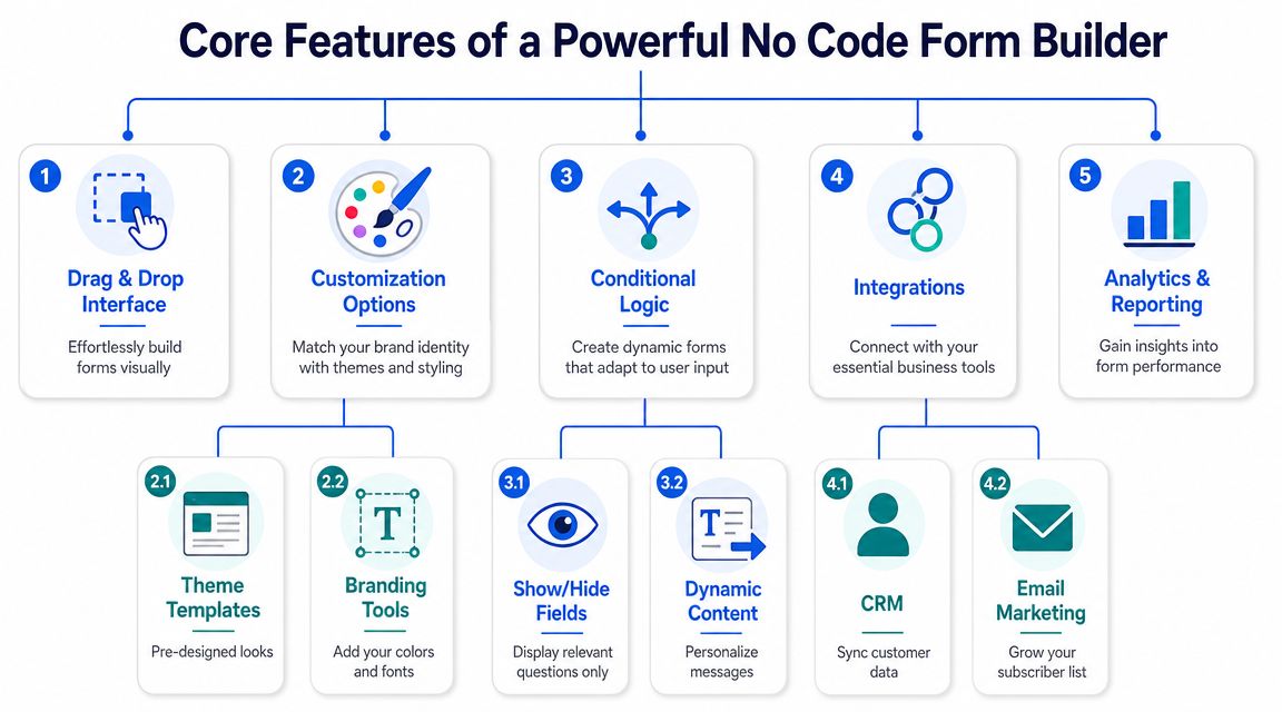
Core Features of a Powerful No Code Form Builder
The fastest way to judge a form tool is to ignore the template gallery for a minute and inspect its core mechanics. If those mechanics are weak, the nice themes won't matter.
No-code form builders reduce complexity by combining a drag-and-drop interface with pre-built components like text boxes, dropdowns, and conditional logic, which lets non-developers create custom workflows in minutes instead of weeks, as described by ExamRoom's form builder overview.
What matters on day one
The first layer is basic usability. You need a visual editor that lets you add, remove, and reorder fields without friction. That sounds obvious, but some tools still make simple edits feel technical.
A solid builder should include:
- Drag-and-drop editing: You should be able to assemble a form visually and understand the layout instantly.
- Prebuilt field types: Text inputs, dropdowns, multiple choice, checkboxes, ratings, file uploads, and consent fields cover most Shopify use cases.
- Templates that save setup time: Templates help when you need a lead form, survey, or quiz live today, not next week.
- Brand control: Colors, fonts, imagery, button styling, and language options matter when the form lives on a storefront.
If you want a faster starting point, an AI form generator for building draft flows can help teams move from idea to editable form structure without opening a blank canvas.
The feature that changes outcomes
The most important feature isn't styling. It's conditional logic.
Think of conditional logic as the part that decides what question should appear next based on the shopper's previous answer. If someone selects “I need help with my last order,” the form should show order-related questions. If they choose “I'm shopping for dry skin,” the quiz should branch into product-fit questions, not generic interest prompts.
That changes the experience in two ways:
- The shopper sees fewer irrelevant questions.
- Your team gets cleaner data because each answer sits in context.
A form that adapts to the user feels shorter even when the workflow is more sophisticated.
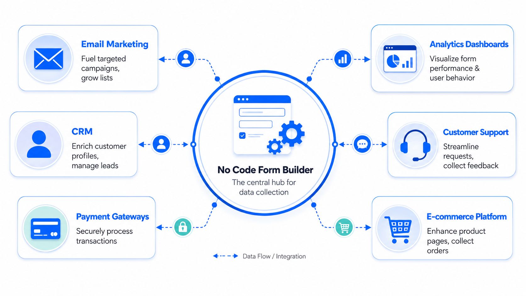
The strongest tools also add analytics and integrations. That's what turns a form from a collection device into an operational asset. Submissions should flow into a CRM, spreadsheet, or marketing automation system so your team can act on them quickly rather than exporting CSV files at the end of the week.
Driving Growth on Shopify with Interactive Forms
Interactive forms work best when they solve a narrow business problem. On Shopify, that usually means helping a shopper decide, helping a team qualify, or helping support handle requests cleanly.
Advanced builders use branching logic and multi-step layouts to reduce cognitive load, which can significantly improve form completion rates compared with long static forms, based on Knack's guidance on easy no-code form building. That principle matters more on product-led storefronts than many teams realize.
Near the top of the experience, this is what an interactive builder can look like in practice:
Lead capture for high consideration products
A standard “Contact us for details” form usually collects a name, email, and maybe a message. That's not enough when you sell products that need qualification, like premium apparel bundles, custom perfume subscriptions, specialty pet nutrition, or wholesale packs.
A better flow asks one question at a time. Start with intent. Are they buying for themselves, for a business, or for a gift? Then ask fit questions that matter to sales. Budget range, timeline, product category, or volume needs. By the time the lead reaches your inbox or CRM, your team knows whether to send a product page, a curated bundle, or a personal follow-up.
One option in this category is VeeForm for e-commerce forms and quizzes, which supports one-question-at-a-time flows, conditional paths, and multiple ending types that fit lead capture and recommendation use cases.
Product recommendation quizzes for large catalogs
Shopify stores often leave money on the table. A big catalog creates decision fatigue fast. That's especially true in categories like skincare, dog food, apparel sizing, fragrance families, or giftable bundles.
A recommendation quiz acts like guided merchandising. Instead of dropping shoppers into filters and hoping they self-sort, the form asks a short sequence of relevant questions. Skin concern. Pet age. Fit preference. Scent profile. Price comfort. Then it routes them toward the right product set or collection.
That creates value beyond the immediate click. The answers also tell you how customers describe their needs in their own words. That helps with product page messaging, email segmentation, and even merchandising priorities. Teams also benefit from related work on improving Shopify discovery in AI, because the same structured product-fit data that powers quizzes can support clearer discovery experiences across channels.
Post-purchase feedback that people actually finish
Most post-purchase surveys ask too much too soon. A buyer has just completed an order and gets hit with a dense block of questions. Completion suffers, and the responses tend to be shallow.
A conversational, multi-step survey works better for this moment. Start with one broad prompt such as satisfaction or purchase intent. Then branch. If the customer had trouble choosing, ask what slowed them down. If the delivery experience mattered most, ask about shipping clarity or packaging. If the order was a gift, ask whether product discovery was easy.
This is also a good place for a short demo of the format in motion:
Shorter visible forms often produce richer answers because each question arrives with context instead of competing for attention.
Support forms that route issues properly
Support forms are often treated like admin plumbing. They shouldn't be. They shape response speed, internal workload, and customer satisfaction.
A flat support form forces everyone into the same path. The result is messy tickets, repeated follow-up questions, and manual triage. A branched support form asks different questions based on issue type. Order issue. Product question. Return request. Subscription help. Wholesale account support. Each path can collect the right details up front.
That means fewer back-and-forth emails and better internal routing. If someone reports a delivery problem, the form can ask for order number and shipping issue details. If the issue is sizing, it can collect product name, selected size, and expected fit. The customer spends less time explaining. Your team spends less time decoding.
How to Choose the Right Form Builder for Your Store
It's common for teams to buy a form tool after seeing a polished demo. That's understandable, but it's not enough. For Shopify, the right choice depends on whether the builder fits your storefront, your team, and your customer data practices.
A major buying shift is happening around control. As no-code tools handle more critical data, buyers are increasingly focused on governance, ownership, and security features, with portability and control becoming important decision criteria alongside ease of use, as noted in SurveyJS coverage of open-source form builders and buyer priorities.
The shortlist criteria that matter most
Start with the workflow, not the brand name. Ask what the form must do in the actual store.
If you're comparing tools, use these lenses:
- Ease of editing: Can a marketer change logic, endings, and copy without training?
- Brand fit: Can the form match the storefront closely enough that it feels native?
- Mobile behavior: Does the experience stay clean on product-page embeds, popups, and landing pages?
- Deployment options: Can you embed inline, trigger a popup, or share by link depending on the campaign?
- Analytics: Can you see where people drop, which questions cause friction, and what answers are common?
- Integrations: Can submissions move into your CRM, email platform, spreadsheet, or support workflow without manual export?
- Data governance: Who owns the data, how easily can you export it, and what controls exist around storage and access?
If a form collects customer intent but traps that data inside the app, you've bought a design layer, not an operational tool.
No-Code Form Builder Evaluation Checklist
| Criterion | Why It Matters for Shopify | What to Look For |
|---|---|---|
| Ease of use | Your team needs to publish and update flows without engineering support | Visual editor, fast editing, clear logic setup |
| Branding and customization | Off-brand forms reduce trust and can hurt the buying experience | Theme controls, custom colors, images, fonts, language support |
| Mobile responsiveness | A large share of storefront interactions happen on mobile | Mobile preview, touch-friendly inputs, readable steps |
| Deployment flexibility | Different campaigns need different placements | Embed, popup, button trigger, share link |
| Conditional logic | Static forms create friction and collect irrelevant answers | Branching rules, show or hide fields, dynamic endings |
| Analytics and exports | You need to improve forms based on behavior, not guesswork | Response analytics, CSV export, drop-off visibility |
| Integrations | Form data should trigger action in the rest of your stack | CRM sync, email platform connection, spreadsheet and webhook support |
| Data ownership and portability | Customer data must remain usable and controllable as you scale | Clear export options, access controls, governance features |
A flashy builder can still be the wrong choice if it forces workarounds around mobile rendering, exports, or customer data handling. For most Shopify teams, the winner isn't the tool with the longest feature list. It's the one that removes friction for both shoppers and operators.
Best Practices for High-Converting Form Design
The biggest mistake in form design is treating completion as a question-count problem. It isn't. People abandon forms when the next step feels unclear, irrelevant, or heavier than the reward.
One of the most under-analyzed questions in this category is whether no-code form builders improve completion for complex workflows. The strongest evidence points to features like branching logic and progressive disclosure, which are designed to improve outcomes even though most content still focuses more on features than measured results, according to Iozen's review of the no-code form builder market gap.
Design for momentum, not field count
A long form isn't always bad. A badly presented form is.
A multi-step flow works because it controls attention. The shopper sees one task, completes it, then moves forward. That's different from landing on a page full of dropdowns, text inputs, and optional boxes that all compete at once.
Use these principles:
- Ask one question at a time: This works especially well for quizzes, lead qualification, and post-purchase surveys.
- Show progress: Progress tracking reassures users that the interaction is finite.
- Branch aggressively: If an answer makes later questions irrelevant, hide them.
- Keep labels plain: “What are you shopping for today?” beats internal jargon every time.
- End with a clear next step: Redirect to a product page, show personalized results, or confirm that support will follow up.
Write questions that produce usable answers
Data quality depends on question design. Vague prompts create vague answers. The fix is usually simple.
Instead of “Tell us about your needs,” ask “Which of these describes what you need help with?” Instead of “Any concerns?” ask “What almost stopped you from buying today?” Those are easier to answer and easier to route.
For teams that need inspiration before drafting their own flows, Trackingplan's questionnaire examples are useful for studying structure and wording across surveys and feedback forms. If your goal is lead generation, a lead capture form template can also provide a practical starting layout that you adapt to your offer and buying cycle.
Good form copy sounds like a store associate asking the next helpful question, not a database requesting another field.
Button text matters too. “Submit” is passive. “See my recommendations,” “Get my quote,” or “Send my request” tells the shopper what happens next. That small shift improves clarity and usually produces better-intent completions because the user understands the value exchange.
Integrating Forms into Your Marketing and Sales Tech Stack
A form should never be the endpoint. It should be the front door to a workflow.
The strongest no-code builders support analytics exports and API integrations so responses can move into CRMs, spreadsheets, or automation pipelines for enrichment and follow-up, as outlined in Knack's discussion of multi-step forms, analytics, and integrations. That's where Shopify teams turn form activity into marketing action.
What should happen after submission
Once a shopper submits, something useful should happen immediately.
- Lead capture forms should create or enrich a contact in your CRM or email platform.
- Product quizzes should store preference data that can shape future campaigns and segmentation.
- Support forms should notify the right team with the right context.
- Feedback forms should land in a system where trends can be reviewed, tagged, and shared.
The stack works when data moves immediately
A clean setup usually looks like this. The form captures structured answers. Those answers sync to your email tool or CRM. A spreadsheet or dashboard stores broader trend data. Slack or another notification layer alerts the team when a response needs fast action.
For enrichment-heavy workflows, it also helps to see examples of connecting data enrichment to Zapier, because that kind of automation shows how form submissions can trigger follow-up steps without manual handling.
The goal isn't to connect everything because you can. It's to remove lag between response and action. If a shopper requests a product recommendation, send the recommendation. If a high-intent lead qualifies themselves, route them into the right sequence. If a support issue comes in with the needed details, assign it properly the first time.
A no code form builder earns its place in a Shopify stack when it shortens that path.
If you want to build quizzes, lead forms, surveys, and support flows for Shopify without relying on developer time, VeeForm is worth a look. It's designed for no-code form creation with interactive, one-question-at-a-time experiences, conditional logic, templates, analytics, and flexible deployment options for storefront and campaign use cases.