
You probably already have a form on your Shopify store. It might be a footer newsletter box, a contact page, or a simple pop-up offering a discount for first-time visitors. It works, at least on paper. People can type in an email address, click submit, and join your list.
But if you're selling anything that needs explanation, comparison, personalization, or qualification, that basic setup is usually too shallow. A skincare store needs to know skin type. A dog food brand needs breed, age, and dietary concerns. A wholesale seller needs company type, order volume, and timeline. A generic email field captures contact info. It doesn't capture buying context.
That's why Shopify form apps deserve more strategic attention than they usually get. A good form doesn't just collect data. It filters intent, guides shoppers toward the right product, and gives your team cleaner information to act on later.
Table of Contents
- Why Your Shopify Store Needs More Than a Simple Contact Form
- From Basic Fields to Interactive Customer Experiences
- Core Features of a High-Converting Shopify Form App
- Powerful Use Cases That Drive Sales and Save Time
- Your Shopify Form App Selection Checklist
- Best Practices for Implementation and Optimization
- Conclusion Turning Form Submissions Into Business Growth
Why Your Shopify Store Needs More Than a Simple Contact Form
A lot of store owners notice the same problem without having a clean name for it. The store gets traffic, some people subscribe, a few customers send questions, yet the team still doesn't know enough about buyers to market to them well. Everyone gets the same welcome flow. Support gets vague requests. Product discovery stays manual.
That gap matters more now because the Shopify app ecosystem is crowded. One April 2026 snapshot reported 17,600+ apps in the Shopify App Store and said app count had grown more than 50% year over year, which means merchants have plenty of options but also more room to choose poorly. In that same environment, Shopify's app platform tests storefront apps for performance impact with Lighthouse before and after installation, a reminder that form apps need to add capability without hurting store speed or mobile experience, as noted in this Shopify App Store ecosystem snapshot.
A weak form strategy usually looks harmless. You add a contact page, embed a newsletter signup, maybe place a discount pop-up on entry. Then the cracks show. Visitors ask questions your catalog should answer. High-intent shoppers abandon because they don't know which product fits. Your email list grows, but segmentation stays thin.
Practical rule: If your form only captures contact details, you're collecting names, not buying signals.
Even simple page design choices can make that worse. If your contact page buries expectations, uses generic field labels, or doesn't guide people toward the next step, it becomes dead space instead of a conversion asset. That's why it's worth reviewing these Shopify contact form best practices before you add more tooling.
There's also a broader shift in how smart stores use forms. They don't treat forms as isolated widgets. They use them as part of lead capture, segmentation, support routing, and recommendation flows. That's the difference between a passive inbox and an active qualification system.
For merchants comparing approaches, it helps to look at examples of ecommerce form experiences that do more than ask for an email. Once you see forms as guided conversations, a lot of missed revenue opportunities become obvious.
From Basic Fields to Interactive Customer Experiences
The native Shopify option covers a real need. Shopify Forms is a native Shopify app for lead capture and customer data collection. It supports inline and pop-up forms, tagging, discount incentives, multilingual forms, and performance analytics. Shopify also says merchants can use it to “boost conversions among 200M+ Shop users,” and its app documentation shows that submissions can trigger automations, tag customers into segments, and send email marketing through Shopify's broader lifecycle stack in the Shopify Forms app listing.
That's useful when your goal is straightforward. Capture an email. Offer a discount. Tag a subscriber. Start an automated follow-up. For many stores, that's enough at the top of the funnel.
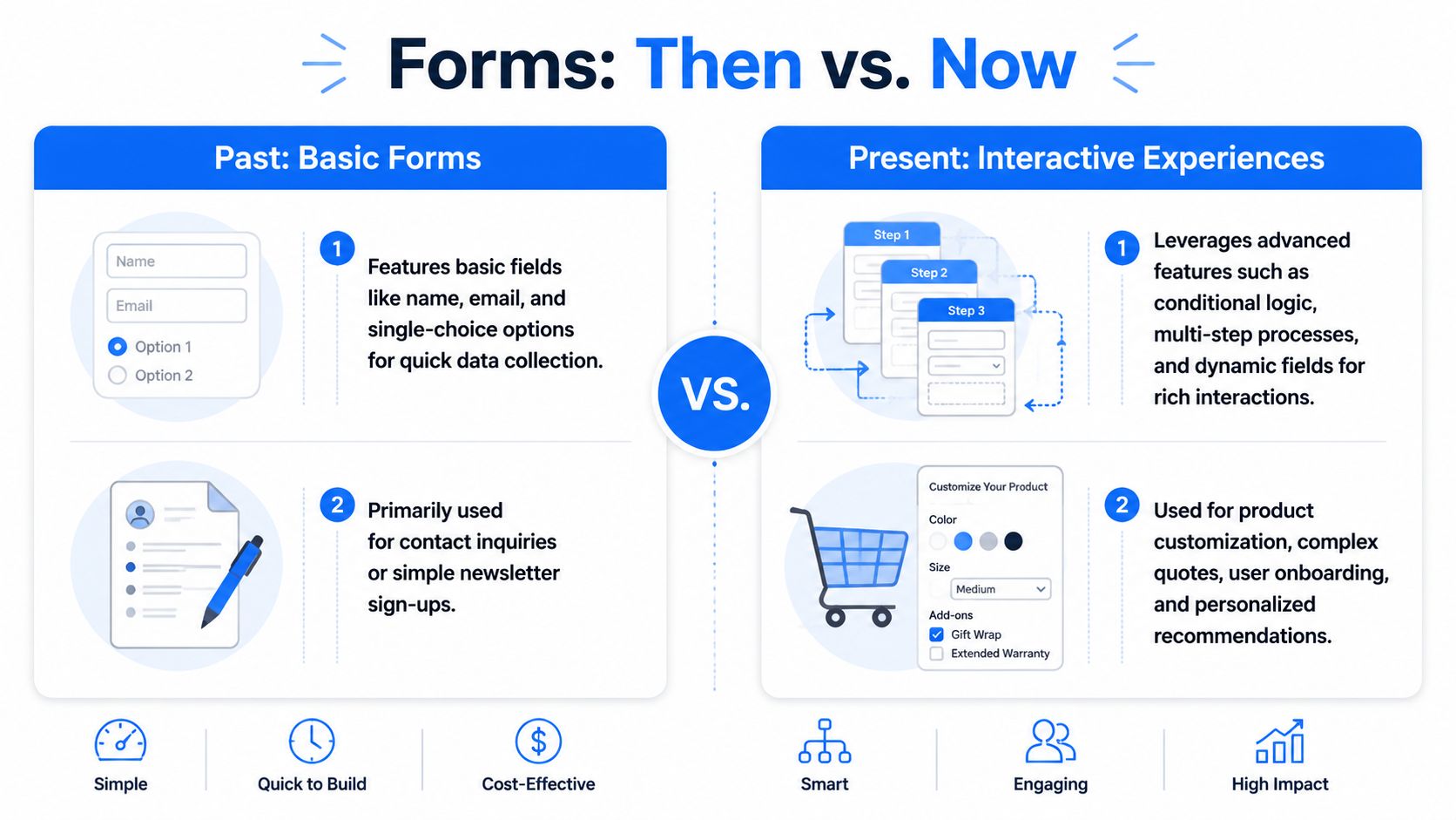
The limitation appears when the buyer journey gets more complex. Current coverage notes that native Shopify Forms is mainly for simple contact or subscription forms, while more advanced needs such as conditional logic, multiple question types, and richer pre-qualification often require custom builds or third-party apps. That leaves a clear gap for stores that need product recommendation, wholesale screening, or support triage, as discussed in this guide to adding forms in Shopify.
Why interactive forms work better for complex catalogs
A shopper buying a candle probably doesn't need much guidance. A shopper buying a supplement, fragrance, mattress, or dog food often does. If the store asks every visitor the same flat set of fields, it misses the chance to narrow options and reduce confusion.
Interactive forms change that by asking one question at a time and adapting based on prior answers. Instead of showing ten fields at once, they create progression. One answer shapes the next step. The experience feels closer to an advisor than a spreadsheet.
That format is especially useful when you sell:
- High-consideration products that need education before purchase
- Large catalogs where shoppers need help narrowing choices
- Custom or configurable items with multiple fit variables
- Mixed audiences such as retail buyers, wholesale leads, and support requests
A form becomes more valuable when it helps the customer decide, not just when it helps the merchant collect data.
Where third-party apps pull ahead
Shopify form apps start to separate into two camps. One camp handles collection. The other handles qualification.
If you want branching logic, richer pre-sale diagnosis, multi-step experiences, or more detailed recommendation flows, you'll likely need a more specialized tool. Some merchants also pair forms with personalization or automation workflows, which is why it can be useful to review the broader range of best AI tools for e-commerce alongside form software. The form is often the first input layer for everything that happens next.
Core Features of a High-Converting Shopify Form App
Not every form app deserves space on a storefront. Some are just prettier versions of the same old contact form. A high-converting tool does something more important. It helps the shopper move forward while giving your team better data.
Visual Templates That Fit the Store
Design matters because forms interrupt the browsing flow. If the styling feels bolted on, shoppers hesitate. If it looks native to the store, they keep going.
Look for templates that let you control layout, button styling, spacing, imagery, and brand colors without hacking the theme. This is one reason many teams start with a no-code builder such as an AI form generator for ecommerce flows. It shortens the path from idea to launch when you want to test quizzes, lead capture, or support intake without a developer.
A template library also speeds up iteration. You don't need to reinvent a wholesale application, product finder, or post-purchase survey every time.
Question Types That Match Real Buyer Decisions
Simple fields are fine for simple jobs. They fail when the buying decision depends on context.
A strong app should support question formats that reflect actual commerce use cases:
- Multiple choice for narrowing product preferences
- Dropdowns for catalog structure or request categories
- Ratings for post-purchase feedback
- File uploads when customers need to share references or issue screenshots
- Open text for nuance that fixed options can't capture
If you sell apparel, fit questions may need size, cut preference, and occasion. If you sell pet products, you may need age, breed, activity level, and sensitivities. The form should make those answers easy to give.
Conditional Logic That Reduces Friction
Conditional logic is where a form stops behaving like a static document and starts acting like a guided path. A wholesale lead shouldn't see consumer support questions. A customer asking about returns shouldn't be forced through a product recommendation sequence.
Done well, logic keeps the experience shorter for the shopper and more useful for your team.
| Customer answer | What the form should do |
|---|---|
| Interested in wholesale | Ask company details and order intent |
| Needs product help | Ask preference and usage questions |
| Has a support issue | Route to order and issue-related fields |
Irrelevant questions create friction. Relevant questions create momentum.
What works: show only the next useful question.
What fails: dumping every possible field into one long form because it feels “safe.”
Analytics and Reporting You Can Actually Use
Most merchants don't need a data science layer. They need clarity.
Good reporting should tell you where people start, where they stop, which answers appear most often, and which forms generate the most useful leads. If a recommendation quiz gets completed but doesn't drive purchases, the issue may be your outcomes. If people abandon at the second question, the opening may feel intrusive or unclear.
The app doesn't need fancy dashboards for their own sake. It needs to help you answer practical questions quickly.
Integrations That Turn Answers Into Action
Form submissions become valuable when they trigger something useful after the click.
That usually means:
- Email platform sync so new leads enter the right sequence
- CRM tagging so sales or support can prioritize responses
- Customer segmentation based on quiz or intake answers
- Internal alerts for high-value submissions
If your form says a shopper wants fragrance-free skincare for sensitive skin, that answer should shape what happens next. The data shouldn't sit idle in a dashboard that no one checks.
Powerful Use Cases That Drive Sales and Save Time
The strongest Shopify form apps aren't just for opt-ins. They solve operational problems and help buyers get unstuck.
Early in the process, a visual builder helps merchants prototype the customer journey before worrying about edge cases or integrations.
A practical starting point is adapting a lead capture form template for Shopify stores and then adding qualification questions that match your catalog, support flow, or B2B process.
Product Recommendation Quizzes
A store selling perfume has a common problem. Many shoppers know the feeling they want, but not the product name. They can say “clean,” “warm,” or “date night,” yet they can't translate that into a SKU.
An interactive quiz bridges that gap. It asks about scent family, intensity, occasion, and ingredient preferences, then points the shopper toward a smaller set of choices. The customer feels guided. The merchant learns what buyers care about.
This works especially well for apparel, supplements, skincare, pet nutrition, and gift-heavy catalogs.
Post-Purchase Feedback and Surveys
Most post-purchase surveys are too blunt. “How did we do?” gets generic answers. Better forms ask about fit, expectations, use case, or the moment the buyer almost hesitated.
Those answers are useful beyond customer service. Merchandising teams can spot product confusion. Marketers can find language customers use. Support teams can spot recurring issues earlier.
If customers keep asking the same pre-purchase question after they buy, the problem often started on the product page.
A short feedback form can also help identify who is likely to become a repeat buyer, who needs recovery outreach, and who might be a strong review candidate.
Wholesale and B2B Lead Qualification
Wholesale inquiries are one of the clearest cases for interactive forms. A generic contact form forces your team to manually sort serious buyers from casual curiosity.
A better form asks the questions a sales rep would ask anyway:
- Business type such as retailer, distributor, or agency
- Product interest by category or collection
- Order intent including timeline or purchasing stage
- Market details such as region or channel
That structure saves time because the lead arrives already framed. Your team can route, prioritize, and respond with context instead of starting from zero.
For merchants who want to see different form formats in action, this walkthrough is useful:
Interactive Support Forms
Support forms are often overlooked, but they can reduce friction across the whole business. A flat contact page turns every request into a manual sorting task. An interactive support intake can separate order issues, returns, product questions, and wholesale requests before a human reads the submission.
That changes response quality. Customers get a more relevant path. Agents get cleaner context. The store avoids long email threads just to identify the issue category.
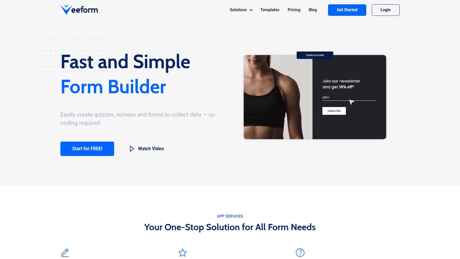
One mention is enough here: tools like VeeForm are built for this kind of one-question-at-a-time flow, with support for quizzes, surveys, and logic-driven forms that can be embedded, triggered by buttons, or used as popups.
Your Shopify Form App Selection Checklist
Choosing among Shopify form apps gets easier when you stop comparing feature grids and start asking what the form needs to do inside your business.
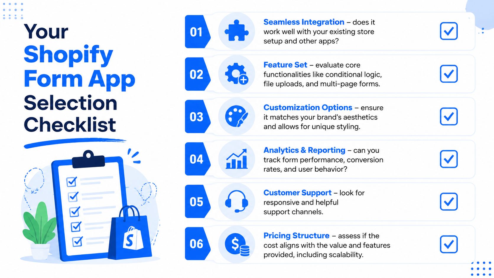
Start with the customer journey. If the store only needs a basic opt-in, native tools may be enough. If the form must recommend products, qualify wholesale demand, or route support, the bar is higher.
Use this checklist before you install anything:
- Match the use case: Does the app handle the exact question types you need, or are you forcing a simple tool into a complex job?
- Check visual control: Can you make the form look like part of your store, not an embedded third-party widget?
- Test the flow: Does it support multi-step progression or logic-based paths when different customers need different questions?
- Review integrations: Can the answers flow into your email platform, CRM, or support workflow without manual copy-paste?
- Inspect analytics: Will the reporting show drop-off points, completion patterns, and response detail clearly enough to improve the form later?
- Consider support quality: If the app conflicts with your theme or another app, will you get useful help quickly?
A second filter is operational fit.
| Decision area | What to ask |
|---|---|
| Catalog complexity | Do shoppers need guidance before they can buy? |
| Team workflow | Who receives and acts on the submission? |
| Mobile experience | Is the form easy to complete on a phone? |
| Brand consistency | Can you align fonts, spacing, and layout with the storefront? |
Selection shortcut: Choose the app that makes the next action obvious for both the customer and your team.
If the answer after submission is still manual cleanup, the form app is probably too limited.
Best Practices for Implementation and Optimization
Even a strong app can underperform if it's deployed in the wrong place or styled without care. Implementation is where many form projects go off track.

Choose the Right Form Placement
Placement should match intent.
An embedded form works well when the page itself has high intent, such as a wholesale page, quiz landing page, or dedicated support hub. A button-triggered form is useful when you want to keep the page visually clean but still give visitors an action path. A popup can work for lead capture or exit-intent offers, but it can also interrupt product discovery if it appears too early or asks for too much.
Use the least intrusive format that still gets the job done.
Respect Shopify Theme Behavior
Technical details matter more than many merchants expect. Shopify forms often run as theme extensions or embedded components that have to cooperate with the storefront's CSS and rendering model. Shopify's developer guidance says app behavior should use documented APIs, storefront flows should be validated across supported browsers, and app extensions should avoid unnecessary blocking in the customer journey in these Shopify app best practices.
There's also a practical theme issue that catches teams by surprise. In the Shopify community, the official Forms component has been shown as a custom element rendered via the shadow DOM, which means normal theme selectors may not work as expected. In those cases, merchants may need to override styling with CSS variables such as --inline-container-max-width: 650px instead of relying on standard selectors.
That's why some forms look perfect in one theme preview and broken in the live store. The problem isn't always the app. It's often the interaction between the app container, the theme, and the storefront styling model.
Don't judge a form app by the editor alone. Test it in the real theme, on real templates, across mobile and desktop.
Optimize After Launch
Launch isn't the finish line. Watch how people move through the form.
A few practical habits help:
- Trim early friction: If shoppers drop after the first or second question, shorten the opener or make the benefit clearer.
- Rewrite weak prompts: Questions that feel vague often produce low-quality answers and weak completion.
- Test calls to action: “Get my match,” “Request wholesale access,” and “Start my recommendation” create very different expectations.
- Review device behavior: A form that feels smooth on desktop can become awkward on mobile if tap targets, spacing, or keyboard behavior are off.
The most useful optimization mindset is simple. Treat each form like a storefront asset, not a one-time setup task.
Conclusion Turning Form Submissions Into Business Growth
Most Shopify stores don't need more forms. They need smarter ones.
A basic contact form has a role, but it won't carry the weight of product education, buyer qualification, support routing, or customer insight on its own. That's where better Shopify form apps make a real difference. They help shoppers move from uncertainty to action, and they help your team capture information you can use.
The most important shift is strategic. Stop thinking of a form as the end of a visit. Start thinking of it as the beginning of a guided relationship. A shopper answers a few smart questions, and now you can recommend products, trigger the right follow-up, route the request correctly, or segment that person for later campaigns.
Keep an eye on your form analytics after launch. Completion patterns, drop-off points, and question-level responses usually reveal where the experience is helping and where it's getting in the way. Small changes to wording, sequence, or placement can make a big difference in the quality of submissions.
When a form captures intent, not just identity, it becomes part of your sales system.
If you want a practical way to build quizzes, sign-up flows, surveys, and support forms for Shopify without code, VeeForm is worth a look. It's built for interactive, one-question-at-a-time experiences that can fit lead capture, product recommendation, and customer qualification workflows.